HOME | DD
 Dakazis-Bro — Metal Breakdown
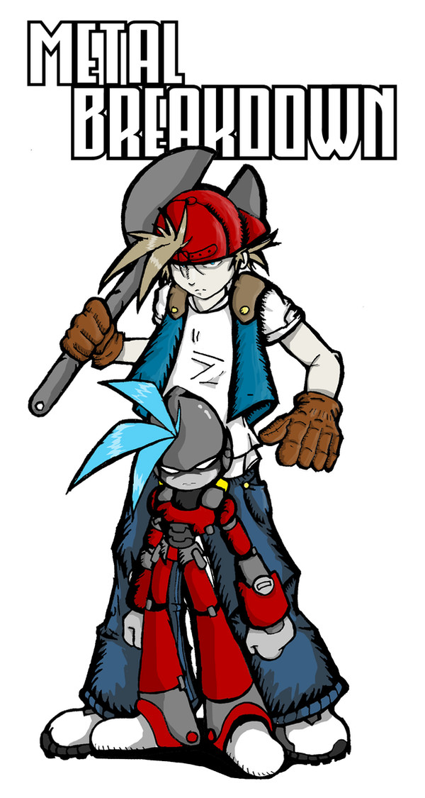
Published: 2007-02-06 01:41:57 +0000 UTC; Views: 1264; Favourites: 23; Downloads: 17
Redirect to original
Description
Been working on this pic on and off. I wanted to do a title page sort of pic, but I'm no graphic artist so I'm not sure what to do with the backgroudn and whatnot. I also didn't want to take too much away from the pic since I worked on it for quite a bit. I originally had a transparent background because it sort of looked nice, but of course it comes out looking funny on DA. Depending on the reception of this pic, I may or may not just remove the text and leave it alone. If anyone's good at making logos or whatever, I'd be happy to do an art trade or something like that.Related content


Comments: 58

I think this is your best one to date  (Smile)")
As for the logo, perhaps something with bolts and gears and whatnot? Pretty generic, but I think it would work well. If you ever get anything down, you should make your own font :]
👍: 0 ⏩: 1

For the logo I wanted to do something with the radioactive symbol, but im still looking into it. HOW BOUT YOU MAKE ME A FONT.
For free.
👍: 0 ⏩: 1

It looks really nice!
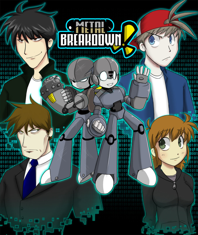
Hahah, it's kind of refreshing to see that a human is taller than the robot x3 Normally it's the other way around >.>
👍: 0 ⏩: 1
X3 Yeah, I didn't really want Crack any taller than Randy. Too many giant robots. Thank you be the way
👍: 0 ⏩: 0

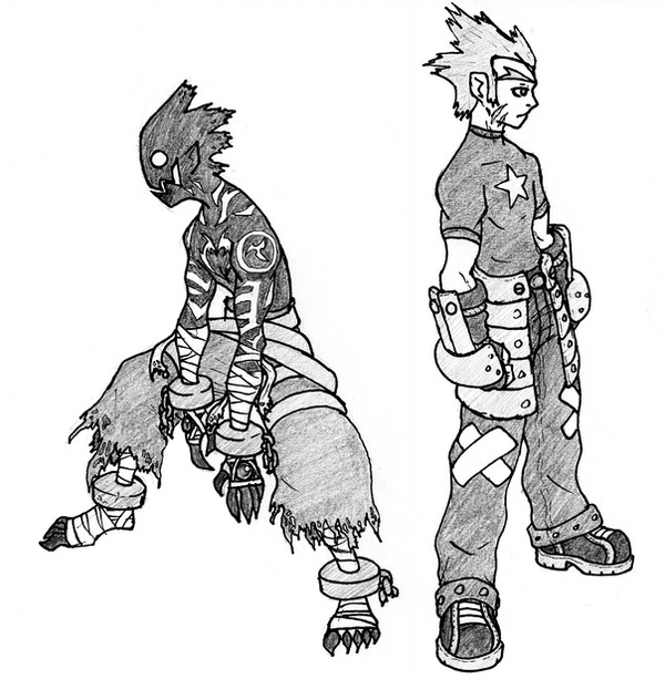
This is hella sweet. I love the jagged line art for the jeans.
Keep the text. It looks cool : D
👍: 0 ⏩: 1
Haha thanks! It took my a while to find a font I liked. I wanna add something to it, but I'm not sure what yet.
👍: 0 ⏩: 0
<= Prev |