HOME | DD
 dAKirby309 — Microsoft Edge Logo - Icon and Vector Download
Published: 2015-05-02 04:53:59 +0000 UTC; Views: 17830; Favourites: 37; Downloads: 3014
Redirect to original
Description
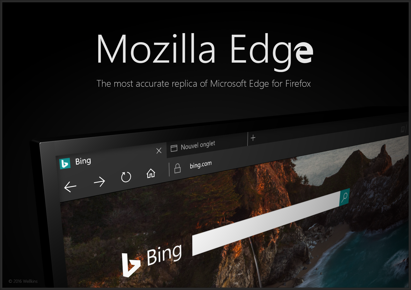
I recreated the new Microsoft Edge logo (formerly Project Spartan) which is currently available as Project Spartan in the latest Windows 10 builds and will be officially available in Windows 10 RTM as of somewhere between July and September of 2015!■ EDIT: Windows 10 has been released for RTM on July 29, 2015 and Microsoft Edge is available and full-fledged in the new OS! (Edge will continually receive bug fixes and new features as time goes on!)
The download includes an HD 2048x2048 px icon and also comes in .SVG and .PDF vector formats so you can resize the icon to any possible size and never lose quality of the image.
The preview also shows the process I took to recreate the icon... I carefully traced an image of the logo and converted it to vector.
")
Enjoy!
 (Smile)")
Microsoft Edge is Microsoft's brand new web browser. It will serve as a total replacement of Internet Explorer and is claimed to be, upon completion, one of the best browsers ever made. It uses the latest features, technology, and style to turn browsing into "doing", hence the name "Edge"; it is on the cutting edge of style, tech, features, etc.
Related content


Comments: 32

👍: 0 ⏩: 0

I didn't know what Edge is. I'm guessing its Internet Explorer on steroids.
👍: 0 ⏩: 2
👍: 0 ⏩: 0

Basically a way for Microsoft to start with a fresh, non-tainted, reputation for a browser.
👍: 0 ⏩: 0

I apologize for the stupid question, but... Where and how to apply this logo?
👍: 0 ⏩: 1
You can use this icon for whatever purpose you want such as changing the icon of some app you want to use...
Here's how to apply it (works for any version of Windows): www.sevenforums.com/tutorials/…
👍: 0 ⏩: 1

I did not like it at first for not being circular. I do love circles.
👍: 0 ⏩: 0

www.windowscentral.com/groove-…
it seems they intend to chnage the groove music icon as well. Im not very fond on any of them but the store app look too blocky for my taste. The current one is far more elegant.
Oblytile isnt very likely to get an update to work with windows 10 after reading the latest post at XDA developer forum. This is the only thing preventing me from upgrading. Aftre using it so long I can resign with the idea to have tiny icons inside squares on my start menu/screen. What was the other tool to make tiles? Maybe they have a solution.
👍: 0 ⏩: 1
I wasn't a big fan of the current Groove icon design, but this new one is.... well... I don't like it. I much prefer the current logo!
Also, sorry that OblyTile isn't compatible with Windows 10, not sure what other app could allow you to make custom tiles, I'm sure there is something or will be something eventually.
👍: 0 ⏩: 1
ypu the one on the sore is too bland and blocky. The current one slim G icon is more representative for the app name.
Darn I cant recall what was the onlytile alternative. it was very similar. i just cant record its name.
BTW Im quite surprised and I might say jealous on how popular is your vector icon
👍: 0 ⏩: 1
The current one is MUCH better in my opinion, it's a clever design. The letter G, a music disc, and can even go as far as to say that it almost looks like how the top of an old record player looked, with the needle (the part of the G where the gap is) pointing towards the disc. It doesn't scream "HI, I'M A MUSIC APP!" but it looks like a music app icon overall.
The new one is way too early Windows 8-like. It looks like Pac-Man eating a nacho or something lol. It also looks like something from my original Metro UI Icon Set, before a large update to the set, the white glyph's were much larger and less professional looking than they are now. (I do not think my Metro icons are professional or amazing looking AT ALL, I made them when I was first getting started into graphic design and could probably do much better on them if I designed them today, but I don't have the time to redesign them).
👍: 0 ⏩: 0


Some people thought that this logo is bad. But others thought that it was actually great, because of its resemblance to the Internet Explorer logo.
👍: 0 ⏩: 1
The logo isn't the greatest design in my opinion, but it is a brilliant design for Edge nonetheless. There are many very clever reasons Microsoft went with that design as anything too different from IE would probably cause some problems, especially for those who look for the "blue e icon" to go to the internet.
👍: 0 ⏩: 0

How can we apply this to MS Spartan? Is there a way to change the icon?
👍: 0 ⏩: 1
Probably if you make a shortcut to Project Spartan somewhere on your PC and then right click > properties > change icon from there it could be changed. However, you can't change the ACTUAL system icon and the actual icon will probably be changed to the new logo at least by RTM.
👍: 0 ⏩: 1

I don't get why people dislike the logo so much :/ good to know I'm not the only one who likes it
👍: 0 ⏩: 1
Yeah, I like the logo! I don't love it, but I feel the design was a VERY good move. There are actually several ingenious reasons as to why they made it look that way, quite interesting. A clever and nice design.
👍: 0 ⏩: 0


Nice work ! You can get rid of the Adobe Illustrator meta data for the SVG though, makes things much slimmer. Here's a much much slimmer version : pastebin.mozilla.org/8832164 (just click download on that page).
👍: 0 ⏩: 1
Thanks for the info  (Wink)")
I'll update the ZIP file (for both this and File & IE Explorer)
👍: 0 ⏩: 1
You can open SVG files in notepad, and you should be able to see what's useful and what isn't
👍: 0 ⏩: 1
lol well for someone who doesn't know much at all about coding, it's difficult to determine the difference between useful/needed and unneeded information.
👍: 0 ⏩: 0
is this official? Well its not better then Explorer and I didnt like Explorer.
👍: 0 ⏩: 1
Yeah, it's official! I like the logos for both IE and Edge, the new Edge logo is reminiscent of the IE logo... which could be bad cause IE has such a bad reputation but we'll see how it plays out.
👍: 0 ⏩: 1
so why did you say you recreated it? You mean you made it available as vector right and thats it
Any way I think its too sharpy and should have more smooth lines otherwise it doesnt look good at all on small size especially on taskbar. Can you provide a screenshot wiht it on the taskbar pls.!
👍: 0 ⏩: 1
I recreated the icon from a raster image. I didn't redesign it or something. I remade it (same as recreate) in a more versatile way so others can use it how they want for their own projects. And no, not just vector. Also in .PNG format at 2048px
What is hsrapy? And I'll put it on the taskbar when the Project Spartan logo is officially replaced with it.
👍: 0 ⏩: 1

