HOME | DD

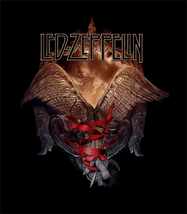
damnengine — Led Zeppelin - Icarus I

Published: 2007-02-11 12:50:21 +0000 UTC; Views: 18871; Favourites: 135; Downloads: 3426
Redirect to original
Description Pitch for a T-Shirt for Led Zeppelin, but unfortunately not used. All photography, textures and other material (except for the bandlogo) by me.
Related content
Comments: 28

drust136 [2021-01-29 02:52:23 +0000 UTC]

👍: 0 ⏩: 0

drust136 [2021-01-29 02:51:41 +0000 UTC]

👍: 0 ⏩: 0

ajcavalcanti [2020-10-11 06:31:44 +0000 UTC]

👍: 0 ⏩: 0

danwind [2019-02-03 04:30:19 +0000 UTC]

It's Looks Awensome, I loved it

👍: 0 ⏩: 0

PhysicalGraffiti1 [2012-02-19 21:02:09 +0000 UTC]

My favourite band ! Nice pic (:

👍: 0 ⏩: 0

Eshkol1 [2011-10-25 02:42:58 +0000 UTC]

beautiful

👍: 0 ⏩: 0

AveNDarknesS [2011-04-05 03:23:11 +0000 UTC]

OHHH MY GOD!!!! I Love This!!!

👍: 0 ⏩: 0

BonnieBuffalo [2011-01-08 18:38:31 +0000 UTC]

i'd immediately print it on my shirt ;D

👍: 0 ⏩: 0

xchechoox [2010-12-03 03:14:44 +0000 UTC]

spectacular..

👍: 0 ⏩: 0

titinax [2008-04-21 18:35:40 +0000 UTC]

Beautiful

👍: 0 ⏩: 0

Blacksun62 [2007-06-26 00:07:21 +0000 UTC]

man you are amazing at designs love the look at the real looking logos on a
t-shirt

👍: 0 ⏩: 1

damnengine In reply to Blacksun62 [2007-06-27 14:16:57 +0000 UTC]

thanks, pity they didn't get through the pitch though

👍: 0 ⏩: 0

Blacksun62 [2007-06-26 00:07:09 +0000 UTC]

man you are amazing at designs love the look at the real lookingl ogos on a
t-shirt

👍: 0 ⏩: 0

0Necromancer0 [2007-02-21 04:30:46 +0000 UTC]

wow.... i love it!

👍: 0 ⏩: 0

coxao [2007-02-19 02:31:19 +0000 UTC]

man.... perfect....
i like so much youre manipulations
don't seem manipulation, it seems drawing or painting

👍: 0 ⏩: 0

cadynho [2007-02-12 16:11:58 +0000 UTC]

awesome!

👍: 0 ⏩: 1

damnengine In reply to cadynho [2007-02-12 19:36:59 +0000 UTC]

thanks

👍: 0 ⏩: 0

Wildfire2003 [2007-02-12 15:05:47 +0000 UTC]

Again, wow! Love your work

👍: 0 ⏩: 1

damnengine In reply to Wildfire2003 [2007-02-12 19:38:12 +0000 UTC]

thank you

👍: 0 ⏩: 0

Reklaw280 [2007-02-12 06:35:46 +0000 UTC]

I think out of the three Icarus designs, I Like this one thE best. I also like the pheonix Design at the top of the shield. Very subtle rebirth imagery.

👍: 0 ⏩: 0

DJar [2007-02-12 00:47:02 +0000 UTC]

Of this serie, i like the position of the body, it kind of give the image a prophetic aspect. I like it very much, specially if it is for a band, really good work.

👍: 0 ⏩: 0

daemonicus [2007-02-11 22:15:36 +0000 UTC]

Nice...

👍: 0 ⏩: 0

Julian-M [2007-02-11 18:46:15 +0000 UTC]

I like it

👍: 0 ⏩: 0

pixievamp [2007-02-11 14:18:28 +0000 UTC]

That is damned good
That band are fools hun this piece is stunning
Luv Pixie

👍: 0 ⏩: 0

Aphariel [2007-02-11 12:52:12 +0000 UTC]

the lower part of the image i like more. Great blending. ;]

👍: 0 ⏩: 1

damnengine In reply to Aphariel [2007-02-11 12:56:40 +0000 UTC]

thanks, yeah the band logo was on top so that's why it's kinda empty

👍: 0 ⏩: 1

Aphariel In reply to damnengine [2007-02-11 13:52:30 +0000 UTC]

also i think that lower colour is more fitting

👍: 0 ⏩: 1

damnengine In reply to Aphariel [2007-02-11 14:13:08 +0000 UTC]

the colours are like that on purpose, warmth from the sun.

👍: 0 ⏩: 0