HOME | DD
 damnengine — trendkiller
Published: 2006-04-02 18:22:20 +0000 UTC; Views: 8939; Favourites: 194; Downloads: 1077
Redirect to original
Description
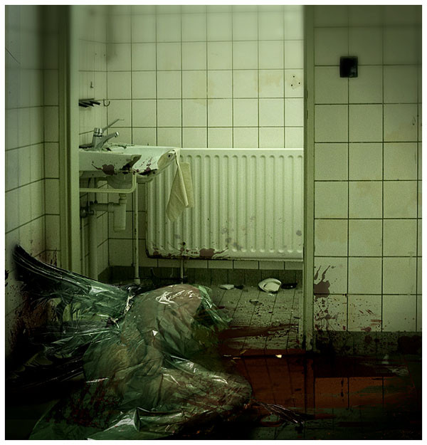
Little manip as a follow up on "The trend is over" piece.All images/photography by me - no stock used
Related content


Comments: 56


You're talented man, amazing gallery and great work !!
👍: 0 ⏩: 0


I like it... it looks like a "Saw" set, but it also looks like an after scene from my hitman story.
Which is why it's going in my favs...
Cheers!
DWF
👍: 0 ⏩: 0

This is brilliant. I absolutely love the choice of atmosphere and the chill that it presents.
👍: 0 ⏩: 0

the strings from the "thing" on the floor remind me of silent hill4. I like this one, very mood setting and disturbing
👍: 0 ⏩: 0


this is awesome - i have done a few CD covers for little local bands but think what you do is amazing .. if anything i think the blurring at the top helps guide the eye down the image it's just wow ... just a shame they never used it- great work and a fav from me ")
Isabel x x x
👍: 0 ⏩: 0

very good but whats with the blurry bit at the top? it is very good though!
👍: 0 ⏩: 1

thanks, well the blurry bit is still a remainder of where there should be a logo, it was made to be a cd cover.
👍: 0 ⏩: 1


wow nice picture. What is a photo and what the manipulation. Except the blood on the right wall.
But pretty nice. The only thing that sucks is the blur on the top.
Greetings
👍: 0 ⏩: 1
it was meant as a cd sleeve (and not used), hence the blur, I simply removed the logo
👍: 0 ⏩: 0

i love this. it's so disgusting and hard to look at. GREAT print.
👍: 0 ⏩: 0

Iam reminded of the mob style killing of an angel.
Which reminds me of the band Coil for some reason.
Fantastic composition and color control in this one.
👍: 0 ⏩: 0

This is my favorite of all your pieces so far.
I just don't like the blood on the wall and the heater. It looks way too fake (photoshopped), other than the rest of the picture. maybe adding very slight variations in brightness (resembling thickness) or transparency would do the trick.
-Jan-
👍: 0 ⏩: 1
Pity this is your favourite, for me this was more of a bit of fun and well that blood is a joke on its own, perhaps you find it, perhaps not, I wanted to know how much people pay attention. Well thanks for the tip anyway.
👍: 0 ⏩: 1
Maybe it's the fun part about it that makes this one seem special to me.
I'm not quite sure what joke you mean though, the only thing I noticed is that the brush you used for the blood appears several times in different sizes and rotations.
BTW: Is that a towel dangling from the sink? Did you place it there on purpose, and if yes, why?
-Jan-
👍: 0 ⏩: 1
It wasn't a brush, yes it appears several times, there's a piece of clean paper dangling from the sink. Yes I put it there and sorry, but I never explain my images, it kills the impact of them.
👍: 0 ⏩: 0

 (Wink)")


amazing work.. How on earth did you?! i like how it expresses this certain emotion..
👍: 0 ⏩: 0

LSJFLQQ??DXS??Q?Q??W?!!?@?!??!!!!
creepy as hell.
i love it
👍: 0 ⏩: 0


quite amazing! the blur at the top works beautifully to focus the eye on the main subject. i think too many people are looking for photographic perfection and forget... this is ART! there are reasons for doing things in certain ways. well done
👍: 0 ⏩: 0

the crop at the bottom is very interesting cutting off part of the being,the lighter tones of blood on the wall,compared to the vibriant red on the floor sorta surprises me I would think it would be a little more of the same tonelity as the floor,but not as reflective due to the angle,great stuff as always though man.
👍: 0 ⏩: 0

i just wake up.. make some breakfast.. and i opened dA to see if anything new is on. True sic and scary..
👍: 0 ⏩: 0

this and the trend is over, both remind me of a music video bush - greedy fly, your an amazing artist
👍: 0 ⏩: 0

I don't know why, but this reminds me of the movie Constatine! Like I said, I don't know why...lol. But I like it and it's genuine Damnengine art. Nice work!
👍: 0 ⏩: 0


very disturbing. the reflections of the wall work well on the blood but then it looks liek the same way the floor is reflected so it skews the perspective makes it look a little weird. just being picky, amazing work.
👍: 0 ⏩: 0


This piece is really tricky. I honestly can't tell what is manipulated and how in this piece, it looks just like a photo' ... Nice one Mr. Engine 
👍: 0 ⏩: 0


Amazing! Your atrwork is truly breathtaking.
👍: 0 ⏩: 0

this is great,
i've seen it before at RASTER and was amazed  (Smile)")
👍: 0 ⏩: 0

this looks a little blurry at the top and I'm lead to believe that it was the stock photo because it is very realistic. it's hard to tell what is real and what is not at this resolution.
👍: 0 ⏩: 1
I blurred it myself to lay focus on the bottom, in every piece all photos are made by me, so there's no stock at all. I won't put up higher res stuff, I had my stuff stolen too often already.
👍: 0 ⏩: 1
you shouldn't put up higher res stuff anyhow, it doesn't fit the screens of users well and it will make any imperfections in your work more obvious if there are any. People stealing things from you is bad when you can't punch them in the face so I don't blame you. It's hard for me to say what I would have focused on if it weren't for the blur but the first thing I noticed was the bottom so you did what you set out for sure.
👍: 0 ⏩: 1

"and it will make any imperfections in your work more obvious if there are any"
And this is bad because ... ? Wouldn't it help to improve a piece? Especially if it's going to be sold as a print?
Damnengine, astonishing as always.
👍: 0 ⏩: 1
~Abalone That makes no sense. you don't appear to understand my comment, why i commented, what i was commenting on, or the context in which that was said. "good" or "bad" was completely irrelevant. when was the last time somebody told you to mind your own business? It wasn't recently enough.
👍: 0 ⏩: 3

stupid canadian bastard
👍: 0 ⏩: 1

hahahaha funny... whats going on down here?!?!
👍: 0 ⏩: 1
| Next =>