HOME | DD
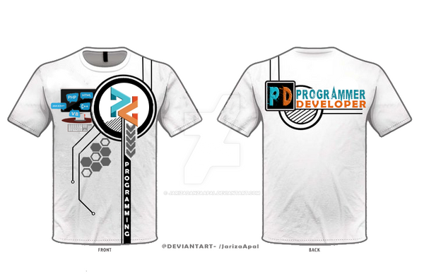
 Dan-Elli — Different

Published: 2009-02-13 16:24:12 +0000 UTC; Views: 2909; Favourites: 23; Downloads: 0
Redirect to original
Description
Be differentRelated content


Comments: 11


Very nice, but I would write "Be different - deviantART" only.
👍: 0 ⏩: 0


 (Wink)")

The IST has to go, otherwise this would be one of my favs
👍: 0 ⏩: 0

It's Awesome =]
But if you don't mind me saying, If i were you, I would change the "ist" Font.
But still, It's good =]]
👍: 0 ⏩: 0

i like it but personally i would like the different arrow somewhere a little less in the middle and more random
👍: 0 ⏩: 0

great idea, but i think the font would be a bit hard to read
👍: 0 ⏩: 0

ye but i dont like the fonts and the logo with the ist^^
👍: 0 ⏩: 1

So you should try with another one and edit the deviation ^^
👍: 0 ⏩: 0