HOME | DD
 danieltg — Publicity try 2
Published: 2005-12-23 22:20:05 +0000 UTC; Views: 118; Favourites: 0; Downloads: 11
Redirect to original
Description
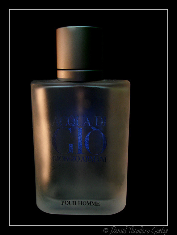
another try..worse than the other in my opinion...
Related content


Comments: 10

I like it, but it's hard to read so I'm not sure it's as good for publicity...ya know? I don't like it as much as the others...maybe frost it or find lighting that doesn't have such a glare?
👍: 0 ⏩: 1

i need money to buy lights to make a decent photo
")
👍: 0 ⏩: 0

gostei mais da anterior.
as letras deste não estão legíveis. :S
*
👍: 0 ⏩: 1
é...
também não fiquei satisfeito com essa
obrigadinho
=**
 (Smile)")
👍: 0 ⏩: 0


Eu num gostei muito do enquadramento e do fato da luz ser amarelada, se fosse azul acho que ficaria melhor, combinaria com as letras do recipiente.
👍: 0 ⏩: 1
as letras são cinzas
elas estão azuis graças a uma luz focal pequena azul, de xenon
e eu usei uma luz incandencente normal e uma flourecente
👍: 0 ⏩: 0

Hey! I've got that exact same aftershave. I've got a pic of it in my gallery too
👍: 0 ⏩: 1