HOME | DD
 danimation2001 — MASM page 5 Prev

Published: 2004-03-20 19:21:34 +0000 UTC; Views: 8999; Favourites: 63; Downloads: 4064
Redirect to original
Description
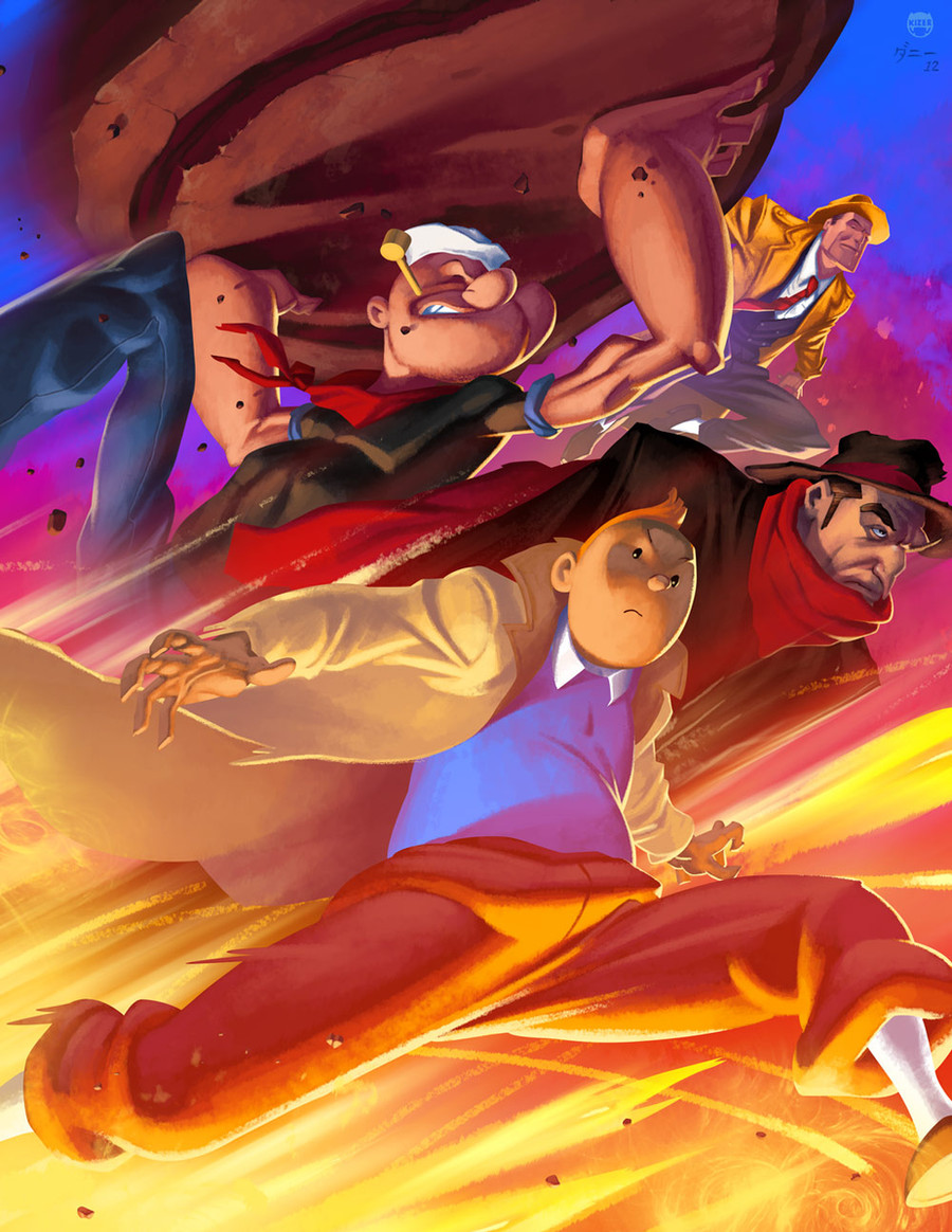
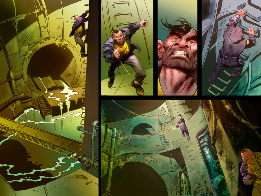
Another page preview to Marvel Age spidermanDrawing by: Mark Brooks
Colors by: me, danimation
Related content


Comments: 57

hey.. thanks man.. i'm a huge fan of both of you..
fuiz
👍: 0 ⏩: 0


DAMMIT. DAMN YOUUUUUUUUU
today in the office i picked up my creative directors marvel catalogue.. and i screamed when i saw something i remembered... YOUR CG!!!!!!!!
you colabbed with another guy .. but the lineart was definetely marks and the CG yours.. i remembered distinctly from the previous works you uploaded..
you must be so proud!!!!!! ")
.one day! one DAY!!!!!!!! ")
👍: 0 ⏩: 0

Excellent ; beautiful colors, nice lightning!! love it ....
+fav
👍: 0 ⏩: 0

The top panel actually seemed like it was emitting more light than the rest of my screen. YOU WIN.
👍: 0 ⏩: 0


fantastic colour work! this is incredbile. i like the very impressive fire work up at the top, and the smoke in the lower left panel. great stuff.
👍: 0 ⏩: 0


Amazing colors! How long does it took to finish this? This is really great.Keep up the good work.
👍: 0 ⏩: 1

It depends on the page. Something like this which is three panels, doesn't really take as long as an eight page panel. For right now though, I'm going at each a day, sometimes two pages a day if the pages are simple enough.
👍: 0 ⏩: 1
Still fast for an extreme coloring style. (Smile)")

👍: 0 ⏩: 0


someone showed me issue one in class today and i was like "dude! i know that guy...well, kind of..." man, your coloring totally makes it work...if they had a crappy colorists on marks pencils, sadly i don't think it would work as well as it does. you make his work look good man. r u going to stay with mark as long as you can? or have u been asked to do other things yet? i can't imagine it being too long now before you are doing a pretty big book. anyways, keep up the great work and i will be checking out your issues from now on. that's so cool man!
👍: 0 ⏩: 0

fantastic I love your colr choises..keep up the good work man!
👍: 0 ⏩: 0

Ouch that got to hurt. >.o
The colors are brillant.
👍: 0 ⏩: 0


the explosion is so WOW. you're doing a great job here, congrats!
👍: 0 ⏩: 0

smooth stuf, im not 2 happy with some of the crits about mark above^ ppl need respect
👍: 0 ⏩: 0


Very good work on the explosion and the fire-smoke effects

👍: 0 ⏩: 0

Hmm well guess someone has to give the first real crit and i guess that someone should be me
I'm no fan of the very very yellow explosion in the first panel, dont really know whats wrong with it but it just looks a bit too.. solid yellow...
and in the panel with the fireman I find it odd you can see this 'light gray' sky with lots of stars when your looking up and there's an entire upper floor burning... just think the sky should have been darker
off course im not the super colorist here but hey cant be bad to give an opinion
Ow and the style of mark brooks totally fits your coloring in my book
greetings Soulrailer
ps ill be watching you
👍: 0 ⏩: 1
You allready know my defense on that one. If the story isn't believable then there's no reason why I should make it more believable.
👍: 0 ⏩: 0


wowww nice lights man, kuv the shadows and relistic touch that you give to the pictures man
👍: 0 ⏩: 0

Awesome man, really great coloring, you gave it a great mood. Keep it up!

👍: 0 ⏩: 0


amazing job dude, what is that in the bottom right panle on dock ocks skin? are they tatoos? or is that were the tenticles were burned into his flesh?
👍: 0 ⏩: 1
yeah the tentacles are fused with him.
👍: 0 ⏩: 0

Jeebus, Dan. I dunno if its at all possible but everytime I see some colors from ya it seems you had gotten better. Its absolutely perfect. I see nothing I can crit on. Though, as much as I love your colors... I always have... I'd still like to see you doing your own work. You deserve to be doing a comic just as much as Mark does. Its good to see that you've broken into the industry. I'm mighty proud of ya.

👍: 0 ⏩: 0


awwwweeesome work
great style and coloring
i like the page layout too, leaves room for detailed cells
yet doesn't overcrowd with a thousand cells haha
👍: 0 ⏩: 0


totaly awsome!. is this like an official comic book for marvel. or just somthing the two of you are doing
👍: 0 ⏩: 1
[link]
does this answer your question?
👍: 0 ⏩: 2
"Instead of the traditional penciler/inker/colorist template, we're using extremely tight pencils, digital inks, and having them digitally painted by a newcomer who goes by the name Danimation. ....With this process, we basically had to split the responsibility 50/50 so my lines count on his digital paints and vice-versa."
Isnt this nice from Mark
Digital inks?? is it also Mark who does this?
btw theres this link to this page youve posted here but on that site the scientists look greener then this pic, isnt this the final version?
greetings Soulrailer
ps ill be watching you
👍: 0 ⏩: 1
If not for him, I'd probably get no recognition for my work on those damn comicbook news threads. That's the one thing that pisses me off. No credit.
There was this colorist that got murdered after coloring a Hulk book and only then do they mention his name. Very low shit, guys has to be dead to get credit... Sad.
anyway.
About the scientist, believe it or not I have no Idea what they are going to change or keep the same. They like to make sure that the lines are visible allways without failure and that people can allways clearly see what's going on. This isn't a believable comicbook, I should have kept that in mind more when I was coloring it. I should have made everything sunshine and lolly pops. like this book is. But I didn't and they will edit. And I don't like it.
eh... It's not worth fighting over. I'll fight for when it really counts. When I work on a great story that's more belivable.
👍: 0 ⏩: 1

Hello Dan at first time congratulations for your amazing work with the colors.
I stoped to read this comment, im agree with you... really i wondered myself the reason why you dont get credit in the comic books, i think Mark is very good but the thing is doing the book amazing is the coloring, no doubt. (i put my logo in all my works ")
They guy who was murderer is Hermes Tadeu, i knew it when i joined in GHG ( [link] ) now im finishing some small work he was doing when he died (im a begginer yet).
Its all  (Wink)")
👍: 0 ⏩: 0
yup thanks. awsome stuff there
")
👍: 0 ⏩: 0

man this is insanity......your colors are insane, the only thing I dont like is outta your control anyways, I wish Marks pencils did a little more justice to it all, but thats just me.
good on ya man.
N8B!
👍: 0 ⏩: 2

Feels funny when someone poses their own standards on to your own art doesn’t it?
👍: 0 ⏩: 0
| Next =>