HOME | DD
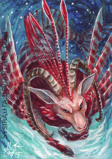
 Daniocity — ACEO: Riprap's Revenge
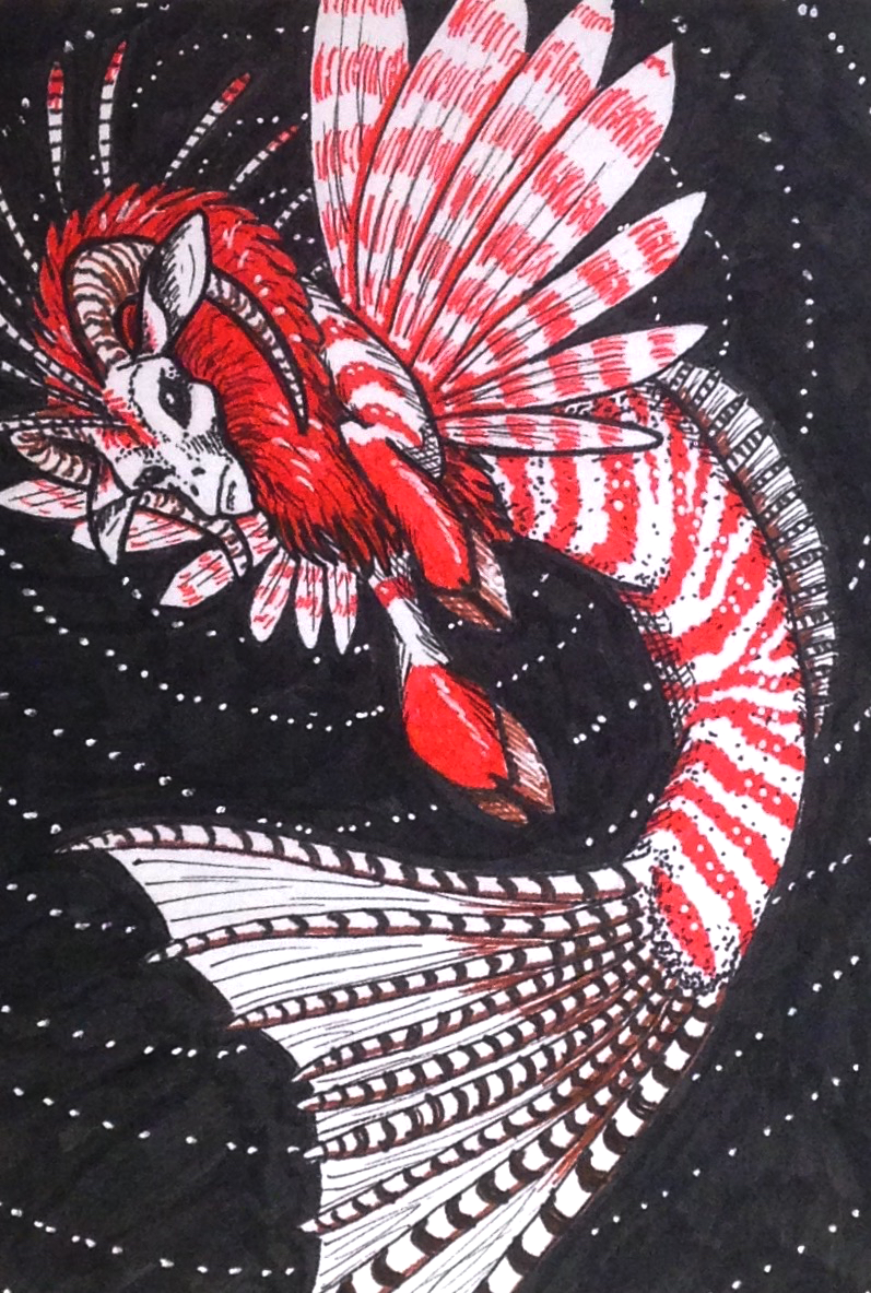
#aceo #artcard #goat #grumpy #lionfish #micron #red #art_card #artcards #capricorn #micronpen #seagoat #zodiac #capricornzodiac #artcardseditionsandoriginals #stylusirl
Published: 2015-04-01 21:07:58 +0000 UTC; Views: 787; Favourites: 67; Downloads: 1
Redirect to original
Description
My Capricorn Sea-goat OC, Riprap being grumpy again. Only my second attempt drawing him, so I'm reasonably happy (Smile)") Also trying to play around with perspective, which worked out less successfully, but c'est la vie...
Also trying to play around with perspective, which worked out less successfully, but c'est la vie...Micron pen and gel pen
Related content


Comments: 36

👍: 0 ⏩: 0


Technique
Impact
firstly, i wanna give a big yaaay for the color scheme, the combination of red, black, and white is simply classic, but it never gets old e.deviantart.net/emoticons/s/s… " width="15" height="15" alt="
the pattern of the fish body with a combination of red stripes into white is simply eye catching and also quite refreshing as you can also see it in a koi fish.
I also love the dynamic pose of this creature, i'm sure drawing in this angle is not an easy task and i'm sure you've been through many experiments before this.
and yeah, i also love his expression, it fits with the theme of revenge, and those black eyes, simply a sign of his fury e.deviantart.net/emoticons/s/s… " width="15" height="15" alt="
no, no i won't point out any mistakes since it will sounds very subjective, art itself is very unlimited and it's a sign of freedom, and also i'm here to give a critique not a criticise, but i can suggest you to experiment more about the center of attention of an artwork and using reference can be very helpful if you're more into a perfection.
and here we go e.deviantart.net/emoticons/s/s… " width="15" height="15" alt="
don't stop making arts, you're good.
👍: 0 ⏩: 1

Thank you so much for critiquing my work!
👍: 0 ⏩: 1


Overall
Vision
Technique
Impact
This particular piece looks great and caught my eye immediately. Especially because the white and red of the creature contrast so well with the pure black background, so really great choice of colors.
I gave max to originality because I'm really enjoying the design. I have seen a few spins on Capricorns, but having a lionfish half is a new one, and I must say it looks great design-wise. I also like the fact that you gave it a thick, colorful mane, it gives it a pompous and majestic feel that goes really well with the lionfish frills and pattern.
I gave technique the lowest score not because the technique itself is bad (you sure have smoother penwork than I or others), but because there are a few mistakes which detract from the best look possible for this piece. First, the goat's face is slanted, particularly the eyes and mouth - one of the eyes is much smaller than the other, and the mouth doesn't feel centered or like it follows the three-dimensional shape of the muzzle. His left leg could also use a bit better foreshortening, but that is something that can be fixed for the future by checking some references on animal legs in that pose. The pose it's supposed to have does come across, it just could use a bit more polishing. And lastly, a minor one, but the tail spikes are uneven, which while they don't bother a lot, are noticeable due to the tail being such a big part of the image.
All in all, though, I really like this little fellow, he's cute and has a great design. Great work!
👍: 0 ⏩: 1
Thank you so much! You're totally right about the leg and face (the face was one of those things I knew looked weird, but couldn't figure out how to fix). Thank you for your critique!
👍: 0 ⏩: 1
Well, that's what happens to everyone, you look at a piece so long you stop seeing minor mistakes or exactly what makes them mistakes, and a second pair of eyes always helps
👍: 0 ⏩: 0

Gorgeous character! I love fish-based fantasy creatures.
👍: 0 ⏩: 1
Thanks! He's become the closest thing I have to an OC. I should probably draw him more, lol!
👍: 0 ⏩: 0

Oooo very pretty. love the composition and positioning
👍: 0 ⏩: 1


")

OMG he's like a lion-fish capricorn!!!!I love it!!!!!!!!
👍: 0 ⏩: 1

So cool design
I like the couloring, nicely done as ever 
👍: 0 ⏩: 1

This looks so cool, your art looks so professional
👍: 0 ⏩: 1
Aww... Thank you! That means a lot to me
👍: 0 ⏩: 0


Aww... thank you so much!
👍: 0 ⏩: 1