HOME | DD
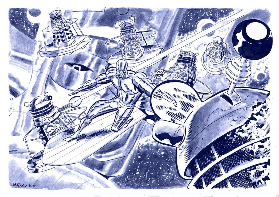
 danmcdaid — DR WHO pin-up - preferences?

Published: 2007-02-20 14:06:46 +0000 UTC; Views: 2155; Favourites: 39; Downloads: 32
Redirect to original
Description
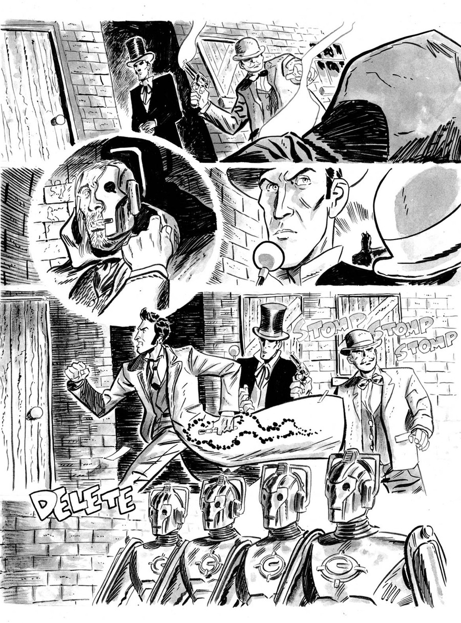
Hi everyone. I'm back! I doubt I'm gonna be posting as much as I used to (not having a job that I hate means, perversely, that I spend less time on the internet and more time working. Weird, eh?), but we'll see. I've missed the old place - and particularly my two biggest supporters (hi Matt and Annora!)Anyway, here's another pin-up that I'm planning on sending to Panini comics to clinch a job or two drawing for Doctor Who Magazine. I've included two versions as I'm not sure which one I prefer - and this is where you fine deviants come in. Feedback very welcome!
Related content


Comments: 30

like both  (Smile)")
pssh has the doctor in, daleks and the heart of the tardis
")
👍: 0 ⏩: 0

I like the foreground best on the right pic, but I preffer the background on the right...
👍: 0 ⏩: 0

I love them i can't say which on is better you art rocks.
👍: 0 ⏩: 1

Well thank you very much Trash-Pirate!
And I agree with your sig 100 per cent!
👍: 0 ⏩: 1
thats fine your art is amazing
👍: 0 ⏩: 0

though I must say the 3D really pops on the right becuse of the extra tones.
👍: 0 ⏩: 1
helgaleena! I've gone the middle way: the muted tones of the left picture with the white background of the one on the right. Everyone's a winner!
👍: 0 ⏩: 1
Yep! Also (whisper it) the editor of Doctor Who Magazine got back to me within TWO DAYS of sending this off and they're going to buy some of my work. Woo! I couldn't be ANY MORE EXCITED (but keep it under your hat).
👍: 0 ⏩: 1
lips zipped, excited bounce
👍: 0 ⏩: 1
Left, left! They print things on white, do they not?
👍: 0 ⏩: 0

I've gotta go with the one on the right.
The washed out look seperates the figure from the background. Alone the one on the left is fine , but next to the one on the right it lacks that pop and looks flat.
You want your characters to jump out, and the left one has that.
👍: 0 ⏩: 1
*Very* interesting...
*strokes chin some more*.
So it's two to one in favour of, er, the popped out one. I shall mull on this further...
👍: 0 ⏩: 1
you know i'm right....ignore all others!
👍: 0 ⏩: 1
Done and done! Sent it off yesterday, so wish me luck gang!
👍: 0 ⏩: 1
Sweet, man.
Good luck- you know you did good work no matter what they say!
👍: 0 ⏩: 1
Thanks dude, but seriously, check it out: within two days of me sending the parcel off, the editor of the magazine phoned me up and, well [George Costanza] "I'M IN BABY!" [/George Costanza]. It's early days, but the editor wants to buy my Doctor Who story, get me to expand on it (and draw the remaining instalments), colour the pages I've done (that *really* surprised me) and maybe do a little work for their Annual as well. It's too early to get REALLY excited, but I think it's appropriate to get a BIT excited.
Only downside - I now have to learn to draw properly. Gulp.
👍: 0 ⏩: 1
CONGRATU-FUCKING-LATIONS, MAN!!!
that's incredible- that's a dream job for ya. I'm really excited (and proud) for you. Enjoy it man.
You won't have any problem knockin their socks off.
super cool
👍: 0 ⏩: 1
Cheers man. I've sent a synopsis for the rest of the story off to him, and I'm waiting to here if he wants to go ahead with it or not. So things are pretty tense around here, as I'm sure you can imagine...!
👍: 0 ⏩: 1
I can ONLY imagine.
Hey I finally figured out what I wanna do with you (project-wise, that is)
An "Introduction to MajorCity."
Basically a prequel-guidebook to the world in which EveryMajorCity takes place. I've started blocking some of it out. Once I've got a series of thumbs done and some sample text I'll pitch it to ya right and proper.
👍: 0 ⏩: 1
i did a bunch more layouts at work today.
3x5 cards scanned and moved around will probably be the roughs
👍: 0 ⏩: 1
Excellente!
BTW, I sent another synopsis off to them (they liked the first one but felt it was too derivative, which was fair enough) now I'm playing the waiting game... Fingers crossed!
👍: 0 ⏩: 1
hopefully they dig it and then maybe send you a rejected script from the show for you to translate into panels.
👍: 0 ⏩: 1
Man, that'd be cool...! But I think they actually want to buy the story as well - or at least the first part of it. It's tricky.
👍: 0 ⏩: 0

I like the hot and cold tones of the one on the right. It's a nice balance of red and blue.
👍: 0 ⏩: 1
...Interesting. *strokes chin*.
👍: 0 ⏩: 0
I completely see where you're coming from, and I think I might agree with you. Maybe the blue mist in the background is the problem?
What do you think of the border? Black or white?
👍: 0 ⏩: 0

I like the one on the left, the one on the right looks washed out. However, I like the glow on his sleeve on the right one... maybe you can add just a little more glow on the left picture around the actual glowy piece but not throughout the whole thing.
Know what I mean?
👍: 0 ⏩: 0