HOME | DD
 danmcdaid — The Last-Minuters - RIP
Published: 2006-09-24 10:13:38 +0000 UTC; Views: 673; Favourites: 4; Downloads: 5
Redirect to original
Description
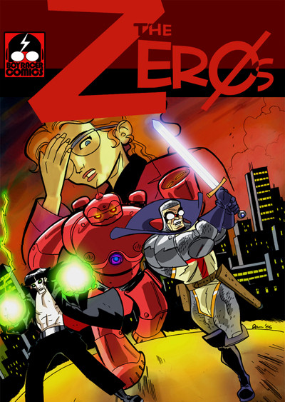
Make way for The Zeros!Feedback welcome guys!
Related content


Comments: 26


Well you can add another yay to the group for the title "The Zeros." It really says a lot without saying too much. If the goal is to present a team of heroes that are under appreciated and not expected to be much of heroes, but manage to save the day, I get the vibe.
If it's something else. Well ... I guess I'm off base.
I had friends a long time ago that published a comic called "Second Rate Heroes" which I think is the vibe you're going for.
I think "Powers that Be" has been taken once upon a time.
👍: 0 ⏩: 0


Thanks Ms. Dreamer! Unfortunately that's like 1 FOR The Zeros and 10 AGAINST. Ah well.

👍: 0 ⏩: 0

Oh, Okay- and god points on the art by the folks above.
They're right about the title cropping and the guy's foot getting cut off by the page-end.
I think you should redraw the cover ANYWAY (cuz you've got so much better) and do it like a collage.
Drop in the background and then have each character seoerate and drop them in in different areas to find out the best place to put them. You can also re-size easier if they're each seperate elements too. The overall design and idea of the cover is spot-on. I'd just want to see more characters densely placed within the boundries of the page.
I think the red is an awesome accent color for this- it really came out great.
I think that's the way to go.
👍: 0 ⏩: 1
See, I'm leaning the other way, towards a more simple, stark image. There's an awful lot of cluttered cover design out there (though thankfully much less than there used to be) and sometimes you stand out better by having one simple, but arresting cover element. But I'm gonna try everything on the road to greatness. Can you say "variant covers"?
I might even consider going for a homage of the famous X-Men cover (you know the one, with the new X-Men bursting through the old?). Anyway, ideas ideas...
 (Wink)")
👍: 0 ⏩: 1
yeah, that's a good idea.
One illustrated cover and one highly graphic cover.
Here's what I'm gonna do on GoldenAge- have two covers (front and back)
Kinda like some of the old Marvel (and then later, Image) flip books. But instead of they're being a second story upside down, the only thing inverted would be the second cover.
That way you get TWO covers for the price of one AND the purchaser gets to CHOOSE which cover to display.
👍: 0 ⏩: 1
Very groovy. I have a nice one in mind with the five of them gathered around Excalibur. See, in the process of doing her job, Alison has sort of assembled a modern Knights of the Round Table. Kind of.
👍: 0 ⏩: 1
ahhh, gotcha.
I see the idea threads pulling together.
The set-up really lends itself well to plotting...if you ever need any story ideas, I've got some.
👍: 0 ⏩: 1
By God yes! One nice thing about building a world like this from the ground up is that there's room for other people's input. A colleague of mine came up with a couple of AWESOME ideas - one comedic, one more serious - which I'm definitely going to incorporate at some point.
Fire away!
👍: 0 ⏩: 1
as I said on DB, i thought you were changing it to
The Powers That Be, which in my opinion is one of the coolest names for a book, EVER! When I first read on page 1 or 2, i was pissed that I didn't come up with it. I realize at THAT time, it wasn't the title of the book, just another story element. BUT, the PTB has a much broader scope than just another "team name book."
TheZeros (whether it's their "in-book" team name) or ZeroHeroes would be good as a name given to them by OTHER heroes, as a derogatory stab.
Say it...
Say it ouloud:
THE POWERS THAT BE
It would really be an awesome title.
👍: 0 ⏩: 1
I kind of agree MC - also it better describes the book, in that it's mostly about her and her life and her job. If I can come up with a good logo for it I'll strongly consider using this.
👍: 0 ⏩: 1
ultimately you've gotta do what feels right to YOU!
You've gotta great thing here, man.
👍: 0 ⏩: 1
Oh I totally see that. But the problem is that I really like ALL of these ideas that are floating around, and settling on one is proving kind of tricky.
I'm leaning back towards The Last-Minuters. If I can work up a nice new logo then it's a definite sell for me. I have one for Powers That Be, but it's a little bit Coca-Cola to tell you the truth. But I'll probably use it in the comic itself.
👍: 0 ⏩: 1
yeah, that's kinda the bright side of it.
Any design work for TPTB won't go to waste.
I gotta tell ya, "TheLastMinuters" will always sing for me.
👍: 0 ⏩: 0

hmm... i like the last minuters better. it makes it less obvious that they're not the popular hero team. and if they become popular that name is pretty original and the defining.
👍: 0 ⏩: 1
I'm hearing this a lot from the people I'm showing the new logo to, so there's clearly something in it. *THINKS DEEPLY*
Thanks for the feedback K!
👍: 0 ⏩: 0

I gotta agree with the others, this looks very good. I would recommend putting the logo behind the reporter's head also. And one last critique, I don't like how the picture cuts off the guy on the left. Everyone else is in "frame" but him.
I hate to nit-pick such a good looking drawing Dan, and I really dig the curvature you gave to the backgroud. That is something I need to work on myself! Good job man.
👍: 0 ⏩: 1
Nit-pick away Gaston! This isn't the final cover art anyway, as I feel I can probably do better now (also the designs for the lead characters have been tweaked a little since this was drawn - and there's one character missing). Cheers for the compliments: there's stuff about this pic I really like!
👍: 0 ⏩: 0

Are you planning on changing their name or something? Is that what this is about?
The Zeros sounds rather short.... What about the Zero Heros?
Just a suggestion
I think all your work is extremely professional. You have incredible talent. This would surely be something I could see sitting on store shelves.
")
👍: 0 ⏩: 1
Hi Annora - yeah, that was the original idea but the feedback I've had on this new idea has been that it's not as strong as The Last-Minuters. I've honestly lost all perspective on the original title and to me it seems a little crummy. But that could be because I've seen it too much, if you see what I mean.
Thanks very much for the kind words - this kind of stuff makes the whole darn thing worthwhile!
 (Smile)")
👍: 0 ⏩: 1

The last minuters is a bit long.. a lot of syllables...
Maybe try a thesaurus and find words that describe "the last minute". The Procastinators... lol.... They are there at the last minute ! ")
My spelling is crap today... sorry lol
*hugs*
👍: 0 ⏩: 0
That's very cool. One thing I would do different though is overlay the woman's head atop the logo.
But anyhoo, if I saw this on a shelf I'd buy it.
👍: 0 ⏩: 1
Thanks Ron! And you're right about the logo!
👍: 0 ⏩: 0