HOME | DD
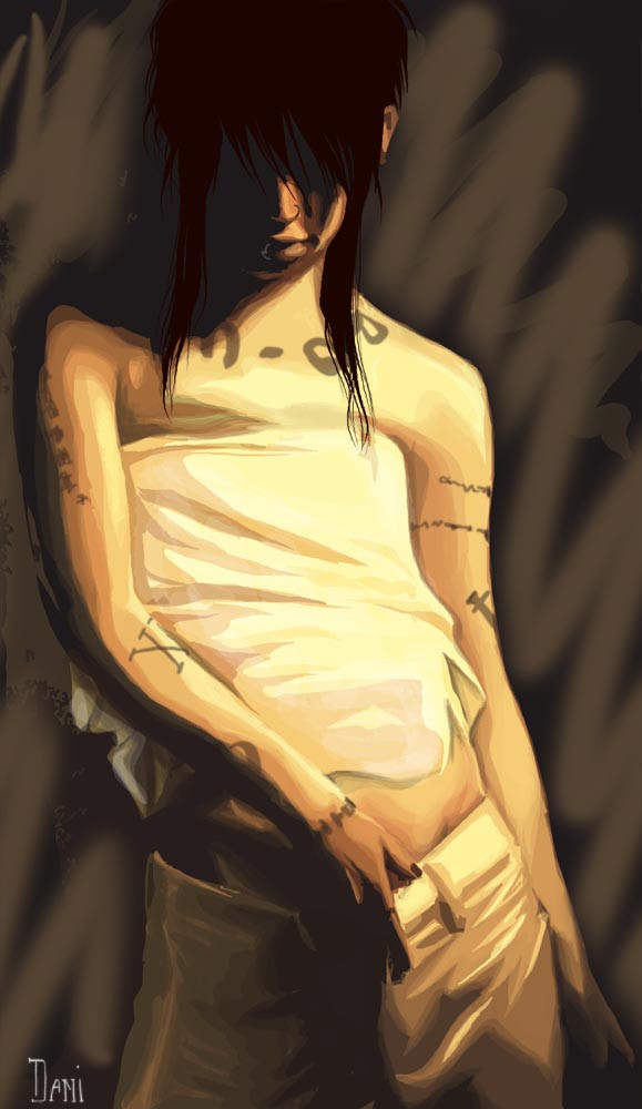
 danny-boy — Miyavi
Published: 2004-12-17 19:52:39 +0000 UTC; Views: 8409; Favourites: 246; Downloads: 390
Redirect to original
Description
This is why I hate working in color... I butcher beautiful people when I work in color.
The tattoos are not remotely accurate, I resorted to scribbles 'cause I couldn't find a decent referance and didn't feel look looking that hard for one.

Related content


Comments: 62


It's beautiful. I love the strong light/shadow contrast on this one.
👍: 0 ⏩: 1

Thanks  (Smile)")
👍: 0 ⏩: 0

That's really good. You're plenty talented with colours, and it looks absolutely beautiful. Colours help add emotion sometimes.
👍: 0 ⏩: 1


wow thats top!! don't worry about the tats they look good, sides i think with the way you've done it detailed tats would have looked out of place.
what did you colour/paint it with? looks like water colours to me?
very nice pic, must fav!
👍: 0 ⏩: 1
It's actually completely done in photoshop
")
👍: 0 ⏩: 1
smart arse ")
well done tho for that pic it looks real
👍: 0 ⏩: 0

I love this
I think its really neat looking, I cant see that you butchered it at all!
👍: 0 ⏩: 1
I'm my own worst critic, I suppose.... thanks for the comment and fav
👍: 0 ⏩: 1
<= Prev |