HOME | DD
 dapride — DevID - firefly-requiem

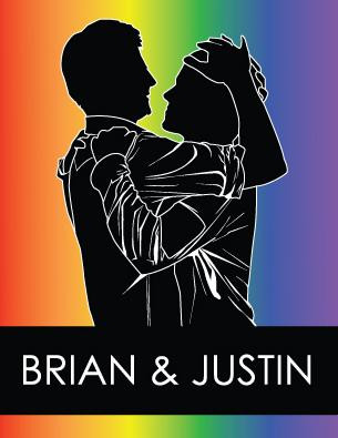
Published: 2005-05-21 17:14:43 +0000 UTC; Views: 2223; Favourites: 32; Downloads: 413
Redirect to original
Description
just tried to create a tender moment, just to show that being gay is about love and not just sex and debauchery (though that can be fun some times) ^_^~firefly-requiem
 The is an entry in the New DAPride devID competition which is now closed.
Related content


Comments: 21


 (Smile)")

*applauds insanely!* 
👍: 0 ⏩: 0

I love this one! It's just the perfect size too!
👍: 0 ⏩: 0

This is the best! It's so perfect, far better than anything I could do.

👍: 0 ⏩: 0

")

yeah i hate the double logo thing too, but it was in the rules that the logo was undisturbed...shame. and i know its not completely universal, but i thought id draw what i know...and that would be more sincere than trying to represent everyone... i tried, s'all i can say ^_^;
👍: 0 ⏩: 0

i like it, the only thing i would say is that i dont think you need two dapride logos. i think just the big one in the middle would be perfect.
👍: 0 ⏩: 0

The message is great, however there are lesbians, bisexuals, and transgendereds on this site too. Thats the only problem I have with these ID's that show only one aspect of the GBLT when it's a whole community. Should appeal to everyone, not just gay men know what I mean?
👍: 0 ⏩: 0


Loved your little comment on your piece. You make a strong point though i ranted about this recently for english. How people tend to show gay as scandelous and foul. Its simply not true. Anyway i love the set up its playful and invitng. Clean simple and clever. It reminds me of a Peter Allan song from Boy From Oz.
👍: 0 ⏩: 0
yeah i not a fan of the double sign, but to have the logo indisturbed was a requirement...something i dint realize till i was almost done...plus i didnt have much to work with. i would have loved to use adobe illustrator or photoshop but i dont have either T_T
so yeah i just had to tac on the logo, tho i wish i could have down played it a bit more...but ts not my rules
👍: 0 ⏩: 0

This is interesting. My initial impression wasn't favourable, but it's grown on me. I very much like how you've avoided the cliche lovely looks! While I agree with 1980 about filling in the open mouth of the guy on the right, I love the expression of the guy on the left - I think the tone it gives the words makes them more interesting and less "cheesy". I'm not sure cheesy is the right word (I've certainly read many many worse things for cheese) but it'll do.
I think the doubled logos *are* a bit redundant, but not glaringly so - just they make me think "why two?"
And looking at the silhoettes ... hmm ... yes, I think they could benefit from a little softening, and also perhaps the image could be a tad larger?
Anyway, this is probably my favourite so far because it's interestingly different in it's tone and the people you depict.
👍: 0 ⏩: 0

oh. one last critique: please consider removing "how can loving you be wrong?"
it's too, um, cheesy? sentimental, i suppose. i think the image will work better without it.
^^
👍: 0 ⏩: 0
mm. i hope you don't mind critiques?
the lines of the silhouette are too harsh, especially as the image is black on white. maybe try a bit of blurring to soften them.
i think the open "mouths" on the silhouettes are unnecessary. i think the way they are drawn doesn't d good on the image, as the two guys look like they've haven't had sex in a long time. okay, sorry for that. my point is, it's too, mm, "porn-y"; removing those mouths will give the image more mystery and an air of tenderness. try filling those white mouths with black and you'll see what i mean.
putting the DA logos twice seem redundant.
also, i get the impression that this logo seem to show DAPride is a gay men's community. mm. maybe i'm phrasing that incorrectly. what i'm trying to say is that, DAPride is for gays, lesbians, bisexuals, and transgendered people, not just for gay men. i think your logo is more geared towards gay men, and unintentionally overlooks the gay women of DAPride.
just my two dollars. cheers. ^^
👍: 0 ⏩: 0


It is not often I give bad comments, but--
Far from well done... what a poor quality image... it is like bad Oekaki...
[truth]

👍: 0 ⏩: 1

Yeah it seems like it.
👍: 0 ⏩: 0
