HOME | DD
 darax — Before and after Coco ^^
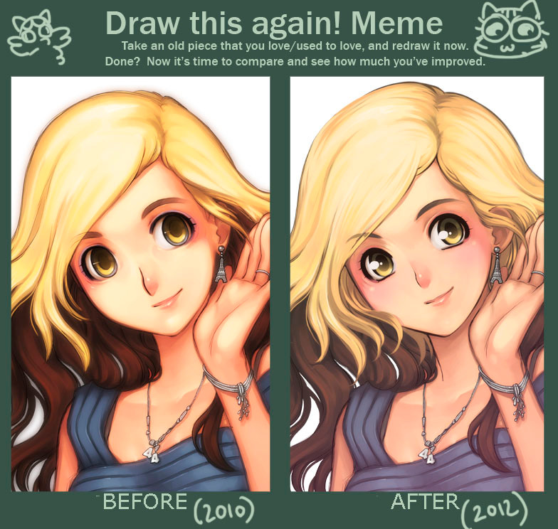
Published: 2012-06-28 08:19:25 +0000 UTC; Views: 4941; Favourites: 174; Downloads: 173
Redirect to original
Description
An illustration I improved for a flyer!!! More info to come!Original:
[link]
Related content


Comments: 27


I like the left one better. The eyes have a hazy deep set quality to them, while the 2012 version has anime eyes which I, personally, detest.
👍: 0 ⏩: 1

both have anime eyes because it basically what you call this art style. the biggest difference and is why the 2nd one is actually an improvement is the colors (although more subdued) have more dimension (?). Not sure if I'm saying the write word. but that's how i feel bout it. plus the 2010 drawing actually have dead eyes... that's usually what a mind broken/possessed(?)/empty person looks like. the 2nd one has a gleam to it and it actually feels like its looking at something instead of staring into nothing as what i feel the 2010 version is doing. my 2cents. TL;DR
👍: 0 ⏩: 1
You're right about the gleam, but only in anime is the gleam that huge and unrealistically overwhelming. Personal preference, honestly. I feel like you gave up a far more unique and charming style for something not that creative and more trendy, but hey, the beauty of art is that you can do whatever the hell, right?
👍: 0 ⏩: 0

la couleur de peau de 2010 est plus vive... mais le dessin de 2012 est plus travailler. je ne sais pas quelle version je préfère^^
👍: 0 ⏩: 0

je préfère celui de droite.
Les yeux sont plus vivants.
Et on sait l'expression passe bcp par là
👍: 0 ⏩: 0

I love the improvement but prefer the color palette from the previous one.
Very nice improvement on the hair and the chara's eyes look better with less lines around the eyes. Somehow in both i feel the mouth is a bit off to the side... but don't listen to me >////< anyway the pic looks great! i swear!
👍: 0 ⏩: 0


I like the original.. more paint-like and the anatomy of her face is better ...
👍: 0 ⏩: 0


 (Smile)")

the drawing is better but i like the colors from before
👍: 0 ⏩: 0

Did you just redraw her face? I really like the one in 2012, but it would have been really nice to see all the areas you improved in, including how you paint fabric and the skin.
👍: 0 ⏩: 0

I like them both but I'm with InjunPotato the one on the left has more character to it than the one on the right
👍: 0 ⏩: 0

Elles sont toutes les 2 très jolies mais on vois très bien l'amélioration ( même dans le manga je trouve ça frappant ), ils sont encore plus expressifs et vivants, la Coco 2012 est MA-GNI-FIQUE !! <3 ( après c'est personnel o3o )
👍: 0 ⏩: 0


The 2010 one is better because it has more character and more warmth. The character on the right looks like every well drawn anime girl ever, whereas the one on the left looks more unique and deep, probably due to lack of cliche and the warmer colours.
👍: 0 ⏩: 1

i agree with you! Altough the way of colouring is better at the 2012 picture. especially the hair. But the colours itself and especially the eyes are beter in the 2010 picture!
👍: 0 ⏩: 0


You sure made a lot of improvement. ^^ hehe Her hair and eyes especially. And the colors are softer with more detail.
👍: 0 ⏩: 0

")
👍: 0 ⏩: 0


I like the eyes in the newer one but i prefer the more saturated coloring in the older one, otherwise i think they look pretty identical.
👍: 0 ⏩: 0

C'est léger mais ça reste conséquent!
Elle à l'aire plus réveiller *sort*
👍: 0 ⏩: 0

She looks like a psychopath (yandere) in 2010. ")
Amazing improvement!
👍: 0 ⏩: 1