HOME | DD
 darc — All the technology in my hands
Published: 2005-04-29 06:26:25 +0000 UTC; Views: 469; Favourites: 8; Downloads: 79
Redirect to original
Description
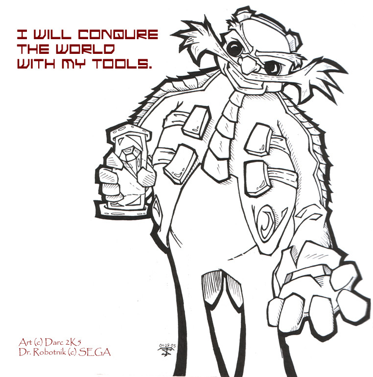
RobotnikIf I liked this any more, it would actually give me a chubby. Which is wrong... I think. Who better for my 100th (yeah, I really need to update more.) deviation. I actually drew Shadow after Eggman here, but I inked it first so this could be my 100th upload.
It's not perfect, the hatching isn't as good as the last few ones I've done. I'm really thinking this would make a good wallpaper, color it, add a bunch of quotes fading in and out of the background. I dunno, I can think of something, hopefully something really cool. I've never really made a wallpaper that I'd use before, or at all that didn't involve avacado... don't ask.
The design took a lot from official images, and some fan art I've found through the site thanks to my all too brief subscription. Mainly in the face. In the official art he wasn't all that expressive, no real eyebrows to speak of and you couldn't see his mouth. Hell, he didn't even have any eyebrows. I like the ones I added though. I love his coat, if I could have something in that style I would. This should be fun to color.
I actually like this design more than any others. The Archie design was neat and all, but never really grew on me. And the old 16 bit one was far from impressive, no offence. But that Eggman was striking fear in nobody's heart. The Sonic Adventure design is my favorite. Though what the hell happened to him in SA2? He looks worse there.
So yeah, tell me what you think, bad or good. Or I'll eat your brain meats.
I'll do it too, I've got the munchies.
Related content


Comments: 4

I like the way you drew him. Makes him looks kinda like a teenager.
Robotnik is def my favorite.
And probably the only one I actually like in Sonic.
👍: 0 ⏩: 0

I really like the textures throughout this and the shapes are really strong and nice. I really like the linear weights the most-especially the strength and boldness of the dark outline :3
👍: 0 ⏩: 0

This is a BITCHIN' eggbastard. And I say that with quite a bit of jealousy, because not once have I been able to draw the good doctor. I love the line inks, meself!
👍: 0 ⏩: 0

Very awesome. I like the line width variation and the detail which gives the drawing a very nice style to it. I think the main problem is the thick inking outside of the arms. The points are a little too pointy which makes it look like it's fur. If you square off the points more then I think it would work better. And personally, I don't think Eggman should have eyebrows, but each to their own.
👍: 0 ⏩: 0