HOME | DD
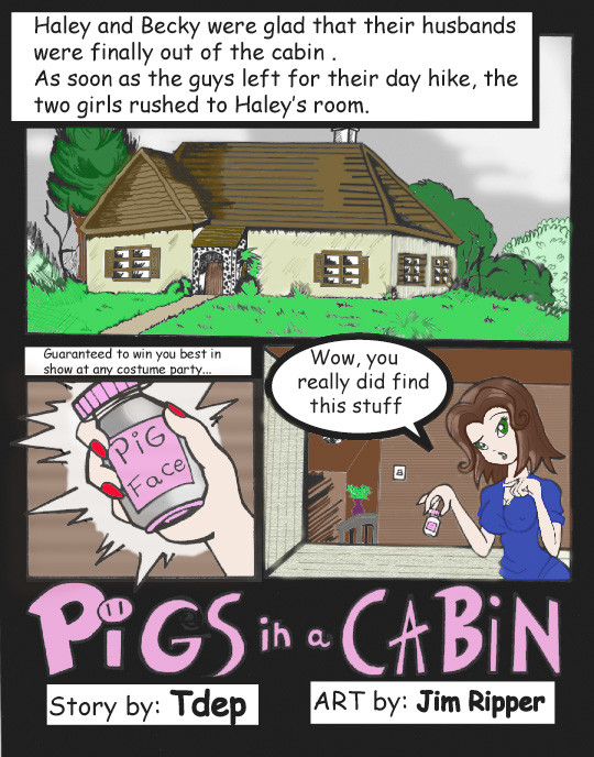
 darkdonny — Pigs in a Cabin Colored - 1

Published: 2009-03-04 22:58:12 +0000 UTC; Views: 21143; Favourites: 47; Downloads: 109
Redirect to original
Description
This is something I've been working on for quite some time, and I finally was happy enough to post it. I will be working on coloring the rest of the comic written by tdep over time.Original - Written By Drawn by - [link]
Colored Using Photoshop CS3
Related content
Comments: 6

Are you painting using "Multiply" and creating multiple layers? I've downloaded your coloring and it doesn't seem like your doing that. It would help preserve the lines in the drawing if you did do that. Also, if you create a semi transparent layer just above the background you can use the color white to take away some of the really dark areas of the drawing like the girl's shirt. Any color you choose now for her shirt comes out extremely dark which leaves out the possibility of having shading to create extra depth to your work. Speaking of color shading, you could do some of that with her skin tone, the grass, trees, house, ect... Right now the colors have an over all flattness to them.
These are suggestions of course, if you are happy with your results, then keep doing It the way you like. Good luck with your efforts. Coloring 27 pages of strips is extremely ambitious for anyone to take on.
👍: 0 ⏩: 1

In all honesty I am not sure I remember how I colored that image. It was two or three different methods, none of which were easy...I am not sure how much of the series I will be coloring. My coloring (if you look at the works of immortaltom i've done) is very flat, like an old EC (Tales from the Crypt, ect.) style comic. Shading isn't something I'm at all familiar or good with.
👍: 0 ⏩: 1

When I came across your colorization of "Pigs In The Cabin" I was already aware of the series of pages. I liked the art style enough to keep it in my head. I saw your version of it and was curious about how it looked against the original drawing. What I see is some of the finer details are being covered over with the color. Not all of the finer lines. The colors like the one you chose for the shirt completely covers the dark grey beneath, while you make a great effort not to paint over the outer lines of the shirt. Actually, that seems to be the way you are preserving the lines. Very time consuming, and very hard work.
ImortalTom is more of a line drawing than a grayscale, and does not have as many fine lines to contend with. The colors are flat, and I can see where you're coming from by using the "Tales from the Crypt" look and feel of it. I guess we're of two different minds when it comes to coloring, and that is fine. I would love to show you what could be done with "Pigs" (at least the first page) with the way I color through multiple layers.
👍: 0 ⏩: 0

can't wait for the rest
you're a fine colourist. Keep it up
👍: 0 ⏩: 0


