HOME | DD
 DarkDragon1010 — Supie redesign

Published: 2013-01-13 22:44:21 +0000 UTC; Views: 1916; Favourites: 32; Downloads: 7
Redirect to original
Description
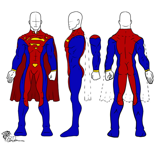
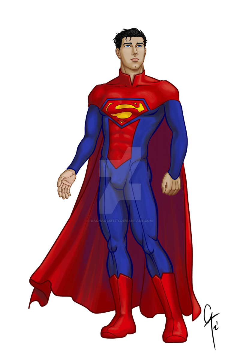
EDIT: Fixed the facial mess. BUT STILL; DON´T LOOK. I MADE HIM UNHANDSOME LAWLEDIT2: Changed the "S". The toher one was baaaad
DON´T LOOK AT HIS FACE.
..It´s ugly ;____;
While browsing through dA I found so many artists drawing redesigns for their favourite characters and all of them came out so well, that I felt like trying the same with mine.
Actually I wanted to start with Batman first, but unfortunately I have NO idea for anything that´d suit him the way he deserves. Maybe it´s because I like his recent design from Earth 1 just too much. Simple but still awesome. It keeps my mind from changing
Guys from DC, I love you. Really, all of you.
I´m just posting this because I know that, in case I wait for another 20 minutes, I´ll be either asleep or regretting what I did to Clark´s face and hesistate from posting.
(plus the face that I´m nervous about it, because this is my first try of redesigning a canon, especially such a popular one like Superman. Otl
But right now I want to know what you guys think about this design. Suits him or not?
Comment please <3 <3
Superman@DC
Related content


Comments: 6

")

nice redesign. the main thing with his face is that the eyes are too wide-set )generally speaking there should only be space for one eye between the two actual eyes) and his mouth is too big. I think if you tweak those just a smidge it'll make a huge difference
👍: 0 ⏩: 1

Fixed.
Thanks alot <3
👍: 0 ⏩: 1