HOME | DD
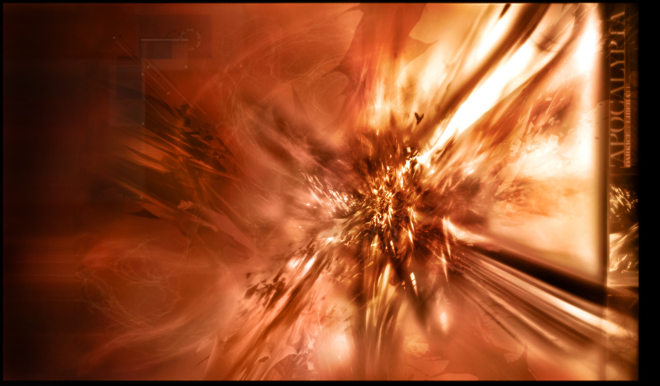
 darkicefx — Apocalypta
Published: 2004-03-06 19:46:26 +0000 UTC; Views: 484; Favourites: 15; Downloads: 231
Redirect to original
Description
Dun dun DUNNN....thought it would never happen again eh?...well...damn..it didCollab between me and - hes my collab bitch =\
Enjoy
 (Smile)")
Related content


Comments: 61

lol i dont know...im horrible with trying to make a tut =\
👍: 0 ⏩: 1

 (Wink)")

Awesome collab. Great brushwork and color. Cool render.

👍: 0 ⏩: 1

very coo color. makes u go... ohhhhhhhhh lol
👍: 0 ⏩: 1
O_o...::slowly walks away::
👍: 0 ⏩: 0


coooL i love the colorssss... the renders is perfect.. awesome img
👍: 0 ⏩: 1
thankssssss - i appreciate ittttt
👍: 0 ⏩: 0

It's looking a little empty there on the left side. Maybe minimal brushing there would have touched it up a bit. ^_-
The minimal 2D you've added in is just great and fitting for that piece. ^_^ Much like the awesome brushing you've done.
The typo's great! I love that blurry effect thingy going on there. ^_^ But I dunno.. Something weird is going on around there. It is as if part of the image was moved a few pixels to the right.
And pretty much like every one else said; the render is wicked. ^_^
Nice job guys! Keep it up! ^_^
")
👍: 0 ⏩: 1
render is his..and...yes the pic was extended and i did a pixel line blur thing
👍: 0 ⏩: 0

👍: 0 ⏩: 0

awsome job on this one
the colors the render and the blury feel
all is good
fav.
👍: 0 ⏩: 1
👍: 0 ⏩: 1
oh shit i only set it as my background i did not add to fav. sorry
i was tired last night
👍: 0 ⏩: 1
a background O_o...it works as a bg?....O_o...
👍: 0 ⏩: 1
oh yeah... vertical with a black background it is sweet and it also matches my winamp
👍: 0 ⏩: 1


Awesome brushing and colors man. Great typography on the right side, you're really good at typography.
👍: 0 ⏩: 1
[can you find the misplaced 1 in this message?]
👍: 0 ⏩: 1
After hours of searching and stress I have come to the conclusion the the missplaced 1, is in fact, not misplaced.
And here it is:
[can you find the misplaced -1- in this message?]
LOL!!!!!!!!!!!
👍: 0 ⏩: 1
...i..hate you ...lol
[can you find the misplaced 1 in the originally above staed comment that does not include this ''1'' and the two ''1''s in the reply?]
👍: 0 ⏩: 1

wee gotta love firey ")
👍: 0 ⏩: 1
no, it doesnt - it started as vertical...and atleast i think it doesnt (l1b doesnt either..)
👍: 0 ⏩: 0

that is some nice work, the colours are great ditto for the 2d and the brushing is most fresh
i also love the whole foggy feel to the picture
👍: 0 ⏩: 1

really good collab you 2 got there! really asthounising... 
👍: 0 ⏩: 1
well your right..orignal was other way..but i was playin around with it..it looked better this way (plus u can still read the words...just put some effort into it <_<
👍: 0 ⏩: 0

damn good work
love the colours and design
keep it up
👍: 0 ⏩: 1

nice work but the colors are just ok
very nice render
👍: 0 ⏩: 1
eh who knows...color cant always be good i guess - i didnt want to completely contradict the title....some colors dont go with titles...
👍: 0 ⏩: 0


tiiiiiight piece!i! You know i like the colors, dont ya
👍: 0 ⏩: 1
....hmm kinda match your ava O_o
👍: 0 ⏩: 0

funking amazing brushing and nice colours....GJ ^^
👍: 0 ⏩: 1
again, its fucking O_o lol thanks alot ^_^
👍: 0 ⏩: 1

awesome colors, awesome brushing, awesome 2d and awesome renders!!
👍: 0 ⏩: 1
so that makes it awesome - am i correct? ")
👍: 0 ⏩: 1
| Next =>