HOME | DD
 DarkJimbo — Hunting of the Snark W-I-P 3
Published: 2008-01-23 18:02:54 +0000 UTC; Views: 178; Favourites: 2; Downloads: 2
Redirect to original
Description
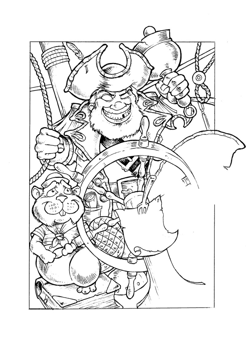
Realising that the Bellman was rapidly becoming my favourite thing about the crew illustrations, I scrapped my attempts to depict the whole lot and settled on this very piratey-themed portrait.He looks nicely demented, but the Beaver looked so awful I couldn't bring myself to finish it. Seemed a little uninspired as an image, anyway.
Note how his bell's gradually been getting bigger and bigger each time I redraw him. In the latest version it's bigger than his head!
Related content


Comments: 7

I think the bell should be even larger and more ludicrous in size...but the Bellman is great! What if you did the beaver as a more realistic looking render...? Might make him look a little less...saccharin? Dear? Precious? I can't find the right word, but he's too...cutsie is what we might say here in the States. He's almost there...but needs perhaps a bit more realism, ironically enough.
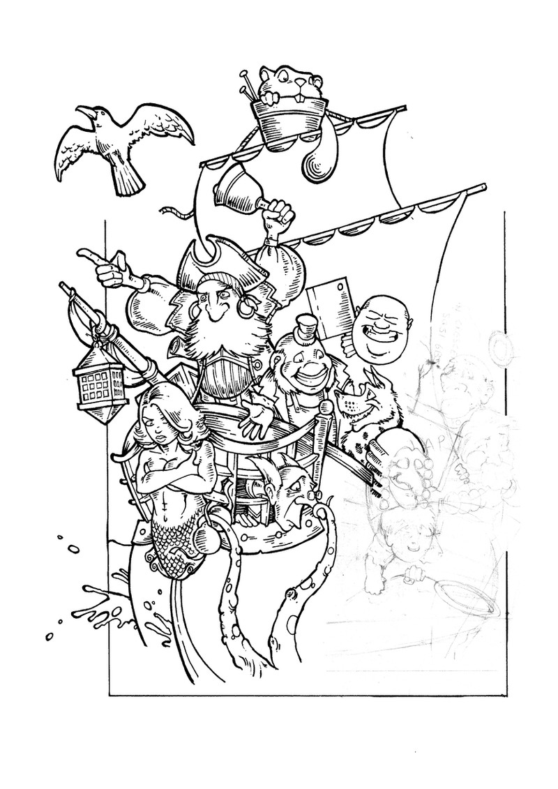
I've loved all three of these and I'd love to see you give the one with all the characters crowding an alarmingly undersized ship another go.
👍: 0 ⏩: 1

I've since done several more of these - most notably the Bellman and the Beaver (yet again!) where I think I finally got them right, and a couple of the Banker meeting and being driven mad by the Bandersnatch. But they've all been done out of sequence and I've been holding off posting them here until I can present them all in order.
As for the 'characters crowding on the ship' theme... I've loved drawing every one of these variations and I'm tempted to just do a stand-alone colour illustration on exactly the same lines - call it 'Ship of Fools' or something, and ditch the Snark theme, because then I wouldn't have to worry about getting the characters from the poem right, which is what hamstrung these.
👍: 0 ⏩: 1
Whatever the path you take- I await the works with great anticipation!
👍: 0 ⏩: 0

Been looking at these a few times and whilst being WIP I think you're being hard on yourself by making them scraps.
What really stands out in these three images is the development you've made in proportions and style. Some of your earlier pieces are semi realistic and semi cartoonish but this is a comfortable balance. And the proportions and really nicely done (the beaver's fine).
👍: 0 ⏩: 1
Thanks for the kind words man. The most recent versions of these are the best, but I want to have several before I upload them.
👍: 0 ⏩: 0

Is it ok if I comment here for all three of these pics? Because that's what I think I'm gonna do.
I really love the lineart here, are you planning on colouring them? In any case it looks really very professional, and well made. Also a technical question, what size do you draw the stuff at when you do it? It seems like you would have to be drawing everything massive in order to cram in the level of detail you do.
👍: 0 ⏩: 1
These were all drawn on A4 Bristol board (mostly at work  (Smile)")

BTW, sorry I didn't do much other than nod when I saw you briefly at xmas - I should have at least said 'hi'.
👍: 0 ⏩: 0