HOME | DD
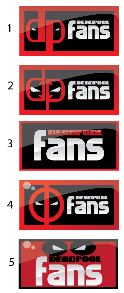
 darkman4e — Deadpool fans id variants
Published: 2010-03-11 16:13:39 +0000 UTC; Views: 1478; Favourites: 18; Downloads: 0
Redirect to original
Description
For the deadpool fans group.Related content


Comments: 34

Love how you incorporated the text and logo in 1 and 2
 (Smile)")
👍: 0 ⏩: 0

Auuu! ")
👍: 0 ⏩: 1

pal, can i use one as a signature in my forum, with the respective credit ofcourse?
👍: 0 ⏩: 1

Sure thing my friend
Can i see the forum ?
👍: 0 ⏩: 1
ofcourse man, right now..
thanks so much.
Here is the D.A. inside you found the direction..
[link]
👍: 0 ⏩: 0

#2 is badass while #4 is the traditional Deadpool symbol
I'd go for #4
👍: 0 ⏩: 1

Thanks a lot, and thanks for the fave
 (Wink)")
👍: 0 ⏩: 0

awesome! i really like the 2nd design best. except for those little 'arrows' inside the DP letters.
you obviously have a strong foundation in typography and advertising.
👍: 0 ⏩: 1
thanks a lot for the lovely comment 
👍: 0 ⏩: 1


2 would make anyone think "BADASS" knowing the char or not
👍: 0 ⏩: 1

They are all pretty good, but I like #4 the best.
👍: 0 ⏩: 1


