HOME | DD
 DarkMechanic — Shade or no Shade?
Published: 2013-11-13 13:47:51 +0000 UTC; Views: 3009; Favourites: 107; Downloads: 0
Redirect to original
Description
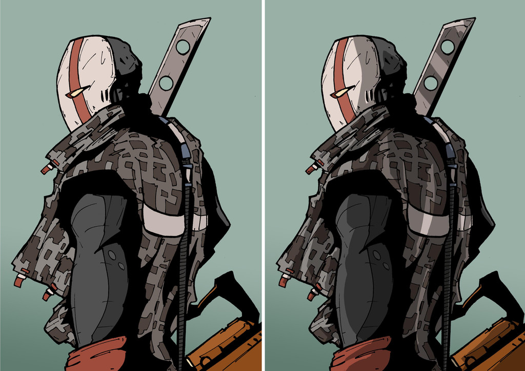
Guys, what do you think, start adding shading to my illustration if it suits it? Or stick to just plain colours? Looked at this a fair bit already today, so my eyes are a bit too used to it. But any recommendations or advice would be cool for when I resume tomorrow and decide.
- DM
Related content


Comments: 55

Thanks, and yeah, I'm missing using flat colours now
👍: 0 ⏩: 0


I love them both...but the one with shade looks a little more sinster and I love sinister characters :3 Great work by the way
 (Smile)")
👍: 0 ⏩: 1

No shade! That way, your personal style is more visible. With the shade, it becomes a little bir standart, ie. a little bit boring.
👍: 0 ⏩: 0


It depends how realistic you want to be, and how much time you have! ")
👍: 0 ⏩: 0

No shade.
The shading on the right is more realistic, but it is softing the artistic look. The clean lines and straight color areas have a very direct/sharp expression. The shadow takes this artistic effect (which can't be recieved by for example photos or photorealistic images. The clean way is the more artistic way. LESS IS MORE. Illustrations in general are very often "over done".
This is a decision...and you decide it!
👍: 0 ⏩: 1
yeah I'm thinking along the same lines. I like the way it gives depth to fabric, but feel its a tad unnecessary if it's not needed. Thanks for feedback!
👍: 0 ⏩: 0

What about a mixture of both. I noticed another artists take on shading and it looked phenomenal.
fav.me/d2ytppz
The shirt, pants, hair isn't shaded, but the face and arms are.
👍: 0 ⏩: 1
yeah its about using it correctly, just wondering if it should a special thing ir something that I mix in as a matter of course with my future illustrations.
👍: 0 ⏩: 0


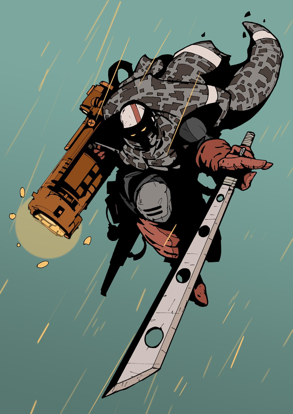
cool style. i dig both. but shade i think creates more depth and improves the perspective of the character. It gives the blade more substance.
👍: 0 ⏩: 1
thanks for your feedback, I agree it gives the material depth, but may be unnecessary anywhere else.
👍: 0 ⏩: 0

Oh definitely shade. It adds so much more drama and affect to him. Good job!!!
👍: 0 ⏩: 1


Shaded does look more menacing but only slightly
👍: 0 ⏩: 0

Shade (and hilights). It's those finishing touches that really bring out the best of art.
👍: 0 ⏩: 0


I like the shade, so much more depth. Although I've always loved your style anyway.
")
👍: 0 ⏩: 1
thanks, I like how the shade looks on the jacket, but it may be unnecessary.
👍: 0 ⏩: 0


I think you can do without shading.
You seem to show depth very well just using line weight. I feel the extra shade on top of that is redundant.
👍: 0 ⏩: 1
I'm leaning towards that as well.
👍: 0 ⏩: 0


The shading adds more depth to the illustration, but it just depends on the context.
In this case I prefer the shaded one.
👍: 0 ⏩: 1
yeah i agree, context is key
👍: 0 ⏩: 0


I like things about both, but I do think you did an excellent job with the shading!
👍: 0 ⏩: 1


shaded is really good but idk how it'd look against a background in comparison to the original
👍: 0 ⏩: 1
thanks, was thinking of keeping the background clean for this one
👍: 0 ⏩: 0


the shade adds a level of demention that your other illustrations are missing. the character feels like hes seperate from the background when you add shading.
👍: 0 ⏩: 1
true enough, although I could put a shadow behind the left one to make it stand out a bit.
👍: 0 ⏩: 0

to shade or not to shade...ah that is the question.
👍: 0 ⏩: 0

Either no shade... or tweak the shade to a slight blue tint rather than just adjusting the darkness alone! Work up the idea of there being warm area's in light, and cool area's in dark.
👍: 0 ⏩: 1
Good point, didn't think of that to be honest. I'm not sure how putting another bunch of colours ontop of the palette thats already being used will look though. I'm not trying to be realistic either.
👍: 0 ⏩: 1
| Next =>