HOME | DD
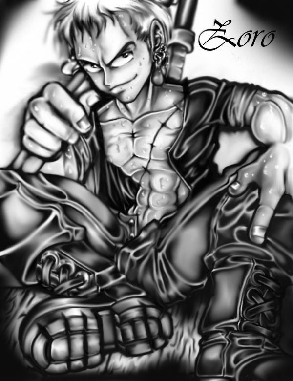
 DarkPenguin — Overworked Swordsman
Published: 2004-02-18 16:32:58 +0000 UTC; Views: 1727; Favourites: 48; Downloads: 139
Redirect to original
Description
Another One Piece fanart. This one started out in pencil. I just thought Id go for the whole BW look even after I colored it with the computer. I like it so Im keeping it that way.Related content


Comments: 27


")

Zoro! 
👍: 0 ⏩: 0


Holy shit this rocks! I don't really get into much One Piece but this is really really good. I love the emphasis on the boots. Sweat looks really life-like, too. Great work. Your gallery is amazing.
👍: 0 ⏩: 1

Thankyou... accually I just looked at this one again and Im planning on fixing a few things... with alot of my older stuff. But new stuff is so much more riveting at the time being  (Wink)")
Anyway... thankyou again
👍: 0 ⏩: 0

Very interesting style you got here, bold, strong, and full of details. ^_^ I 
The only thing that bothers me is the text, the font doesn't fit your style, it's very fluent, but your style + Zoro's personality, im my opinion requires more boldness.
👍: 0 ⏩: 1
Yeah I was told that before... perhaps its one of those things I need to fix and just never did. Thankyou for the fav though ")
👍: 0 ⏩: 0

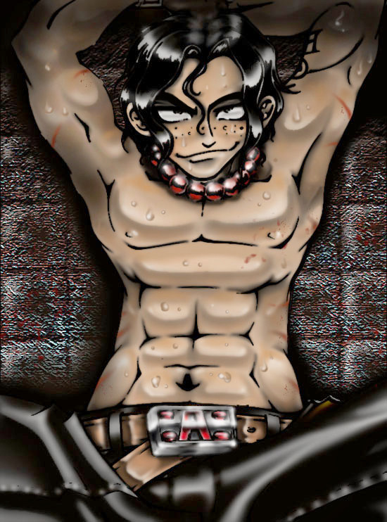
Damn, this has to be the best out of the three! I don't recognize this character, but it turned out very well. A very nice job you did on the body, he turned out to be a pretty good looking guy.
👍: 0 ⏩: 1
At the risk of being repetetive... thankyou very much
👍: 0 ⏩: 0


that's pretty clean, almost looks airbrushed (i'm guessing you used the airbrush tool
👍: 0 ⏩: 1
thankyou for the comment. Ill keep that in mind

👍: 0 ⏩: 0

I really like your style a lot! are these painted in photoshop? my only crit is that the image seems to lose its crispness around the linework. compare the lines of your drawing to the lines of the "zoro" text. maybe if this is lineart taken into photoshop preserve a layer and put it back over once you're done painting? or maybe just go back and reinforce those lines around the hands and face? I don't know, something to think about, great work! keep it up! welcome to DA!
👍: 0 ⏩: 1

No really...
Beleive it or not Im trying to improve that.I have absolutly no idea of how to do what your talking about though. I sorta learned to use photoshop 6.0(which is what Im using) from messing around with the controls till I figured stuff out. I'm not computer illiterate... but not all that compitent with it eather.
Ive accually heard people say the smudginess makes it look better... in a way I guess it does... in the aspect that everything doesnt have a line and can add demention.
BUT on the other hand... I agree with you in... I want them to be crisper and clearer. Theyre alot better than they used to better than they used to be. It gets difficult to do over lines with the brush tool and the mouse.I wouldnt have to do all that if I could figure the prog out better. But oh well...
I'm out of practice too. I have been without a scanner for too long. 

👍: 0 ⏩: 1
np, keep up the excellent work!
👍: 0 ⏩: 0

this is absolute stunning.. great work! 
his shoes..damn its great
 (Smile)")
👍: 0 ⏩: 0

*blinks*
Whoa, One Piece fan art... I actually don't think I've ever seen it on Dev Art before...
Zoro is looking awesome, you've got a really cool personal style.
Welcome to Deviant Art! Enjoy your stay!
👍: 0 ⏩: 0

very nicely done, and I love the details ^.^ keep it up ^.^
👍: 0 ⏩: 0

Very nice, black and white, not a one peice fan bt this is just good art, excelent.
👍: 0 ⏩: 0

this looks so fucking great .. sjees.. omg..etc. etc. fav it.. no doubt!
👍: 0 ⏩: 0