HOME | DD
 Darkratbat — Compare The Difference

Published: 2008-03-24 17:02:13 +0000 UTC; Views: 1057; Favourites: 19; Downloads: 24
Redirect to original
Description
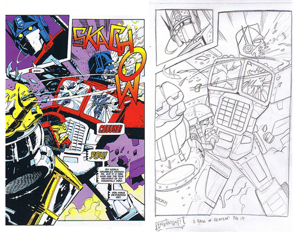
Well i thought i would put this up on the right is the artwork style of Manny Galan And the Right is My Style this way you get a better take on the overall differences between the too. As stated this is the redrawing i have started on in the rage in heaven story from the G2 Series The Battle between Optimus Prime and JhaxiusRelated content
Comments: 18

Looks good. I like how you drew OP's eyes on the small frame on the top left. I know they were drawn that way (on the original) to show emotions but they look a bit silly.
👍: 0 ⏩: 1

I thought the old eyes Lost the Effect needed and that the new look would work better
👍: 0 ⏩: 0

You did it very nice, although in my opinion it'd be better if You add more 'shadowing'..
and the author of the pic on the right is Geoff Senior, not Manny Gallan..
👍: 0 ⏩: 1

fair point i was looking at the details of the penciler in the Tf graphic novel i had will Double Check that to be on the sfae side
👍: 0 ⏩: 0

i like it, yours seems to keep the machine look. Manny's seems to want to make them too human, the way primes torso is curving, too... real? not sure if thats the right word, maybe "violent and awesome". can't wait to see the rest
👍: 0 ⏩: 1

nice work mate, i might have to do something like this with my style and see what i can come up with. *thumbs up*
👍: 0 ⏩: 1

i have a few papes if you wanna try some of mannys artwork
👍: 0 ⏩: 1

for sure, u have my email address i think? i know i have it in my profile on TFW anywayz.
👍: 0 ⏩: 0

your style looks a bit more cartoonish...while the other is a bit too violent and awesome.
👍: 0 ⏩: 1

with the colours added after inking the look of the impact will be a lot stronger in general
👍: 0 ⏩: 1

Not bad, I never liked the G2 style and yours, althought similar, has a litle extra that I like.
👍: 0 ⏩: 1

i thought with my style just brings it a bit more up to date but when inked and coloured will look great and Lettered
👍: 0 ⏩: 1

great! I wil wait for the finished version then. ^^
👍: 0 ⏩: 0


