HOME | DD
 darkspeeds — Collision Course
by-nc
darkspeeds — Collision Course
by-nc

Published: 2010-12-06 01:00:26 +0000 UTC; Views: 6149; Favourites: 106; Downloads: 39
Redirect to original
Description
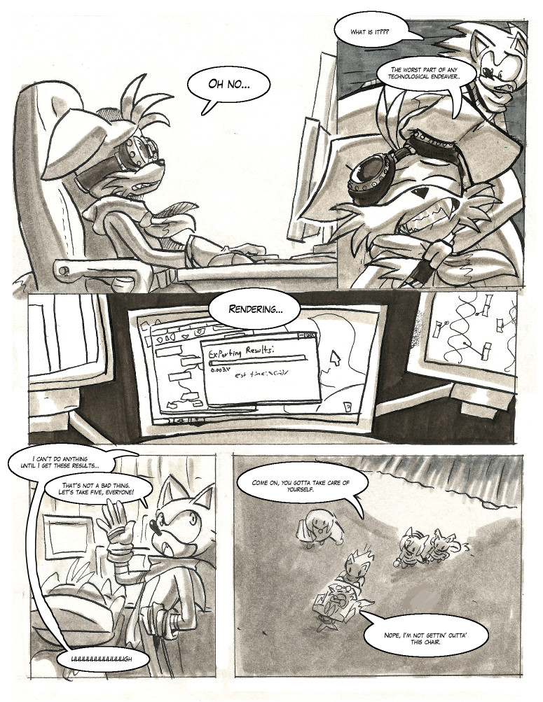
Sorry guys I'm a bit lazy to post again, so I'll use what I wrote on the GRAND HUNTER site, but I will say this...I've stayed up for almost 24 hours... Woo! *dies*
Oh and please don't hesitate to give me feedback on the page! I'm sure there's plenty of errors to pick on - like the lighting and colour balance, wrong spelling etc... I'd appreciate all the help I can get to improve on every page.
 (Wink)")
[GRAND HUNTER transcript]
Project 24 was an incredible success. I had an awesome time doing the show, catching up with Mike Pollock begin_of_the_skype_highlighting end_of_the_skype_highlighting, keeping the listeners entertained, and listening to all the other shows that I could get a hold of during the 24 hours.
I'm STILL listening to Project 24 and am on the final leg of the show - Roarey Raccoon is closing it with his brilliant show entitled 'The Raccoon Zone' - go check it out now !
Nevertheless I do apologise for yet another delay, colouring this page took ages once again. I'm seriously going to consider about hiring a colourist to help me colour the next chapter (i.e. Chapter 10: The Shocking Truth). Colouring all of Chapter 09 by myself should give the colourist an idea and reference on the quality I'm aiming for. In fact I've already made a quote with someone whom I find who could potentially do the job nicely for the right price too. I should get her quote within the next day.
Anyways hope you'll enjoy this page while you can! There's loads more to do, yet so little time. It's time for me to celebrate and rest after staying up almost 24 hours for Project 24!! *dies and sleeps on the floor*
Oh and also! I may probably change the scheduling of updates around because I can't seem to keep up with two pages a week at this stage. So on WEDNESDAYS I'll make updates to the site content (e.g. fanart, concept sketches, wallpapers etc...) and on SUNDAYS I'll try to upload a brand new page (I should be able to get at least one page done a week!).
In addition, I shall be posting this page on my deviantART account - it seems that I've been getting useful feedback on my pages. My thanks goes to those who have been double checkin' my spelling and grammar (and any other errors that I don't spot at first on my page). *thumbs up*
So yeah I'll see how that goes, for now enjoy this crackin' page as Corny and Fei collide unexpectedly and meet up for the first time! XXD
Related content


Comments: 32


Hmm not sure how to submit a critique on DA anymore so I'll just make one here. Gotta say I love the expressions here but look out with your colors and perspective. I don't want to sound rude but the first panel seems really confusing. There's just too much happening in it. You have bright high saturated colors everywhere and they are all competing for the most attention. I find myself wanting to look more at the shocked rabbit in the lower right and the 4 guys on the left than the main characters just because they are so highly saturated with color and produce the most contrast. So perhaps consider taking down the saturation on all the background characters so the focus goes from the main characters out.
As for perspective I'm a be confused on what's happening in the panel there. Is it 2 point perspective with the characters about to turn a corner or are there 2 separate panels there? If it's supposed to be 2 point make sure all your lines are headed for the vanishing points. That, and make sure the characters are in the correct perspective as a well. It looks like our horizon line it pretty high so we should be looking down on them more. Still redoing all the characters seems like way too much work.. so maybe just lie about the perspective a bit and bring up the wall so none of the sky is showing in the first panel. That way the panel is also less busy and you can read the thought text better without it blending into the sky and mountains.
Also more on perspective and focus and such, perhaps consider blurring some characters that are real close up or far away. It's something that's a bit tricky to do and you might wanna play with it a bit but I think it can give off a better sense of space ")
👍: 0 ⏩: 1

I didn't actually initiate the critique on this deviation but hell thanks for the lovely suggestions and tips!
Yeah I was going to blur out some of the action on Panel 01 but it'd lose the details that I had intended for that panel (e.g. posters, character/crowd reaction).
Thank you so much Rally-The-Cheetah! I really appreciate the feedback there.
 (Smile)")
👍: 0 ⏩: 0

THIS IS FANTASTIC! I love the humor in this comic! XD
👍: 0 ⏩: 0


Quality work on this Elson,their expressions are priceless and i love nothing better than priceless expressions!
")
👍: 0 ⏩: 0


I hav no word to say, other than amazing
You're so good with expressions XD, specially on that second panel 
keep up with awesome stuff 
👍: 0 ⏩: 0


")


Excellent job in the coloring! The first panel is simply great and is hard to believe that you did it with the sketch from the site before!
Is very sunny in that city doesn't it? XD
Usually in comics, when something funny/awkward happens, the situation entirely focus in that, leaving the light effects and shadows out to receive the entire spotlight. I only say that because there....so....much....light....in the last panel that with some difficulty can see what really happened
Again is just my opinion! I don't read enough comic books to confirm this!
I guess I know who is that colorist that you are going to hire

👍: 0 ⏩: 1
Lol, you maybe right! I actually tried to do it plain but it just looked too boring without the additional lighting. =' ( XD
Ah it seems like you know who. I shall be waiting for her results.
👍: 0 ⏩: 0

Once again a great page. I don't really see any errors with your work although just a little nitpick i have is that the sky is a little bland. Please don't take it the wrong way i still like the page.
👍: 0 ⏩: 1
Not a problem buddy! Please don't hesistate to state what you honestly feel about the page, your feedback on the skies is much appreciated! I too feel that it's bare but I think it's nice to keep it simple (i.e. less complicated) so that it becomes less of a distraction from the focus point (i.e. Corny and Fei expressing their downfall).
👍: 0 ⏩: 0


The colouring on the last panel are really beautiful.
👍: 0 ⏩: 0

Nice new set up for the schedule so far. Awesome page too.
👍: 0 ⏩: 1
Thanks for your feedback on the new schedule! It will defintely help me more until I improve on my colouring speed (or otherwise when I improve on my organisation of getting those comics out faster - e.g. hiring someone to colour them for me).
👍: 0 ⏩: 0

...What's going on? Does this continue from the last page of Chapter 9?
👍: 0 ⏩: 0

lmao!!! fail on the focus and careful part
ahaha!! really nice work on this Elson I started lmao with both of their faces haha!!! and I really like the coloring : o !!!
👍: 0 ⏩: 1
Cheers EvyCrystal! It was impossible to stop them from colliding from each other...
👍: 0 ⏩: 1
indeed it seem so!! haha x3
👍: 0 ⏩: 0

i've no bloody clue whats really going on in the picture but i like the style used anyways, and it looks great :3
👍: 0 ⏩: 0

OHHHHH YEAH! 
👍: 0 ⏩: 0
