HOME | DD
 darkspeeds — OVERDRIVE Duke V. - Reference
by-nc
darkspeeds — OVERDRIVE Duke V. - Reference
by-nc

Published: 2009-03-09 15:25:11 +0000 UTC; Views: 2859; Favourites: 58; Downloads: 44
Redirect to original
Description
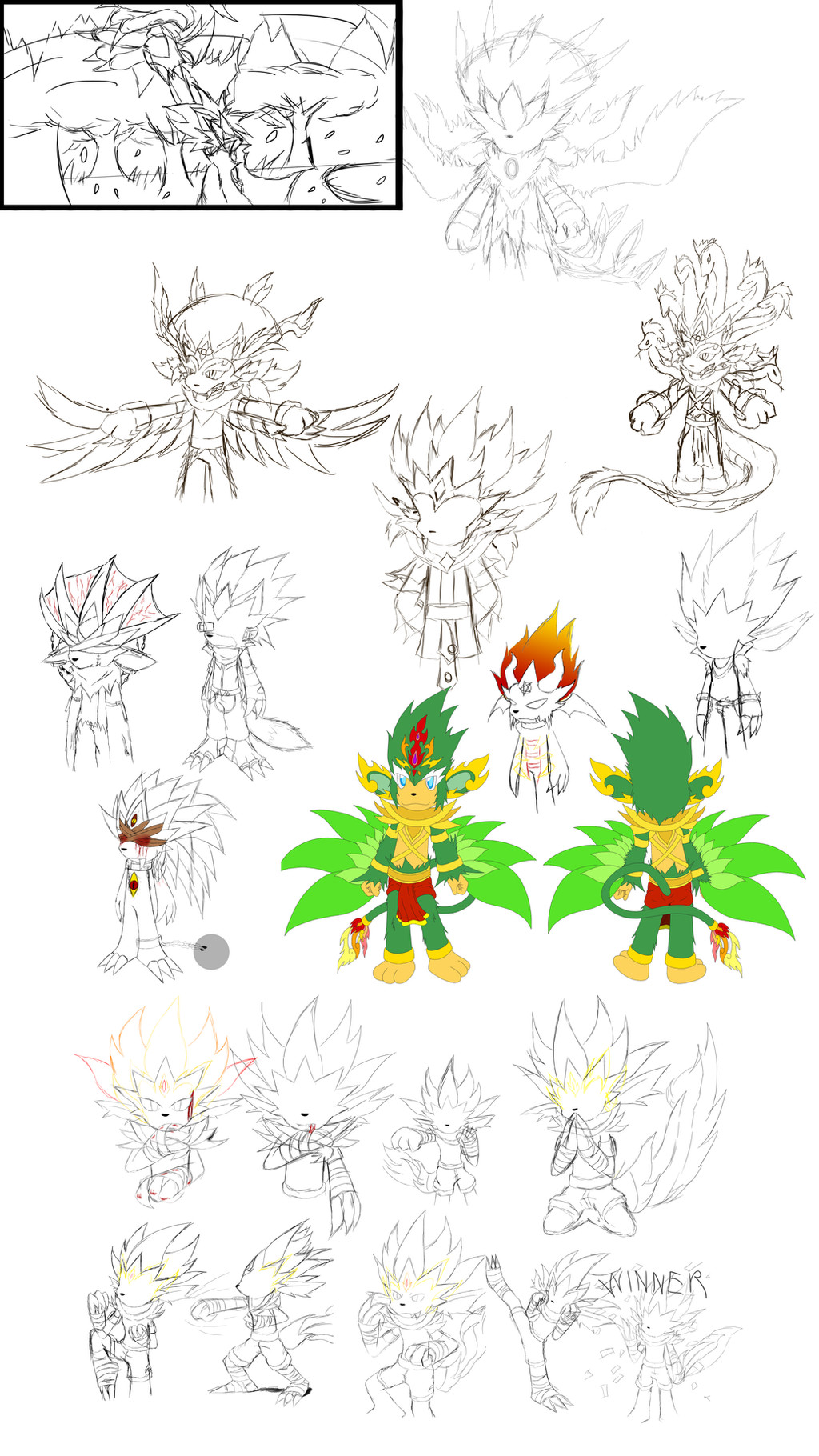
I still think the sketch version on the left rocks so much more than the final product (i.e. You're Already Dead). /= /Looks sexier, more detailed and well composed.
Anyway this was submitted to show what the concept initially looked like and also people who would like to know what his colour scheme/pallet is for OVERDRIVE mode please don't hesitate to download and use the drawing on the right as reference.
 (Wink)")
Original textured background (C)
Related content


Comments: 21

Wow, this character design is really amazing! ")

I hope to see some more art from you, Elson!

👍: 0 ⏩: 0

wow who knew that duke would look like that when he's in color wow reall cool
👍: 0 ⏩: 0


I'm disagree with you. I like much more the end result than the sketch on the right. Hey! You did a great job with the frost effect and you managed to give to the observer the sensation of the sword being in very close.
Maybe you wanted to show better the crystal ice, but anyway, the end result looks great and you can be proud of it!
The three versions are good. The no colored one has that charm that no colored pic can give though. To me, the less nice one is the colored sketch and the better one the end result. Really!

👍: 0 ⏩: 1

Whoops! How did I make that mistake?! XXD
I meant the sketch on the left (without the colours). 
But yeah after seeing more of the final product I'm starting to take appreciation on how the ice turned out in some parts. It looks pretty good.
👍: 0 ⏩: 1
Ha ha! You're welcome on the feedback, Elson!
I'm glad you're starting to see your drawing from other point of view.
When an artist is being perfectionist never ends to see something wrong on his/her art. Remember when I tried and tried to improve 'Jazzing for you' because I was detecting something, not wrong but not as what I wanted for the song! That was the same case.
👍: 0 ⏩: 0

AWESOMENESS!!! You a beast! 
The sword is so cool, I don't know how to draw weapons like that. Impresseive.

👍: 0 ⏩: 0


Awesome work. I do think the final coloring adds some nice contrast, making the sketch '
👍: 0 ⏩: 1
^Opps, the word I was attempting to use was " pop ". Sorry for the auto smiley...
👍: 0 ⏩: 0


what a great work Elson x3
it's incredible!!! Duke looks so so kick-ass in that pose x3
👍: 0 ⏩: 0


Overdrive Duke's True Colours: REVEALED
He's gonna be sooo mad when I leak this information to the Gloryea Gazette...
👍: 0 ⏩: 0


")

Looks awesome dude, The Textured background looks amazing. Keep up the great work ^^
👍: 0 ⏩: 0

I tried to be careful in comparing both the versions: sketch and final pic.
You got a point: the sketch is clarely more accurative.
Well amigo, this is like everything, the sketch got all the detail. In order to make your precise effect for the move, many details had to disappear.
Something that I just realised now is that you used most the blue colour in the final drawing to represent the bright from the move. That is extremely difficult! And you managed to do that brightly and I didn´t notice before! That´s the reason why the final drawing was so shining. Now made all the sense.
A good reference are the comic from from his series XDragon. He is used to show that similar effects in signature moves.
👍: 0 ⏩: 0

Oh boy, Elson-boy. That must've took a really long.
The structure looks so much different than in the completed version, so much shading and light effects. It's really impressive really.  (Smile)")
You know, watching this made my old rusty instinct kick in again.
Now if you excuse me... *locks himself in the old, dusty, drawing studio*
 (Devil)")
👍: 0 ⏩: 0

looks cool i might want to draw my version of this guy XD
👍: 0 ⏩: 0
