HOME | DD
 darulian — Questions ?

Published: 2003-10-16 21:53:17 +0000 UTC; Views: 2973; Favourites: 17; Downloads: 806
Redirect to original
Description
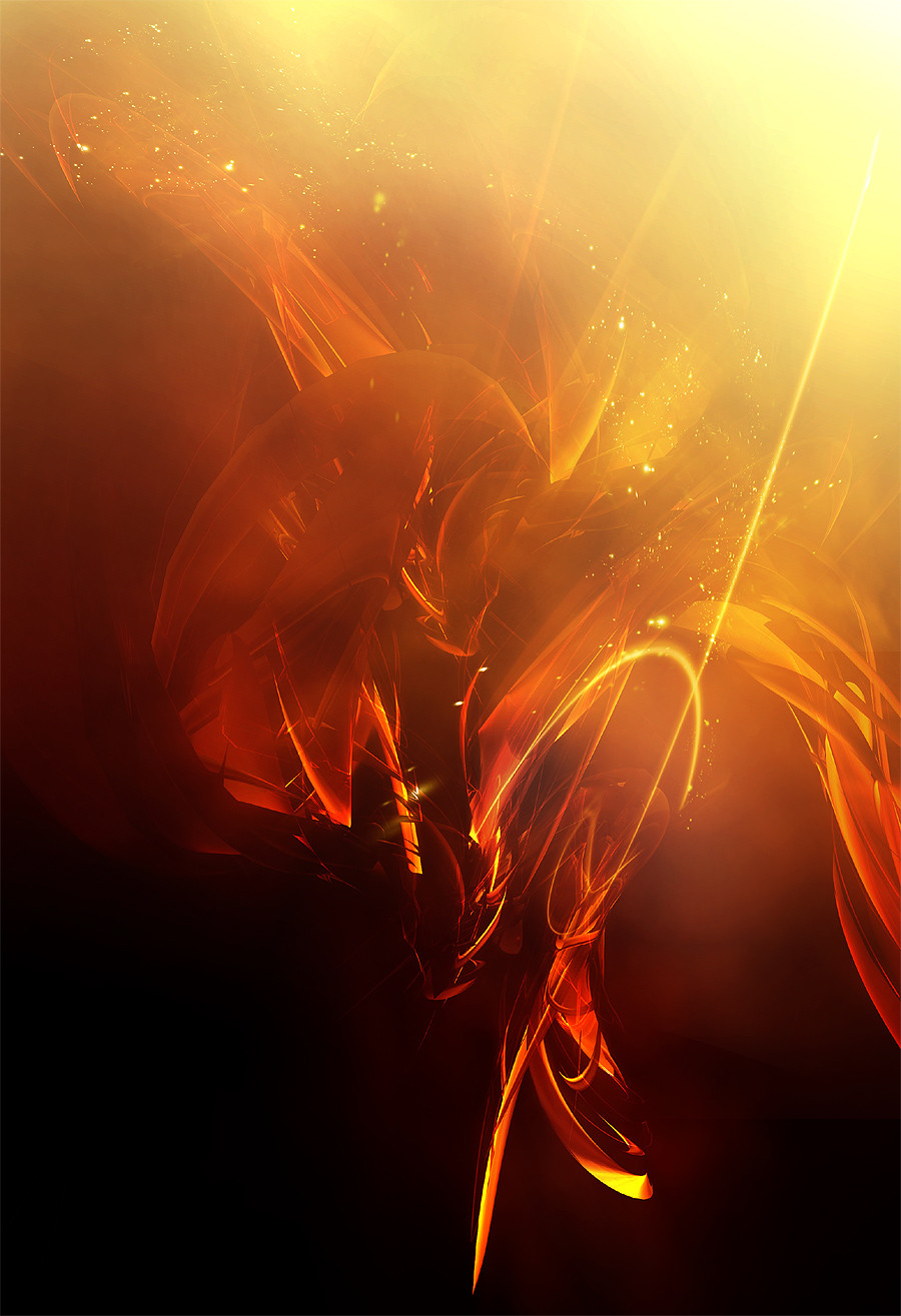
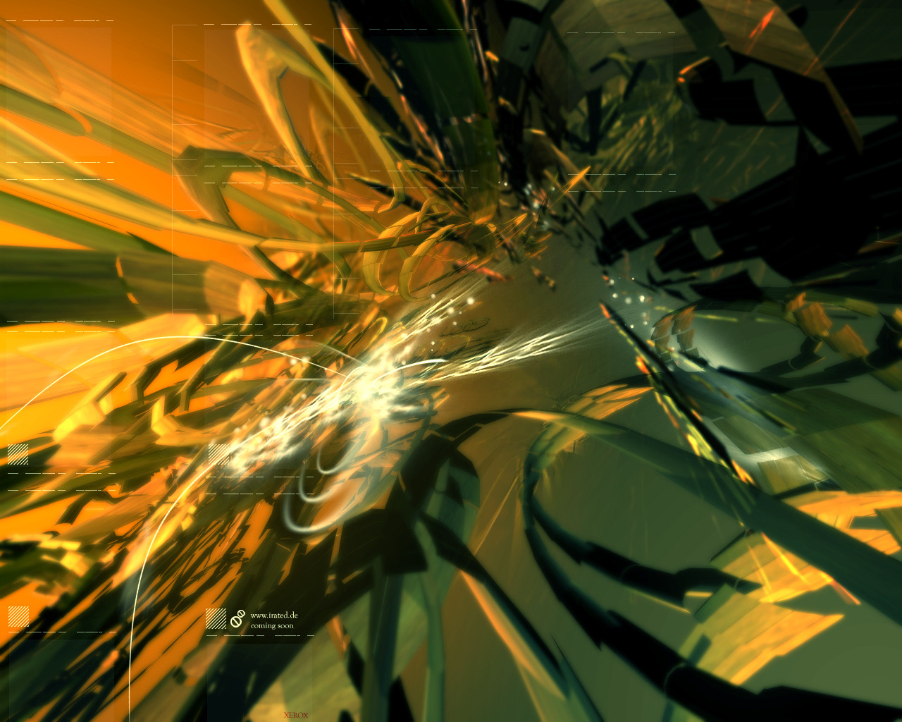
Sort of an experiment. I wanted to do something very different then my usual stuff. Everything is welcome.____________________
And be sure you'll check Pack 3 of sweetDNA. Its coming................wait [link]
Related content


Comments: 57

Ho the importance of a headline is obvious on this one.
MASSIVE WORK MAN!! MASSIVE!!
👍: 0 ⏩: 0


")


i really like stuff like this... randomness that is pulled together into cohesion; three is still a little bit of jumpiness about the piece, but overall i like the feel of the shapes and layers. the only i really dont like is the pixelated stuff. while the contrast from the pixelation to blurriness and smoothness is cool, the transition seems too rough to me. i would prefer the pixelated areas to have softer edges, but its really just personal preference. generally,however, i think this is a cool change for you. good work.
👍: 0 ⏩: 0


Very good to break from the norm. The colors are especially striking. The combined shapes and pixelations are very eye catching.
The only thing that I see is the circular blur above the "re" doesn't quite fit with the rest of the image.
Keep experimenting!
👍: 0 ⏩: 0

KICK ASS dude!
ahh and great to see that so many ppl are commenting this 'weird' peice of art!
looove that none supersharp lines.. got to love pixels
👍: 0 ⏩: 0


i like your 3d & brushing stuff......not this..
👍: 0 ⏩: 0


very nice n' very diff. for commin' from you. I like it, however: maby it would look good with som mmore details round the middle?!? I really like the pixly part  (Wink)")
👍: 0 ⏩: 0


your.... there! no THERE! no.... there there there there there!
so confuseing... but loverly all the same!
👍: 0 ⏩: 0

great job on this piece man a different style is always good and you succeeded in making a great piece,very nice colors and design...
👍: 0 ⏩: 0


this experiment has a really nice result! good job, I am looking for more in the future!
👍: 0 ⏩: 0

very interesting, i dont like the pixelated stuff very much, but thats nice work indeed.
👍: 0 ⏩: 0

wow man this looks very cool!
Love the style of the pic and the colors!

👍: 0 ⏩: 0

Tite work man , very different from ur usual style but I like this a lot  (Smile)")
👍: 0 ⏩: 0


uh
all those colors fit very nice. nice atmosphere and the pixelated stuff gives a cool fealin
nice perspective and good shapes.
👍: 0 ⏩: 0

Dude, this really really sucks, maybe your experimenting or shit but this ain't it. Like your work on your site better..
[AmK] 4 Life bitch boy
👍: 0 ⏩: 0

cool! very nice pic!
but the tech is not so good, i think
👍: 0 ⏩: 0

totally different but great as always
👍: 0 ⏩: 0

very different indeed, maybe not as cool as your other works but it's a pretty neat idea though... keep it up
👍: 0 ⏩: 0

Nice experiment. I really like the composition, for the rest I agree with resuk, he gave the right comment
")
👍: 0 ⏩: 1


Excellent experiment dude
-Anthriel
👍: 0 ⏩: 0

very nice
Good to see you with a total different style
I really like the red shapes and the pixelfx
Things i like less, are the orange lines
they make the pic to chaotic
overall very nice work
")
👍: 0 ⏩: 0

Nice, definitely not your usual style, but I guess that's good cuz you're doing new things. Good work.
👍: 0 ⏩: 0


the desing has a good concept you just need to push the envelop more and add more dynamicism
solid visuals throughout
👍: 0 ⏩: 0

Woah.. trippy, BUT I LIKE IT!! ^_^ Very very cool!
Never watch the movie "Dark City"... you'll feel like you just took a huge shit load of LSD.
👍: 0 ⏩: 1

Dark City was a fantastic movie. The matrix actually took ideas from it...
👍: 0 ⏩: 1
Cha. >> It was just trippy as hell.
Everyone in that movie had a lazy eye, I noticed. Well.. "Emma" didn't, but her eyebrows were.... large. xD
👍: 0 ⏩: 0


hmm i like the contrast between red and green..and the text is ..dunno
take away the black boxes
👍: 0 ⏩: 0

")
You know I like it, because I am all about an artists experimentation and personal advancement. What you're trying is really good, and can only let your creativity open up more. Anyway, onto this little thing here =]
Overall, it's pretty good. Not fantastic, but you've never really experimented with these techniques, and what you pick up from this image will serve you better in other endeavours. This is all about learning where things go, what colours to use and most importantly, why...
I'll start around the focal point, the middle. It is by far the best area of the image, everything flows into it well, the hues, tones and shapes all fit nicely around it (yes, suprisingly, even the orange does) The pixelated areas are useful, they provide a good contrast from the more uniform shapes around, and really draw your eye into the type work (which stands out nicely against the dark right hand side, great job around that area)
The lower area of this image is probably it's weakest point. I dont like the black boxes, and bits of the orange linestuff looks quite messy. Thankfully, there is plenty more to look at, so onto the rest!
The red overlayed section is funky as hell. It makes the whole image in my opinion. It just gives it something... else. Something that really makes you think. It's different, fresh and funky. We like that a lot mmmhmmmm. The text in the background adds your main detail to the design, and whilst bits of it look a bit skewed out of shape, it's still not bad, they are at the right angle. and opacity.
And well, thats it. For now.
basically. Good design, but it could be polished up if you wanted to rethink it a little.
👍: 0 ⏩: 0


Hey bud, it is good you are trying different things, its always fun to experiment, I quite like this design, everything seems to fit, and i like the pixel parts..
overall nice work
👍: 0 ⏩: 0
| Next =>