HOME | DD
 DataScream — Fate

Published: 2006-07-27 21:52:26 +0000 UTC; Views: 1349; Favourites: 27; Downloads: 51
Redirect to original
Description
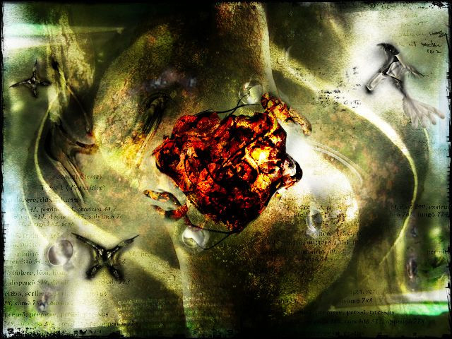
Another one of my old releases from my old account. I'm happy to be able to re-post these on this account") . This was a make-over from a different version of the same piece. I'll post the original version I made sometime later. This version was made because someone said the color in the original was too dull. So I amped it up a little bit more. I do kind of want to go back and add some more...but I don't want to be like George Lucas and muck around with something that is probably fine the way it is
. This was a make-over from a different version of the same piece. I'll post the original version I made sometime later. This version was made because someone said the color in the original was too dull. So I amped it up a little bit more. I do kind of want to go back and add some more...but I don't want to be like George Lucas and muck around with something that is probably fine the way it is  (Smile)") So I hope you like...the concept I feel is self-explanatory, if not..it just means I suck at naming stuff. So enjoy! And comments are of course always welcome!
So I hope you like...the concept I feel is self-explanatory, if not..it just means I suck at naming stuff. So enjoy! And comments are of course always welcome!
Related content


Comments: 34

I love the lighting on this! The texture is pretty incredible too though.
👍: 0 ⏩: 0


i like this piece JUST... delete the FATE lettering at the bottom ... its not even needed. let teh reader understand whats happening instead of you brushing it in the face of someone
just that fate bit makes me cringe imo the entire image would get a face lift with out it.
👍: 0 ⏩: 0

a little too shiney for me.... but good color choices and use of texture and design ;D
👍: 0 ⏩: 0

wow the lighting in this is simply fantastic! instant fave
👍: 0 ⏩: 0


I like this alot. How do you get the different textures?
👍: 0 ⏩: 1

I used mostly brushes and some random stuff I found laying around on my harddrive. I used a cracked wall photo on the right side, as well as some happy accidents on the small light flares floating around that I made using a history brush. I also used a photo of fire for the middle section. So in all not actually a lot of textures, mostly just photos that I used just happened to have the right color tone I wanted. That's mostly how my stuff comes about is just randomly trying leftover photos I had laying around.
👍: 0 ⏩: 0

The composition of this is AMAZING. Everything just fits so well together. Most certainly 
👍: 0 ⏩: 0

Awesome. As usual. You do great work and I love the colours you use in ALL your pieces. Whether or not you do, it seems like you put a lot of thought into the colours alone.
👍: 0 ⏩: 1
thank you for the comment! yeah I like bright colors in my projects, a lot of my inspiration comes from artists Dave McKean that directed Mirrormask. however I didn't care too much for the movie, but his artistic imagination is a gold mine of ideas
👍: 0 ⏩: 1
I liked mirrormask alright. Not my favourite movie however. ^_^
👍: 0 ⏩: 0

The composition works better here though I don't like the over exposed bits. But the colours seem nice too.
👍: 0 ⏩: 0

Awesome! A very awesome manip. I love the colors. It's really very interesting... it's has lots of detail. Brilliantly done.

👍: 0 ⏩: 0

fate: the half brother and albeit truly unpredictable one of free will it's so much like the ying and the yang in this photo. I truly adore your shot considering the two colors contrastly beautifully and yet they don't truly combat one another like the ying and the yang, but it does a lot of work and nice thoughts on the eyes and does a lot to show us how much fate and free will combat and yet we can't let either get the upper hand in all of this.
👍: 0 ⏩: 0

very cool concept , I like the feathers that come out of the frame
👍: 0 ⏩: 0


So much to this picture. It's hard to stop looking at it!
👍: 0 ⏩: 0

Damn, this one's a classic. I don't know if it was already on my favorites under your old account, but it is now. Great composition, the blending of colors and the grunginess work really well. Reminds me of dynamic duality, almost like the Ying-Yang symbol.
👍: 0 ⏩: 1
yeah that was kind of the idea, but I was supirsed that it came out as well as it did. even though there are a few areas I wish I could touch up on. add some layering, you know...the Lucas effect
👍: 0 ⏩: 0

nice peice of art....Thanks for sharing it with us...
👍: 0 ⏩: 1
no problem
👍: 0 ⏩: 0


this is awesome, between the feathers and the railroad tracks in the center. kinda reminds me of that one piece by mike bohatch, cant think of the name though. good job.

👍: 0 ⏩: 0


I get the impression that it's supposed to be a heaven/hell sort of thing, only the feathers give the impression of heaven and the right side of the piece doesn't do much for hell... Interesting, but I think it could use something more on the right to make it a little more obvious. What does the central bit represent?
👍: 0 ⏩: 1
initially it was more meaningful in the original version I made. I could almost say it was just fodder, but it fit into the piece anyways. But as I look at it now, it feels like a cage over the middleman. The ones inbetween fate, that haven't made their desicion on where their fates lay and are caught in the crossfires of the approaching climax. That's how I feel about it now. I find it funny that some of my own work can make me think again in retrospect. And thanks again for the comment!
👍: 0 ⏩: 0


WOAH! Now that's awsome. I'm not completely sure what I'm looking at, but I do know that it's amazing. Upon close inspection there's a few parts that could be brushed up a bit, but it's still fantastic! Well done! ^_^
👍: 0 ⏩: 0

yep the concept does pretty much explain itself, good concept, good manip
nice job on that ^_^
👍: 0 ⏩: 0
