HOME | DD
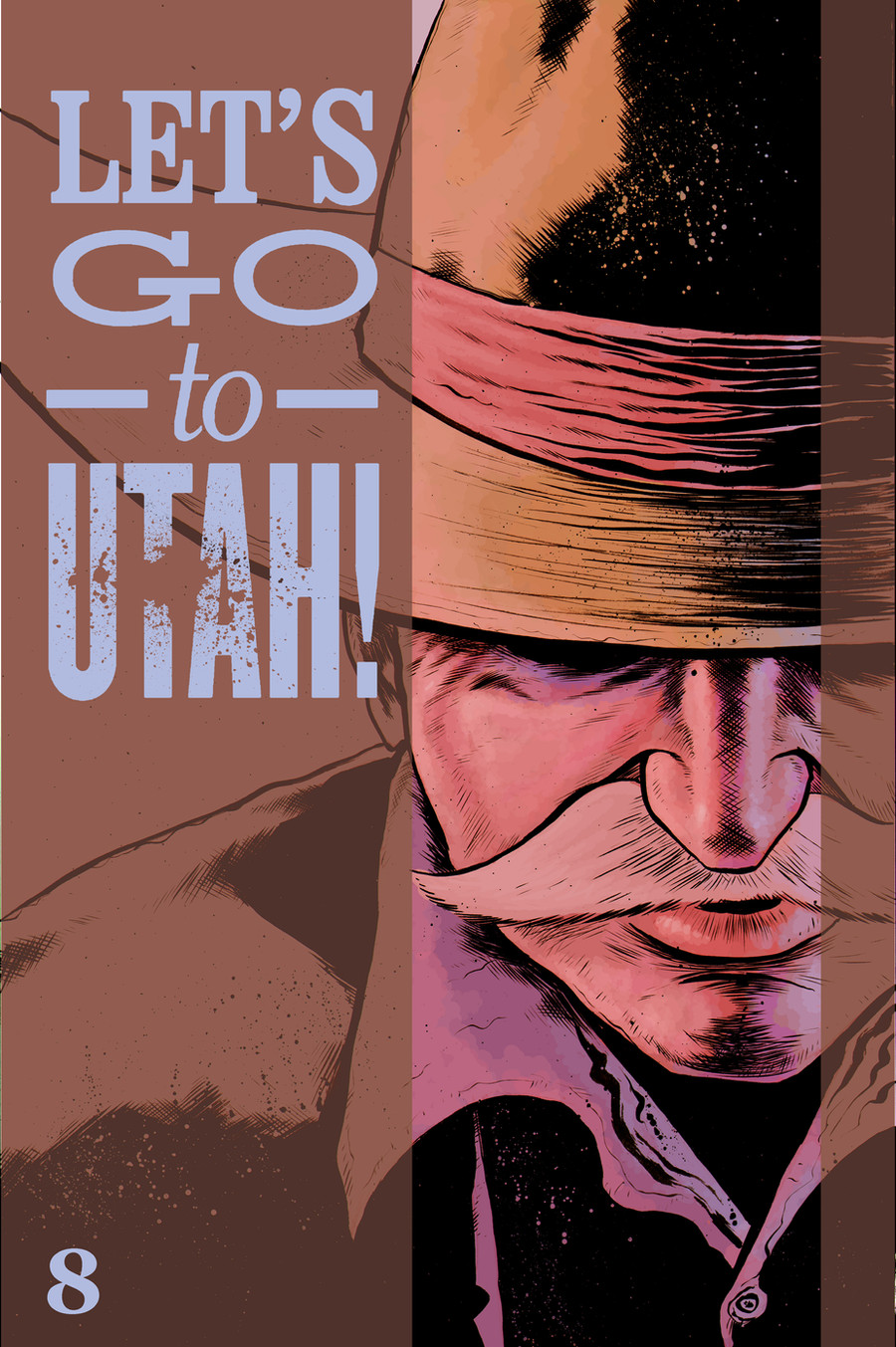
 davechisholm — Lets go to UTAH number 8 cover
Published: 2009-01-08 20:17:35 +0000 UTC; Views: 470; Favourites: 11; Downloads: 29
Redirect to original
Description
what do you think?are the colors too dark?
Related content


Comments: 33

Colors are great
BTW, I might be moving to Utah soon (might be.. not sure yet though)
Just random stuff
 (Smile)")
")
👍: 0 ⏩: 1

cool! it's nice here.
👍: 0 ⏩: 1
Yeah, I know...
Besides, I got a good career lead in Utah.. My place don't offer much chance for graphic designers x-r
👍: 0 ⏩: 1

Great to see you got the cover down for Issue 8. It's perfect.
The colors look just fine!
👍: 0 ⏩: 1

wow, this is great! I think the colors are perfect, I really like how you layed out everything and the text works perfect. Nice
👍: 0 ⏩: 1
thanks! feel free to read the rest of the comic if you want.
no peer pressure.
👍: 0 ⏩: 1
I dont really read comics, but im sure its lovely!!
👍: 0 ⏩: 0

I like it, the colours are dark, but that helps to add to a feeling of unease, which the end of the issue follows up very well.
👍: 0 ⏩: 1
You're welcome, dude.
👍: 0 ⏩: 0

2nd to last issue! the series is SETTING!
👍: 0 ⏩: 1

The colors are great. Don't touch 'em. These are some of your best colors.
👍: 0 ⏩: 1

I think the coloring on the cowboy is fine, one of the better coloring jobs you've done, really. But I'm not sure about the brown/periwinkle for the strips and lettering. Maybe something brighter or more saturated for those would work better? or not, since it looks like you're doing low opacity layers... hmm... That's all I can think of.
👍: 0 ⏩: 1
cool. thanks for the input.
👍: 0 ⏩: 0

I think this is really awesome? How do you do that? photoshop or normal painting? anyway this is one of my favorite cover and I really like the reference in number 8 to the big lebowski's cowboy")
👍: 0 ⏩: 1
photoshop, my friend.
*colored with a mouse...
👍: 0 ⏩: 1
I don't know how you make your drawing look like that but this is awesome
👍: 0 ⏩: 1

Hmmm... I kinda hunger for some contrast here, everything seems very much on the same level and a little muted. I'd like a little yellow or a little fire in the reddish hat band. But, that's just me and I ain't no colorist, gawd knows.
👍: 0 ⏩: 1
coool. thanks for the input, h-dog.
👍: 0 ⏩: 0


I dig the colors, the only thing I might do is boost some of the contrast, but honestly that's me nitpicking. Another great cover, man.
👍: 0 ⏩: 1
yes, good point. i'll work on it tomorrow when i'm on my own computer.
👍: 0 ⏩: 0
