HOME | DD
 davidcfx — dark escape

Published: 2003-09-18 03:25:43 +0000 UTC; Views: 666; Favourites: 10; Downloads: 278
Redirect to original
Description
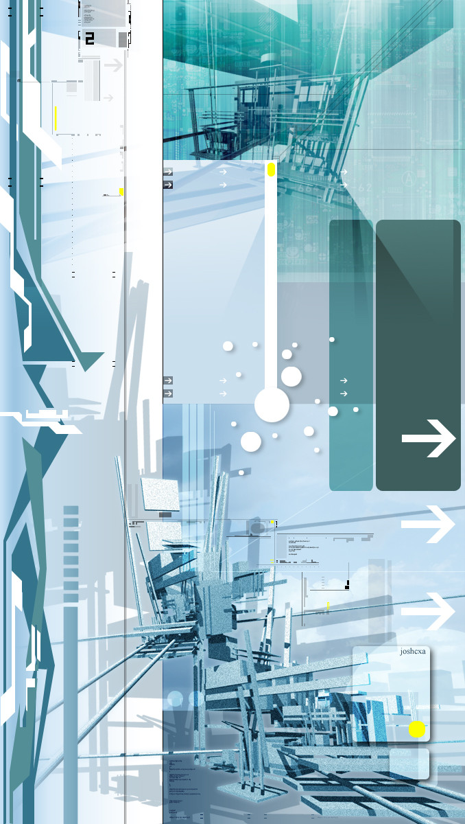
Well i was bored one afteroon after school, thought of the awesome precurser style, and tried to do something like it...this will have been my second attempt") , i hope its atleast somewhat pleasing to the eye...just dont flame me for trin' pre's style, I could never do as good as he does...anyway...
, i hope its atleast somewhat pleasing to the eye...just dont flame me for trin' pre's style, I could never do as good as he does...anyway...Photoshop...an hour and a half im guessing....
Related content


Comments: 14


Nah man not at all, Its just tips on giving me better Ideas is what is is. Thanks for the suggestions I'll have to put htose to better use...its Just that when I do the bottom i give it more of a chaotic look, then when I go to the top I kinda get lost of what to do...do I make it dismantle?, or do I continue?..ya know...stuff like that. And yes that one piece is repeated 4 times....kinda tried it out to see how it would look.heheh...but I can see its not that good : P. Thanks for the comment though.
👍: 0 ⏩: 1

Come to think of it kinda looks like you droped ink into the water and then drew its motions
👍: 0 ⏩: 0

badass job on the whole thing bro - keep me posted on more pre-ish stuff
the bottom was extremely well done. I really like how it blots out the " structure"
I will venture to say that the top part is 1) the same thing 4 times in a row which really looks wrong 2) too well defined - you can too easily see what everything is and 3) has no cut ups on it like the bottom does to kinda give this "whats in front whats in back?!?!?!" feeling. It just seems to....wide open on the top while the bottom feels like theres a shield over it - which really feels like a pre type desktop. Also its way too thick at the top - its usually just a thin band that extends outward......
on the little boxes you have just sitting out there - i would suggest putting a duotone picture in there that fits the theme of the desktop. or maybe just a piece of one so u cant tell what it is...but it adds a lot to the picture. The lines are also much much too thick. The stuff you have going out horizontally about an inch from the bottom is perfectly done -- i really like that.
also might i suggest working in a larger format? I know that if your desktop is really small its hard to work in larger format pieces - but it gives you much more freedom with your desktop - way more space to move your stuff around in.
Sorry if i seem too harsh - but this is so mfing close I really have to get into the nitty gritty
 (Smile)")
👍: 0 ⏩: 0

Wow! Awesome! I don't know what else to say. I'm just staring at this in awe. I'm dying to know how you did this.
👍: 0 ⏩: 0
Ha! ha... Everyones sweeping your shit David! I like the pic though. Make comics, drawn ones or at lest but a DOMAIN and us [link] for one gig for 6 bucks at month, or you can worka free plan!
👍: 0 ⏩: 0
thanks everyone, i appriciate it, also one minor note...my site ins't called effecta.com anymore........someone took it >_< before i could shnag it!.....so if anyone can think of a sweet name that could go along for my graphic arts site....be my guest please!!!!!
👍: 0 ⏩: 0


WOOOW! So good it hurts!
This one will be my WP for months.
Keep up this kind of jobs!
👍: 0 ⏩: 0

fucking sweet design! nice balance of objects and shapes. so much detail within that. great work, keep it up, definately
👍: 0 ⏩: 0
