HOME | DD
 DavidDeb — TUTORIAL- Shading n Proportions

Published: 2012-08-30 19:35:42 +0000 UTC; Views: 71148; Favourites: 1897; Downloads: 0
Redirect to original
Description
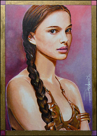
Here's a tutorial for my artwork 'Arya Stark of Winterfell', 2.5*3.5 inch sketch card, ref picture here-)[link]I divided the tutorial into SHADING and PROPORTIONS. You will find all the tools used into this WIP &Tools deviation
SHADING---------------------
1. The shading of my art relies on many layers of marker. This piece is interesting for a tutorial since it doesn't use that much color type and it has an interesting contrast that one must interpret and divide into 'layers of colors'. Letting proportions aside for now, just note that I drew a few stronger lines around the visage, being pretty sure they lie here. I start with pale marker Warm Grey 0.5, 1,2 and 3 (WG) to do a general structure that do not need to be exactly perfect or complete, can be just a part that you wanna work with for now. The pale crayon lines are watercolor pencil that can more or less fade in with marker(or water).
2.I'm starting with stronger color, hence a Lavender from TOUCH and Lavender for ProMarker and a Pale Lavender from TOUCH. Stronger colors can be modified/faded with pale ones, so you need to start strong.
3.I started using Cool Grey 7 and 6 that are quite dark, when shading a visage, I recommend not going over 6 or 7 because if you miss, colors too dark won't 'decolorate' or fade much with a colorless blender. By keeping colors low, you can pretty much move them around and rework them with other layers to alter their value.
I then attempt to shade it all that with Warm Grey using mostly 4, 5,6 and 7, the Pale Lavender(TOUCH) and Lavender(ProMarker).
Note that I will not use Cool Grey anymore, but wanted to have a bit of that tone since my background will be Cool Grey mostly.
If you feel you went to far with a dark color, you can use the colorless blender to diminish it's value, but it will create a 'halo' and you'll pretty much need to do all over.
So you can use the pale lavender or something less damaging. Don't be afraid to try layers, if you are unsure of the outcome, use them aside to see.
So you play with layers until you are pretty much satisfied of what you get, it can takes a few layers or a crazy number, you just need to wait a bit between consecutive layers if you don't wanna screw your paper (and make sure your paper do well with blending)
for eyes, used a Pale Blue Light (TOUCH) and lavender tones and the Mauve Shadow from TOUCH, Putty from ProMarker
lips, lilac tones, not much important for now.
4.I continued detailing the main features and perfect the blending with warm greys, lavender tones and also used a layer of putty in pale areas
for details I used watercolor pencils, multiliners and verithin prismacolor.
Even if it's not in the reference, I decided to introduce the Pale Blue Light color as a source of light, it gives much more punch than just using white
I also put the hair part in same color. It could have been possible to use a yellow or a orange tone for a totally different piece, but all blues and cool colors would have to exit.
For the iris, I used a Marine (ProMarker) and diminished it's intensity with Blue Grey 3 or 5 and put some 7 in the upper part
I also used the colorless to enlight some parts before that
White light dots are Copic White (with paint and brush)
5.Background consist on the right part of a gradation from black to Cool Grey 8, using the 9 in between, left part I went up to Cool Grey 5, then used a Warm Grey 5 in the bottom part. Finally I used the Pale Blue Light from middle to top part of the left section of the background. I also used the some warm grey light tones to create some texture and dilute here and there. I also used the Marine color for clothing even if it's not really that color on the reference, but I will alter it with blue greys and cool greys. That choice will enhance the eyes since it's the same color. Introduced the Ivory (ProMarker) for a bit of right side of the face and used the colorless to fade some lavander tones from before
Ivory will also be used in the collar along with many colors used before
6.then you can start!
yeah indeed that piece will need a lot more details, you can see I started the hair using a mix of Cool Grey 7 and Warm Grey 7 and also black multiliner 0.03 and 0.05 to direct my lines. You do need a lot precision and observation in that chapter. For highlights, I used Copic White and brush but also introduce the Prismacolor Premier that do well over dark surface and since it's softer than other crayon, it will appear strong even against a Warm Grey 7 so you can put a line of blue over a dark marker surface and it will show pretty clear (if you try that with a hard verithin, it won't even show up); the watercolor pencil used wet will also work not bad, dry a bit less.
For the blue in the hair, I used Premier Bleu Ciel Pale and Bleu Inactinique and also Creme much used in other areas
Now to get to the final piece, I'll rework the visage creating 'bridges' between too visible marker lines with either verithin, or watercolor pencil dry or Stabilo All-Brown color here, that will help create a better harmony in the shading
If you need highlight you can also use the Prismacolor premier
If you make mistakes, you can revamp with layers, watercolor pigments will go away
For micro details, I used multiliners
If you make mistakes with them, you can correct with either Copic White and redo, but only in small areas or you can alter with wet watercolor pencils, creating some paste over and then you work again with multiliners. You can also 'color' the White Copic with your watercolor pencil and use that mixture.
So the shading is pretty much done in pic 6. Please see final version!
total around 20 hours
PROPORTIONS-------------------------
There is several methods that help getting proportions right and one of the best tutorial I seen about it is , some art teachers even use it!
On my part I use Free Hand and Shapes methods
Recognizing shapes in a drawing helps a lot, not only shapes of what you draw, but also shapes of empty spaces, for instance it's better to draw the edge of the head using the shapes of the background vs the edge of the card, rather than just checking the edge of the head itself
Free Hand
Directing you to point 5 in her tutorial
It is indeed very important to use a reference the same size of you drawing to check and you can also measure important points that need to be a certitude
You will also need a hi-res image at the end to see things that cannot be seen on a printed reference image of that size (in my case a sketch card size image)
If you are too much 'into the drawing', takes some time off and you'll have a different view of things when back
I never finish a piece the day I finish it, but take some time off to have a fresh look before doing my corrections
You can also ask a friend or a parent if he sees somethings off, artists are often blind with things they create themselves and this is a great way to improve a drawing.
I personally prefer to work on small surface, I find it less difficult to figure out proportions.
Remember that we all improve with experience and if you put the time and efforts, you will reach your goals.
you can always visit my Scrapbook section, there is always plenty of WIP for many pieces
thank you for reading this big novel!
")
Related content


Comments: 63


Enjoy looking step-by-step blocks of artwork ~))I have another new fave artist to watch *^*
👍: 0 ⏩: 0

Thank you so much for this great tutorial! It helped me a lot
 (Smile)")
👍: 0 ⏩: 0


Love the finished painting and this is very informative too
👍: 0 ⏩: 0


wow, I didn't read everything but I enjoy looking step-by-step blocks of artwork to break down the technique. Just been looking at your other work and I have another new fave artist to watch
👍: 0 ⏩: 0


Woooooooooooooooooooooooow,
I just started digital painting, and I always have to fix the position of the face features to make them look right. How do you make sure that you don't make any mistakes since you are drawing on paper? Cause I don't see you using any pencil lines. But they look exactly like who they are suppose to look like. Do you just know where to put your line? :0
👍: 0 ⏩: 0


Wow! your work is simply awesome. Thank you very much for the Detailed Tutorial of your work. It is very much appreciated.
👍: 0 ⏩: 0


Amazing!!! And thank you so much for the detailed steps / guide
👍: 0 ⏩: 0


thank you so much for this! I was wondering how you do it. I will learn soooo much from it!
👍: 0 ⏩: 0


it is so cool, so beautiful! I hope someday i can do a portrait light and authentic and realistic and BEAUTIFUL as yours!
👍: 0 ⏩: 0

she is one of my favourite character (of the girl ) . Your work is just perfect
 (Wink)")
👍: 0 ⏩: 1

thank you very much, me too, she will have a bright career
👍: 0 ⏩: 0
Very informative; Learned a lot about shading the face. I've been having trouble with it, and this really helped! Thanks for sharing!
👍: 0 ⏩: 0

this is an impressive work, it's great to see the progressive shots and how much work each step takes. I am completely ignorant in markers, so this makes it even more impressive to me.
👍: 0 ⏩: 0


Wow, you work those markers like a master, simply amazing!
👍: 0 ⏩: 0

I'm not going to lie, this is so beautiful I almost cried DX
👍: 0 ⏩: 0


Yout process is amazing... seeing the shit all laid out like that... I still cannot comprehend.. awesome, as always!!
👍: 0 ⏩: 0


You could make a video to explain your work process, couldn't you? That would be very awesome. I'm very interested to know more specifically how did you do this amazing cards
👍: 0 ⏩: 0

you have no idea how happy I am that you made this detailed tutorial ")
That said,
you delivered yet another WONDERFUL artwork and I'm really hopeful to see some more Arya in you GoT card collection in the future
👍: 0 ⏩: 0

Excellent !
But how much does all of your material cost ?
👍: 0 ⏩: 0

Thanks to you for share your knowledge with us!!! very very useful material and GOOD job!!!
👍: 0 ⏩: 0

It's great and helpful to see how the magic happens!
👍: 0 ⏩: 0

I still don't know how did you do that. You're just an amazing artist!
👍: 0 ⏩: 0


Great tutorial David!! Appears I will have a good read next week. Will sit down for this one.
(And thank you for referring to my tutorial as well. You are awesome!)
👍: 0 ⏩: 0


| Next =>