HOME | DD
 davidfoxfire — 2014-02-10-The Rest You Know
by-nc-sa
davidfoxfire — 2014-02-10-The Rest You Know
by-nc-sa
Published: 2014-02-10 07:09:02 +0000 UTC; Views: 1134; Favourites: 4; Downloads: 8
Redirect to original
Description
foxfirestudios.net/johnnybriz/…This strip got delayed because of family issues, also known as "I wanted to put this strip out on Saturday, come Hell or High Water, and Hell or High Water flipping Arrived!" My parents needed a new computer, and of course, being the only technically inclined person in the whole immediate family, it was up to me to help them get a new laptop, add on a new printer, and set it up in their home which takes much longer than what you think it should. And all the while Murphy was doubled over with laughter and Martin Freeman sized middle fingers.
At least next week will be better. Should be better. Must be better, am I right, my dear Editors?
This strip starts a new experiment and learning curve for me as well, a change in my inking style: Up til now, I've been using artist tip pens ( www.dickblick.com/products/fab… ) to ink these pages. My editors said that the lack of line weight variety is taking away some quality from my penciled work, and requested me to use dip pen nibs to improve on this. I love working with dip pens and I use them when I'm working with extra stuff like sketches and illustrations outside of the web comic. I think I'm goign to combine dip pins and the felt tips together and see how it works out.
Related content


Comments: 2

The profile work is better than the initial attempt. Glad to see the advice is helpful and productive. The heavy-handedness of your linework does detract from the previous life your sketches produce, so maybe taking some of the inking to the digital stage might be another course of action; even if you don't have a tablet, a big enough zoom and a mouse would be enough.
Some things going forward:
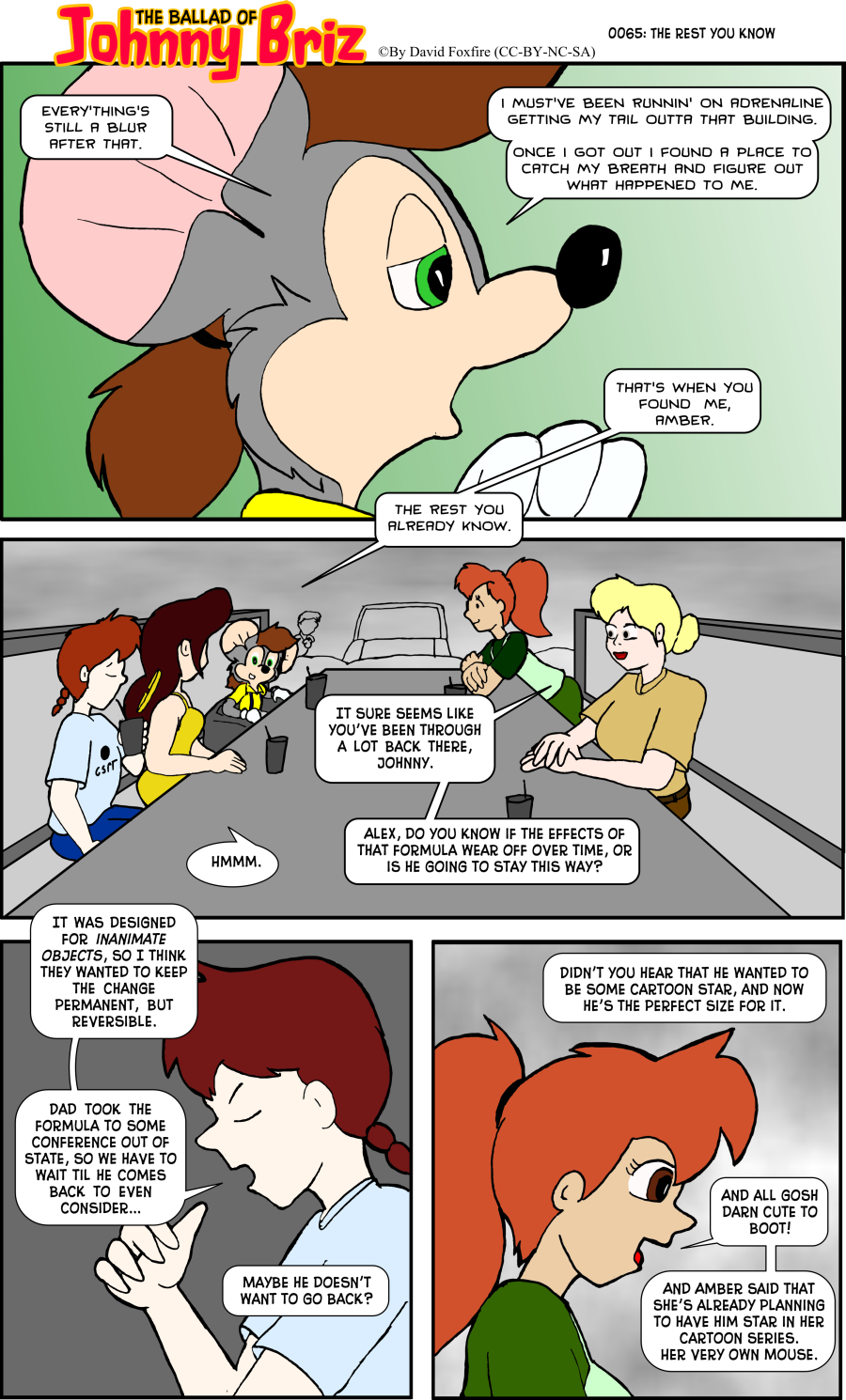
- Alex's hair changes color from Panel 2 to 3.
- In Panel 2, the white of Johnny's eyes is so close to his skin tone, it's hard to discern where the two colors separate; a thin outline for his eyes would be best.
- Jennifer, in the same panel, is missing the rest of her eye detail.
- Inking really didn't do Carolyn's facial expression any favors.
Jennifer's dialogue in the last panel could use some improvement:
- The first statement Jennifer says is a question, so it needs to be its own sentence with question mark.
- For the second part of that statement, the 'toon-size' concept still doesn't make sense because toons are not a set size; Mickey Mouse isn't the same size as Johnathan Brisby, after all.
- You know it's coming, especially from me; You're starting sentences with 'And' again.
I know, and I understand, that this was a last-minute rush-job. I'm just pointing these issues out so that when the next crunch-time comes, these issues will be at the forefront of your mind in order to avoid repeating them.
👍: 0 ⏩: 1

Yeah, I guess when you're short on the clock, some of the things you mentioned slip up. (for the record, catching up with things during the week and a couple appointments with notorious time hogs kept me from responding. Not that things cooled down I can get back to work.) I'll keep your point-outs in mind for the next strip, and even got some better nibs so I can work on improving my inking. I hope to show the progression in the next several sketches, both here and in the private message forum.
👍: 0 ⏩: 0