HOME | DD
 davidfoxfire — Introp01Demo
by-nc-sa
davidfoxfire — Introp01Demo
by-nc-sa
Published: 2012-11-01 02:38:11 +0000 UTC; Views: 1540; Favourites: 3; Downloads: 10
Redirect to original
Description
I thought a little preview of what I'm going to do with my collaborators group on the web comic. I'm releasing the Introduction pages here, so that the collaborators will haggle over it so I can find what needs improving. With the feedback, I can take these pics to my paint programs to put in the corrections before I color and shade them.For these three pages, anyone else who wants to help me out with the constructive criticism as well. If you're good enough, and are willing to sign up on a message board off DA [link] , you might get invited to be in that inner circle.
The finalized strips will appear sometime 3-4 weeks in the future (which is why I'm going to move this to a private group) fully colored and hopefully shaded well to boot. (I'll probably learn how to do that as I go through the strip, like I said.)
Related content


Comments: 1

Overall


Vision
Originality
Technique
Impact
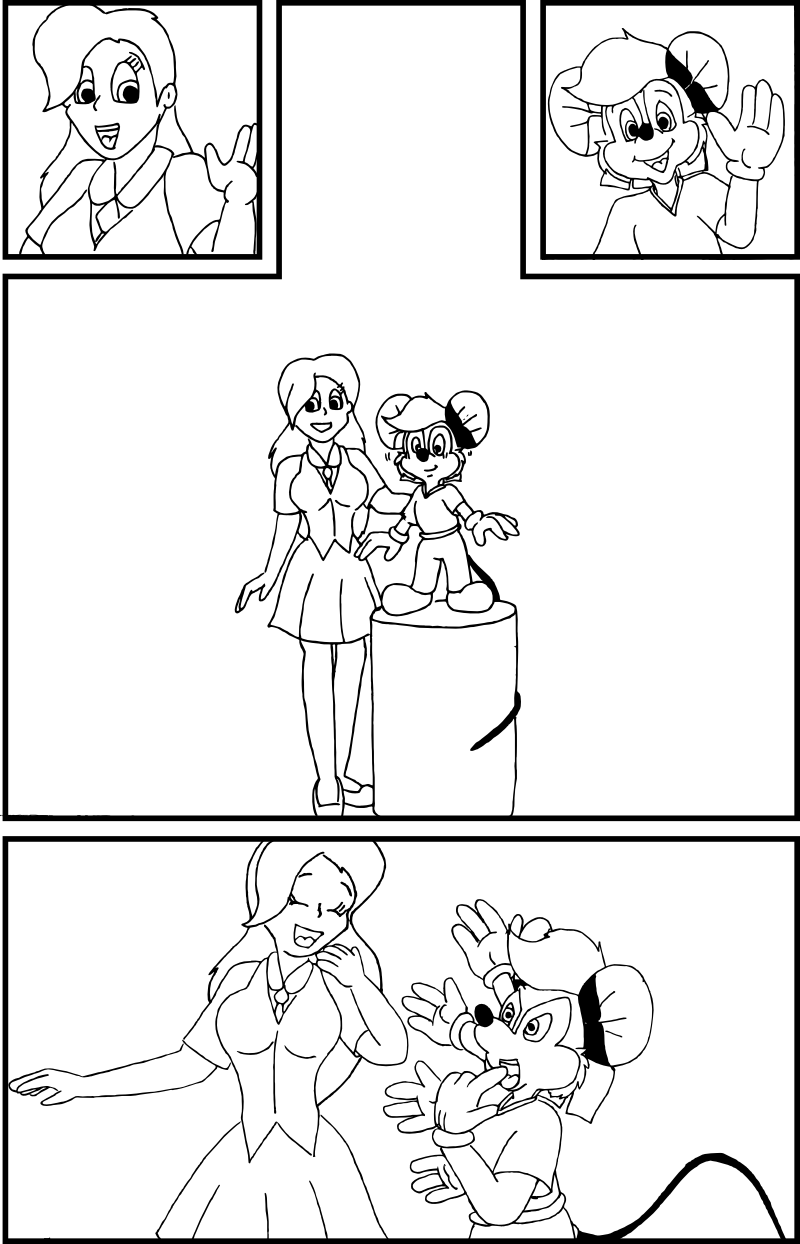
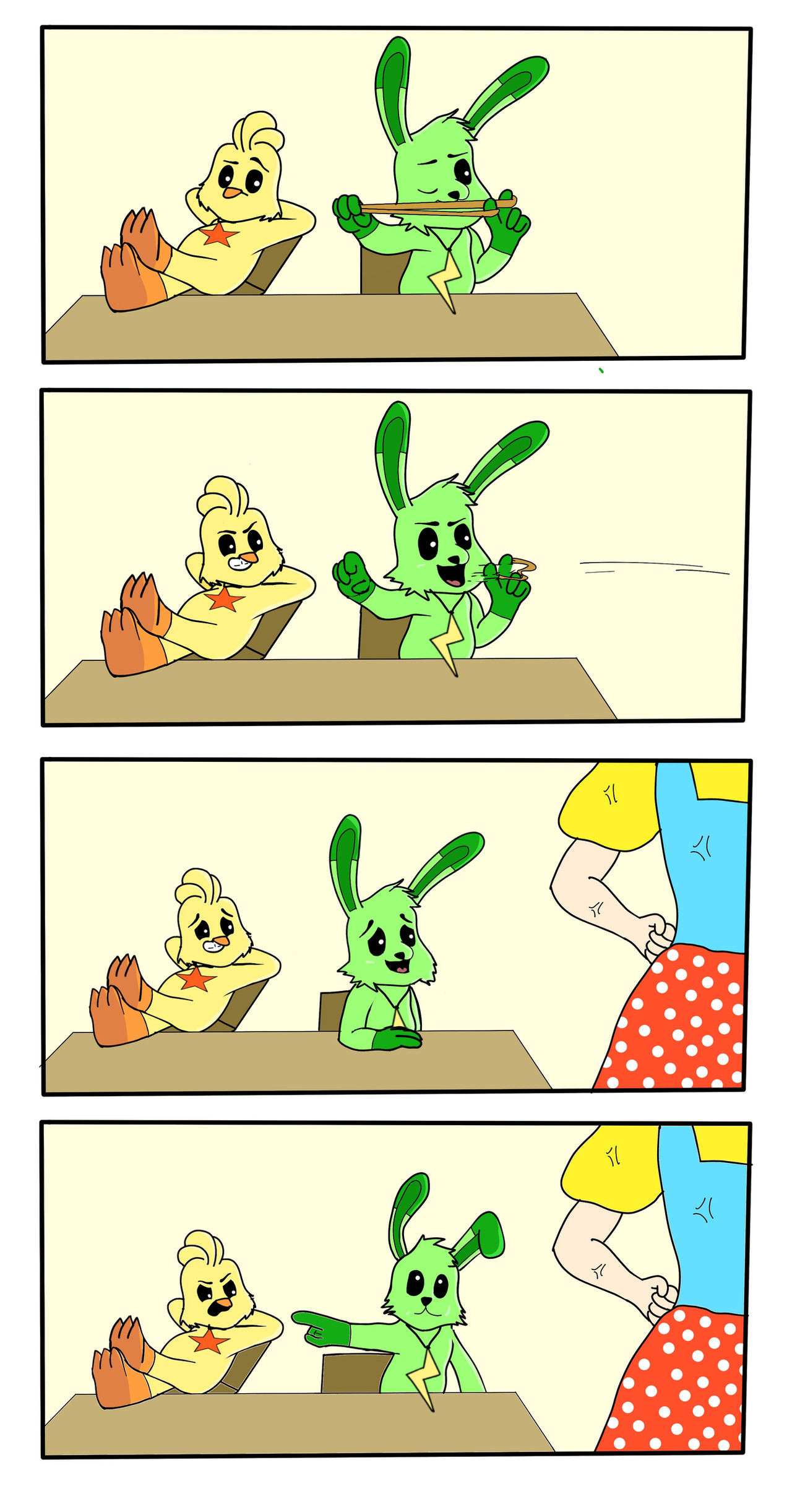
All right, time to get into this, one frame at a time.
The initial frames between Amber and Johnny are set up well for a framing device, and you've left plenty of room for dialogue boxes. So far so good. Amber's waving hand looks awkwardly made; where the wrist meets the base of the thumb needs a little reworking. Johnny is pretty solidly represented in his introduction panel, though the arm on the right appears to be a bit too far into the shoulder.
Middle panel: Again, good work on keeping room for your dialogue bubbles. Reading this with the script open helps. While the outfits appear rather plain, I'm sort of glad you didn't resort to the old Polo shirt placeholder and putting those Mickey Mouse buttons on Johnny's pants... He just lacks a little clothing detail. In addition, Amber's hands are rather small, and the usual wrist issue returns; the base of her thumb is supposed to protrude outward from the base of the wrist, rather than be a simple continuous line.
Bottom panel: Amber's wrist issue and small hand problem returns, see above. Johnny doesn't seem to have that problem, but that's probably because of the gloves. Amber's right arm (on our left) seems too short from the shoulder to elbow and too long from elbow to wrist. A good first attempt on the visual arm flailing gag with Johnny, but there needs to be lines (or faded drawings of the extra arms) to convey motion (like with his nose in the above panel). Also, each "arm" is originating from different spots behind him, causing them to look disconnected. If each one originated from the same point, it would appear more strongly like flailing, combined with one of the techniques to convey motion I mentioned.
Overall, the designs aren't terrible, but the lack of definition on the outfits sort of holds the piece back. I'm not saying there needs to be obscene detail, but little things like Amber's vest buttons, maybe a stripe down JB's pant legs, and some shoe detail would go a long way on improving the piece.
👍: 0 ⏩: 0