HOME | DD
 davidkawena — New Project - Work In Progress 01
Published: 2014-09-30 21:52:54 +0000 UTC; Views: 17311; Favourites: 453; Downloads: 0
Redirect to original
Description
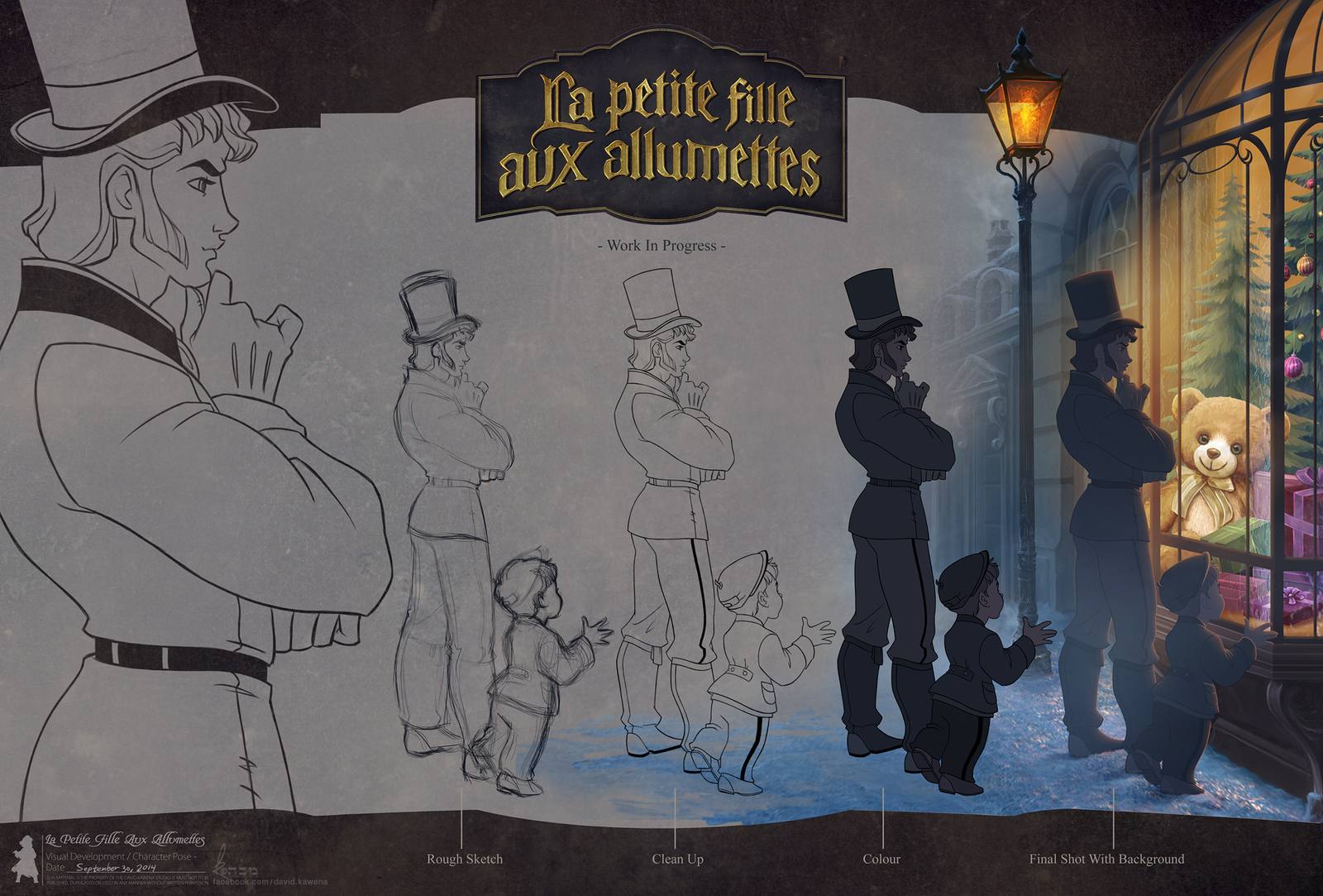
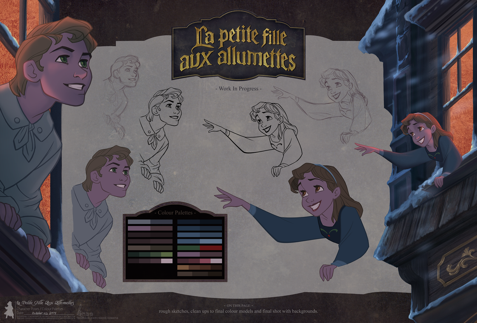
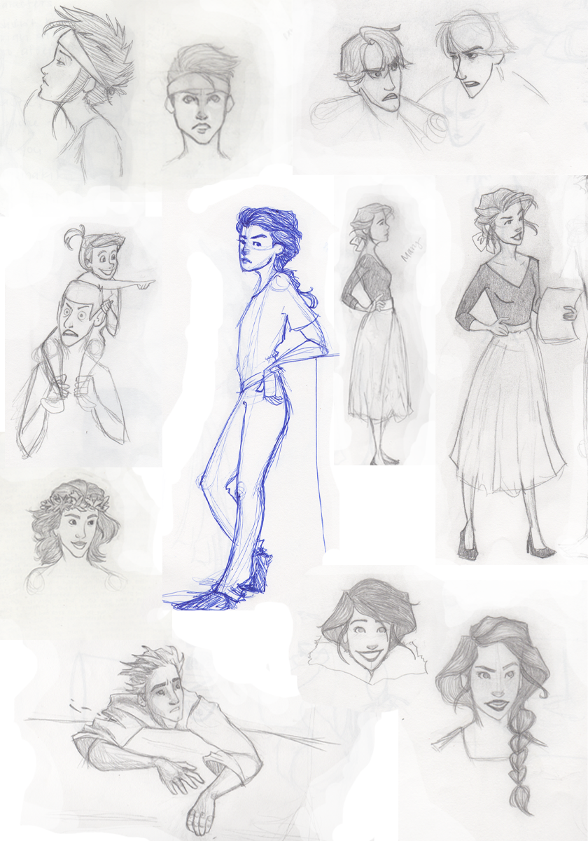
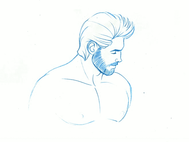
A new 'Work In Progress' shot from one of my latest project.FULL PROJECT TO BE REVEALED ON MY FACEBOOK @ www.facebook.com/david.kawena NEXT WEEK!
DK.
Related content


Comments: 17

This is adorable! I love the way the little one has his hands on the glass and you can just feel the excitement on his face.
👍: 0 ⏩: 0

David, do you sketch your initial sketches digitally or pencil on paper? Your work is superb. I'm so inspired!
👍: 0 ⏩: 0

 (Smile)")

Kinda looks like hans uwu it's so amazing!
👍: 0 ⏩: 0

Hes cute!!! Is the officer police ritgh!!!
👍: 0 ⏩: 0

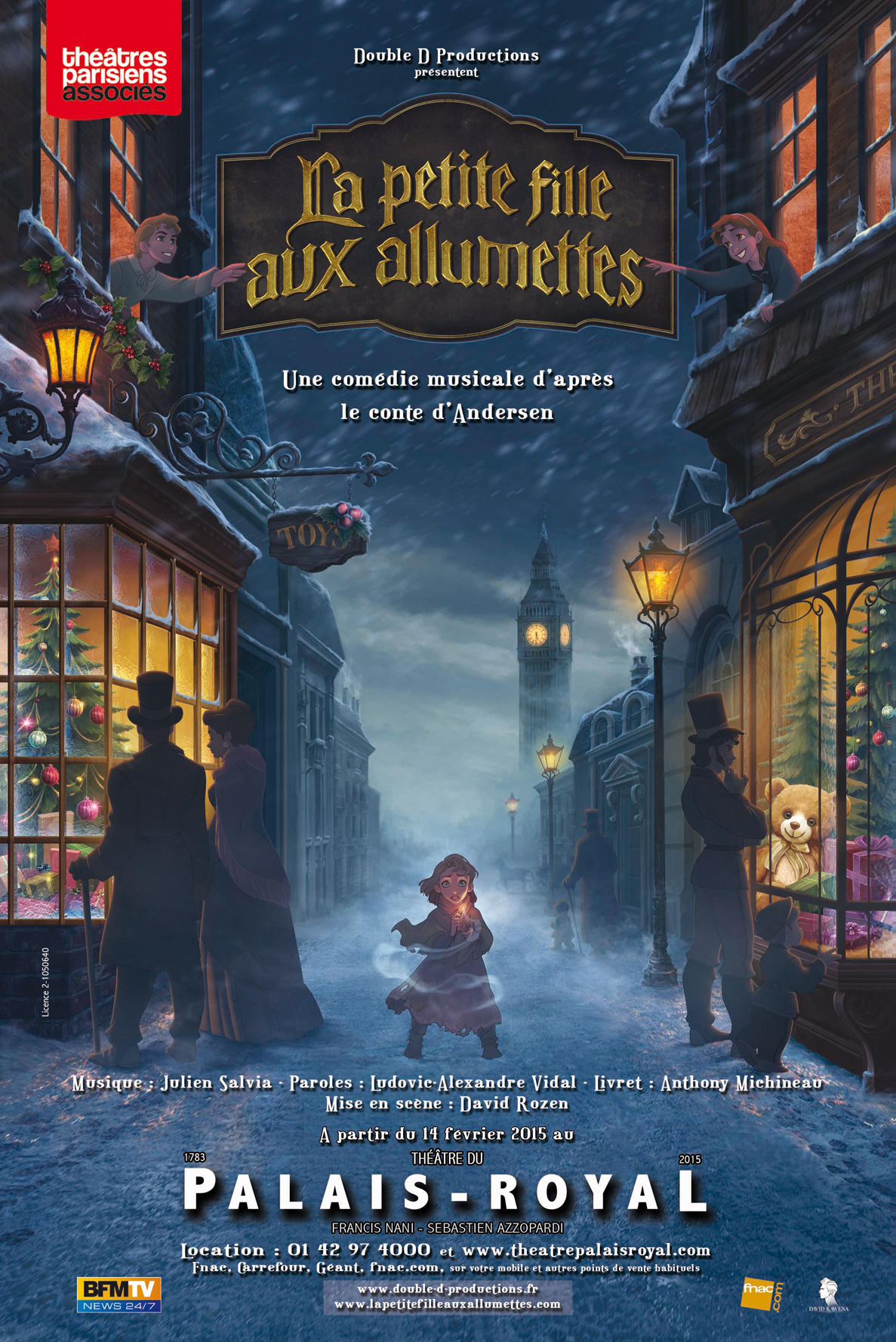
Allumettes... Doesn't that mean matches?
The Little Match Girl?
👍: 0 ⏩: 0


may I ask if the lineart was made using the tool brush or the tool pen?
👍: 0 ⏩: 0

Pareil que pour l'autre planche. Du grand art. Vraiment très beau.
J’espère qu'il y en aura d'autre, car ca donne envie d'en voir d'avantage.
👍: 0 ⏩: 0

")


I'm loving how this is coming along! Your style is fantastic!
👍: 0 ⏩: 0


An interesting style! I hope there's more so we can properly critique. He seems to have a solid design, but there's very little to work from. The title does scream Disney to me though, in a good way. Good font treatment but it seems a little small for the space within the banner. Maybe a slight filigree (per the top-hat period) surrounding the "La Petite fille" and across the bottom will help to make the words fit in the space.
👍: 0 ⏩: 0

 (Wink)")