HOME | DD
 DavidMunroeArt —
Dissused
DavidMunroeArt —
Dissused

Published: 2013-09-25 18:58:30 +0000 UTC; Views: 4652; Favourites: 245; Downloads: 0
Redirect to original
Description
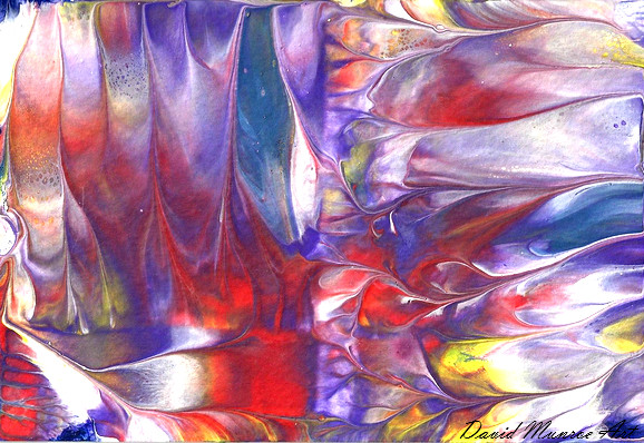
Part of my new Industrial series of paintings 16" x 20 on Canvas. For Sale. www.davidmunroeart.com/Like for a Like on Facebook?? - www.facebook.com/ArtistDavidMu…
Related content


Comments: 115


i think this painting is beautiful! the colour choices fit so well together and comingle so well together. did you use staining? or is it all brush work?
👍: 0 ⏩: 1

it was actually painted mostly with a pallette knife and hot air gun
👍: 0 ⏩: 1
oh wow! thats amazing it really looks like staining! bravo!!
👍: 0 ⏩: 1


I can‘t stop staring! So much going on definitely well deserved dd

👍: 0 ⏩: 1

I think the color scheme is working well, since it is based on the primary colors (which you really can't go wrong with). Personally, I feel that this would work better as a vertical piece (portrait) rather than a horizontal/landscape. I have done some abstract paintings before and sometimes I would start out painting them as landscapes but later they became vertical pieces because the movement and composition were stronger vertically.
👍: 0 ⏩: 0

I like the combination of colors. I think it reminds me of a tree on an island in the middle of a lake (well if the trees were of metal). Sorry if I'm noy very articulate, I do not speak English.
👍: 0 ⏩: 1
thats a great description, thank you for commenting  (Smile)")
👍: 0 ⏩: 1

Is it weird it that it reminds me of a rainbow because of its splendid colors?
👍: 0 ⏩: 1
hehe not weird at all, thank you
👍: 0 ⏩: 0


It's really pretty. It kind of reminds me of fall. Is it oil paints your using?
👍: 0 ⏩: 1
thank you so much
👍: 0 ⏩: 1
That's pretty interesting. I think I'll be giving that a shot. lol.
👍: 0 ⏩: 1

Something about the colors in this just draws me in. I can't really explain it, but I really like it. Great job!
👍: 0 ⏩: 1
thank you very much
👍: 0 ⏩: 0

it reminds me of almost corroded metal, rusted in a way.......... is very beautiful, especially the colours and the effect they create
👍: 0 ⏩: 1

The feeling you expressed here seems almost blocked by the orange (but not in a bad way!) .The tints of green go great with blue as they mix but the orange seems like it wants to make a statement, as if saying, "look at me"! The feeling has now changed from the quiet blues and greens with a bold standing orange, it seems like he/she wants to be the one, the one to be the center of attention while the blue and green, feel "disused". But they are not! They support the orange so much in everyone's view. Maybe them [blue and green] feel like background colors than the "main attraction". I think this piece is wonderful and hearing everybody's view on it is awesome! ")
👍: 0 ⏩: 1
Thank you so much indeed. It really helps me so much and means everything to me to hear everyones thoughts on my work so i cant thank you enough
👍: 0 ⏩: 1
Thank you!
👍: 0 ⏩: 1

Such a lovely use of complementary colours as peacock blue and rusty orange. It feels down-to-earth and pleasant, balanced but calming.
👍: 0 ⏩: 1
Thank you so much for taking the time to let me know your thoughts, it means a lot to me
👍: 0 ⏩: 1

I love the contrasting colours. I think this is something I could stare at for hours.
👍: 0 ⏩: 1
Thata amazing to hear, thank you so much
👍: 0 ⏩: 0

Thank you so much, really pleased you like my work
👍: 0 ⏩: 1

I love the combination of colors.... Though they're completely different colors, they go together perfectly and are in the right spot to make a beautiful canvas... Great job and congrats on the DD!
👍: 0 ⏩: 1
Thank you so much, really glad you like it
👍: 0 ⏩: 0

Wow. I absolutely love it! The colors are really eye-catching, and I especially love the blue. Wonderful piece of art!
👍: 0 ⏩: 1
Thank you so much, really pleased you like my work
👍: 0 ⏩: 0

Looks like old peeling paint, but also maybe like a lake at sunset. with clouds and stuff. Looks good.
👍: 0 ⏩: 1
Anytime! Thankyou again for the watch.
👍: 0 ⏩: 0

It looks fantastic.I like how you mixed all the colors together,it looks like a real painting.
👍: 0 ⏩: 1
| Next =>