HOME | DD
 DavidScript — How I drink Dr. Pepper WIP
by-nc-nd
DavidScript — How I drink Dr. Pepper WIP
by-nc-nd
Published: 2011-08-06 02:02:14 +0000 UTC; Views: 854; Favourites: 19; Downloads: 12
Redirect to original
Description
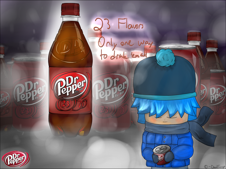
EDIT: NEW ONE HERE: [link]Me drinking Dr. Pepper in Christiansburg, VA a.k.a. Dr. Pepper Capital of the World
I drew the cans and bottles before I knew that the Assets pack had them
The whole thing took me a few hours, but I worked on it for a few minutes a day. Then I decided to go all out and surprised myself with the water tool (I think I mastered it
 (Smile)") ) I think I made the logo on the bottom left look bad
) I think I made the logo on the bottom left look bad 
I haven't drawn all of the 23 flavors yet. Turns out that the recipe's a secret and half of them are liquids
If the picture needs to be corrected, just tell me and I'll be glad to change it
")
I think I got the hair shading done right
Related content


Comments: 28


Be sure to check the new one out too

👍: 0 ⏩: 1

In fact ... I feel like going to buy a Dr. Pepper
I like your art ... I find it original.
👍: 0 ⏩: 1

That made me thirsty.
The drawing is really good. I like the bottles and cans in the background, and the blur / haze effects are great; however you could give some more shading to the bottle label - right not it looks a bit flat, in contrast with the bottle itself.
As other commenters said, the boy in a foreground is a bit cartoonish compared to the rest of the image, and the two styles don't go well; you should make it more realistic.
(On behalf of #ProjectComment )
👍: 0 ⏩: 1
Thanks
👍: 0 ⏩: 1

I love how cold the picture looks. The background makes it look likes it's snowing. Looks very refreshing.
👍: 0 ⏩: 1
Thanks
👍: 0 ⏩: 1
It's good, but I personally liked the first one.
👍: 0 ⏩: 0

woah! at the first look i thouth that its a real photo
👍: 0 ⏩: 1
Thanks ! You can see the new one now too
👍: 0 ⏩: 1


This is a really neat design! I love the background and how much time and energy you put into making those cans and bottles. They look very real, in an illustration manner, and it's impressive! However, the figure doesn't match the level of detail and realism you put into the bottles, and the two styles don't go well together. I recommend putting more time and effort into the figure to make the piece go together more.
You are off to a fantastic start. I am in love with those bottles and cans. Keep up the fantastic work!

👍: 0 ⏩: 2

yeah agree, face needs more detail and effort, i will do smaller hat and give him neck
👍: 0 ⏩: 1
Thanks for the awesome critique
That's the magic of chibi >:3
👍: 0 ⏩: 1


I think the only improvement I'd make would be to make the text a computer font, rather than hand-written? I loooove the background with the bottles, it just looks so fab!
👍: 0 ⏩: 1
Yea, the text's just a reminder. I'll definitely make it better
And thanks
👍: 0 ⏩: 0


The lines and colors look so clean. The texture is so smooth.
Amazing job

👍: 0 ⏩: 1
Yay, a real comment
And thank you
👍: 0 ⏩: 1


WHY YOU SO GOOD AT COLORINGANDOUTLINEINGANDDRAWINGANDBEINGAWESOME)$&#@(RFJDS:
👍: 0 ⏩: 1
Becauseitsshowsmyragingpowerofnothing
👍: 0 ⏩: 0