HOME | DD
 daylightsaver — Ao

#ayakashighostguild
Published: 2016-07-08 03:05:44 +0000 UTC; Views: 901; Favourites: 32; Downloads: 0
Redirect to original
Description
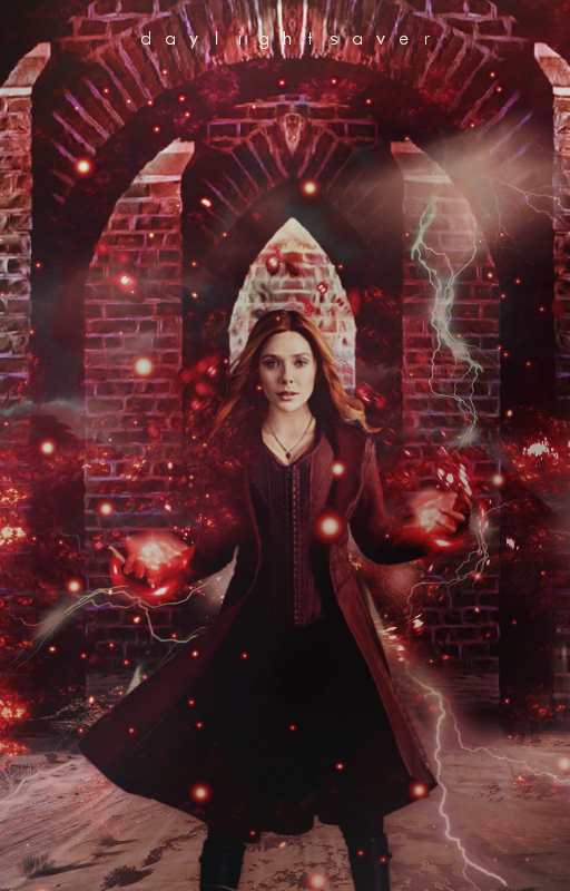
Render by MusicalSushiLighting textures by Carllton
Related content


Comments: 18


Found this through a.deviantart.net/avatars/p/r/p… " alt=" " title="ProjectComment" />
I have to say I liked this one a lot as I enjoyed how the colors blended together so nicely in this piece of art. The facial expressions looked just right as well too and the flow of air/wind causing the robes and fabric to move looked very realistic as well too improving the look and presentation of your piece which I find overall very good and there is little in terms that I can comment on that would be seen as either a way of improvement or otherwise as I can find nothing negative in the slightest.
Without doubt this is one of the best artworks I have seen so far that I found through Project Comment.
👍: 0 ⏩: 0

Impact
Hi there! I'm from ProjectComment .
A very interesting design you have here! Very blue....which I much enjoy as I really like the cooler color palette.
The first thing that catches my eye is that there is a soft, watercolor feel to the character. Next, I ponder if the stars or galaxies in the background mean anything other than being pretty? Lovely as they are, I do find them distracting from "Ao" in the foreground since some of the stars are large and sharp. I'm unsure what the twisty/spiral texture is on the right hand of the piece. Perhaps it's a story element I'm unaware of...
I'd recommend toning down the background's vibrancy as "Ao" is the star of the piece.
His costume is fun to look at as there's some lovely detail on the kimono?/robes? I almost missed the small bead chain at his waist because of the FX coming from his right hand. The folds of the clothes are my favorite part of this piece. I can almost hear them flowing in the breeze ~
Keep creating!
👍: 0 ⏩: 0

Originality
Wow! I love the overall composition and the colour palette! It's very well balanced and the light flare in the center draws the attention straight to the figure so the character does not blend into the background! The cool toned palette keeps the character in harmony and is not distracting.
I mostly understand the concept you are trying to give, but the light flare in the bottom right hand corner is a bit distracting ^^ if it was a bit more subdued I think that the image would be much more balanced. Also right now the direction my eye travels is a bit chaotic. I see the central light flare first, then the words, face, and then to the light flare to the bottom right hand corner. If this direction was more fluid then viewing may be much more enjoyable :3 Perhaps moving the character to the left a bit more and moving the hand that is light up either higher up or lower down. And if that purple crystal on his hat (it's a hat right? e.deviantart.net/emoticons/m/m… " width="15" height="15" alt="

These are all minor details though and I still love it! <3 Definitely featuring it in my favourite's folder ^^ have a good day!!!
👍: 0 ⏩: 1

Thank you for your critique! I really appreciate it <3
I will work on improving the 'flow' of the signatures from now. Your response was really helpful. Thank you again!
👍: 0 ⏩: 1
I only mention flow to really good artists cause I know that they can work on it!!! ^^ I'm glad you liked it!!!
👍: 0 ⏩: 0

Greetings from ProjectComment
Okay, let me give my comment assuming that this is your own creation. I'm usually pretty good at giving constructive comments, but I'm at loss here. Is your art realistic? Obviously no, but as anime style, it's very spot on. Your colours are so pretty. Granted I'm biased toward blue, you have such a great sense for the range of blues you've used. I especially like the way you coloured the fabric. It looks so good to the point that it makes me curious how good you can paint realistically. Maybe you could have used a better font for the blue/ao bit. But honestly, I'm digging here. The face of the character isn't my favourite style of manga art (I'm a big fan of Reiko Shimizu's art if you've heard of her at all), but it's still pretty good as far as manga art goes. So yes, nice work.
Now because it says "render and lighting textures, plus customization", I am wondering if you didn't actually draw this but did some addition to it? In that case, I'm not sure what to comment because I'm not quite sure what you added.
Anyway, I hope it's 100% your work so my initial comment is valid
👍: 0 ⏩: 1
Yeah, I didn't actually draw the character huhuu . It was a render from a card game called 'Ayakashi Ghost guild'. I did however pull together the background and the effects (well, all except that lighting texture) with a bunch of tools from the program I use. I'd say it's 75% my work then? That's the best of my ability for now.
I'll be checking out Reiko Shimizu now haha ")
👍: 0 ⏩: 1
You are very welcome. Whatever you put together is great to look at. Honestly, this was the first piece I had nothing to add really.
👍: 0 ⏩: 0

Hey, I'm form PC C:
The background is really nice C:
Sparkles look awesome ^^
I like charactes outfit, looks cool B)
anatomy and shading are very good
Overall great art ♥
👍: 0 ⏩: 1
Thank you for your comment! It is very much appreciated!
👍: 0 ⏩: 0

Im on my phone idk how to write a critique so heres a comment one:
Overall the background is amazing, like expected. The character anatomy looks overall great. That spark of light bothers me really it takes too much attention away from the actual drawing. Overall an excellent peace as always, and hope you do not get offended in any way. Favorited  (Smile)")
👍: 0 ⏩: 2
No, no, I'm not offended! Thank you for giving me some feedback. It is always well appreciated. I think your comment is fair, you touched on the good aspects and negative aspects of the piece, giving an overall constructive comment, although a bit on the short side. A critique (the function) has a minimum word count of 100 words. You might want to keep that in mind for the future. However, it doesn't hurt to leave a shorter normal comment. It would encourage the artist very much. On the side note, I never thought I'd be providing feedback for a comment. It amuses me to no end hahaha!
👍: 0 ⏩: 1
Haha im happy about that :3
👍: 0 ⏩: 0

Fair, but I'd like to say a word on one thing: it's true that the sparkle draws attention, but it also acts as a light source and, since it's in central position and near the subject, somehow even integrated in it, the attention is still kept on the protagonist area, it could be worse if it would be moved in a corner
👍: 0 ⏩: 1
You have a point here. Well your crit on my crit is fair. Also its my first one soo xD
👍: 0 ⏩: 1
Oh, it's your first crit? Well, it was very good, fair, honest and polite, keep this style for the next one and remember to both praise the good and evidence flaws;
but you're lucky to have done it on your phone, when you're on pc they're separated from the comments and need at least 100 words. Don't be scared, they're even few when you know what you want to say. Also, they must be approved by the author before being published.
👍: 0 ⏩: 1
Thank you
👍: 0 ⏩: 1
Always happy to be helpful!
👍: 0 ⏩: 0