HOME | DD
 DC-Miller — Arrogance Map by jimmymcwicked
Published: 2013-03-08 11:58:38 +0000 UTC; Views: 7256; Favourites: 44; Downloads: 45
Redirect to original
Description
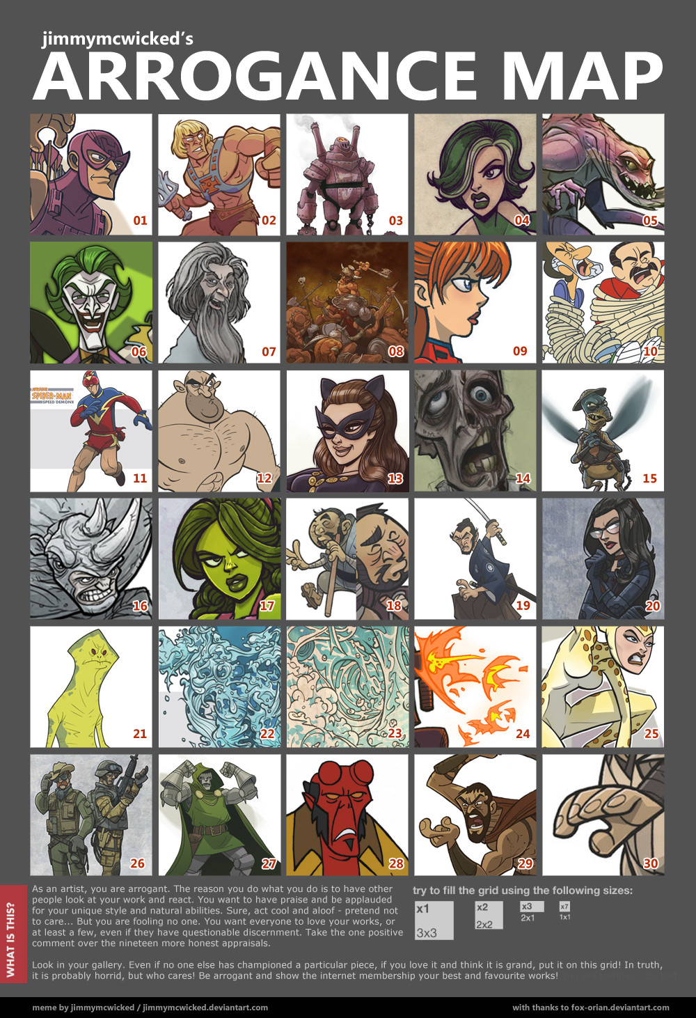
Rarely do I add commentary to my submissions, aside from cut-&-paste words courtesy of the Wikipedia servants. After creating a very original ‘Arrogance Map’ template, I then innocently and unexpectedly stumbled upon it and found it to be a proper opportunity to drone on about the most favourite and splendid of my many, many splendid drawings…***************ARROGANCE ALERT! SELF-INDULGENT COMMENTARY BELOW! DEAL WITH IT!***************
-01) Hawkeye. A favourite character I’ve submitted renditions of a few times. This was the first one.
-02) Dopey He-Man. He-Man is dopey. I hoped to capture this without creating a disservice. I tried a similar feat with a dopey Thor and though I posted it, I hate it. I always want to delete it.
-03) An ancient steam powered robot. Not steampunk, because steampunk is near terrible. Yes masses, I said it – deal with it. One of my favourite designs, though many years old. I still consider using an army of these in some imaginary future project.
-04) Viper. I like to draw a girl’s face. I don’t mind too much that my girls all look the same. Just the hair is different. This is a common trait among us drawers, no?
-05) An alien monster I didn’t draw. Drawn by Deviantart’s ~HEROBOY *. He is a successful cartooner design-man in the animation world. He allowed me to colour his work and socked my stomach three times, which he says was unrelated. This image is not in my gallery, only his, because the payment is a fourth and fifth punch, which he says would also be unrelated. [link]
-06) My version of the Joker. I’d draw the Joker like this in a world where funny books were allowed to be fun and varied. But they are not permitted to do this, I am hearing.
-07) It is a wizard. Not as inspired by the Gandalf fellow as you may think. Rather I was fantasizing of Melanthius from the Sinbad movie, Eye of the Tiger.
- 08) This is a copy of a Frank Frazetta Conan painting. If I may say, this is my most underrated image. Probably because I put much more effort into this than I normally do. Just worked out that way. (I have quite a few overrated images)
-09) Girl’s profile. Happens to be some anime character which I like the design of. My earliest real drawings I did as a kid were pretty much identical to this. I have learned nothing.
-10) I usually find myself working as a designer in animation. These two characters were designed for a PBS flash animation show initially by a famous and successful fellow, Stephen Silver. My duty was to wade through very rough storyboards and create key poses where needed for the animators. I was a fan of the characters style and tried to work both with it and the limitations of flash. The problem is that flash doesn’t necessarily breed the highest quality of animator, nor do the local schools, despite what they'd have you believe. I liked my work on the show, but sadly didn’t see much result onscreen. Awkward, broken and ugly. The show was cancelled pretty quickly.
-11) Speed Demon. A marvel villain. The gym shorts are inspired! (This guy is from my four pages of 50 Spider-Man villains I did in roughly a three week span while my town shut down for some type of Olympic party. I would be successful if I could consistently put forth this type of effort.)
-12) A cartoony style I’d like to do more of. In my town, the animation work is very rarely a nice style.
-13) Catwoman from a commission I did. I liked her expression. I wish I’d done some stronger highlights on the whole drawing overall, but still like it a lot. Not in my gallery. See if you can find it here on the Deviantarts! [link]
-14) I used to draw with a pencil. My drawings were much better a long time ago. Softer lines and more loose.
-15) It is Watto. I have gone from hating prequels to just hating all of Star Wars. Sad but true, and inevitable. However, I thought that Watto was a pretty good CG character for the time. He’s a fun character to draw and I was pretty happy with the colouring.
-16) Rhino. Such a great character. I would like to pursue the style of this specific drawing. I like the balance of detail and the cartoonishness.
-17) Another woman’s face. I like her expression. I cannot recall why she is green.
-18) I like this design. It is a fictional Japanese character Zatoichi.
-19) Similarly to 18, a character which I liked the result of. However, a style which has trouble finding a home.
-20) This is the Baroness. I find she is a sexy character without having to draw her in the offensive modern comic type of skanked up pose. Man, I hate, hate the way women characters are drawn to appeal to morons. Don’t get me wrong – I am no true feminist. I totally believe men are superior.
-21) Amanaman (I think that is the spelling?). Fun sometimes to do characters in a specific style. He is meant to be in the ‘Clone Wars’ style. Not sure I nailed it or not, but think he looks good. Love that he is coloured with no tones or highlights.
-22, 23, 24) Some water and gunfire. I’ve designed some effects for a few cartoons, here and there. I wish this was something that was cared about in the average production - It really is not, and it shows. These aren’t from any production, but I like to imagine they are.
-25) I try to be efficient with lines and instead use colouring to compensate for dimension. It most often does not work as I plan. However, I think it worked out on this Cheetah.
-26) Two G.I. Joes. I love these two characters and think this drawing is near tops of all I’ve posted. As I’ve touched on a few times above, I wish this style on these types of characters would fit in other people’s eyes as they do mine. Not cool enough. 'Plus' the extreme. Dark and Grittaay for the teenz. Whatev…
-27) Doctor Doom. Always loved the character. He should be threatening, and always clunky. Man, I’d love to draw him more.
-28) Dopiest Hellboy. Imagined how great it’d be to have Hellboy meet the Mystery Machine kids with this one. Like Amanaman, no tones or highlights. I gotta do this more.
-29) King Leonidas. Very close to my current and unpopular bug-eyed style, this guy is a fraction more pushed and wonky, which I should really do more of.
-30) THE BEST HAND I’VE EVER DRAWN! A touch more graphicky than I’d normally do. Certainly a result of a project’s style rubbing off on me.
******************END OF ARROGANCE ALERT!******************
*
Related content


Comments: 16

When you mentioned that you wish that this style was seen as more fitting by others did you mean in animation or in comics (both)? Personally I think all the SW and Joe work is great. I also really enjoy the Marvel, love how the characters are cartoony so that their expressions and actions can be exaggerated and there is still great attention to detail in regards to clothing, hair etc.
👍: 0 ⏩: 0

Wow! Reading the 'what is this ' section is like listening to the dark artistic demon within my mind. Very scary and very true... You really know it that well.
I think you should write a comic book. Those kind of words are exactly what a villain would say.
👍: 0 ⏩: 0

You've got a lot of great work to be proud of...dare I say, arrogant!
👍: 0 ⏩: 0

I find she is a sexy character without having to draw her in the offensive modern comic type of skanked up pose. Man, I hate, hate the way women characters are drawn to appeal to morons. Don’t get me wrong – I am no true feminist. I totally believe men are superior.
Jim, you're a man after my own heart.
👍: 0 ⏩: 0


This is brilliant. I love this. And how I wish I lived in a world where "funny books were allowed to be fun and varied." One day, one day...
👍: 0 ⏩: 1

one day... but probably not.
👍: 0 ⏩: 0
do it, my friend! thanks for lookin'!
👍: 0 ⏩: 1

As promised: :thumb358907490:
👍: 0 ⏩: 0

Awesome and yes arrogance is one of dr doom biggest donwfalls
👍: 0 ⏩: 1
good way to look at it, my friend!
👍: 0 ⏩: 0

I hate you because you're correct I'm probably going to do this...
👍: 0 ⏩: 1