HOME | DD
 dcjosh — Hasbro Movie Prime
Published: 2007-07-22 08:31:27 +0000 UTC; Views: 15871; Favourites: 760; Downloads: 498
Redirect to original
Description
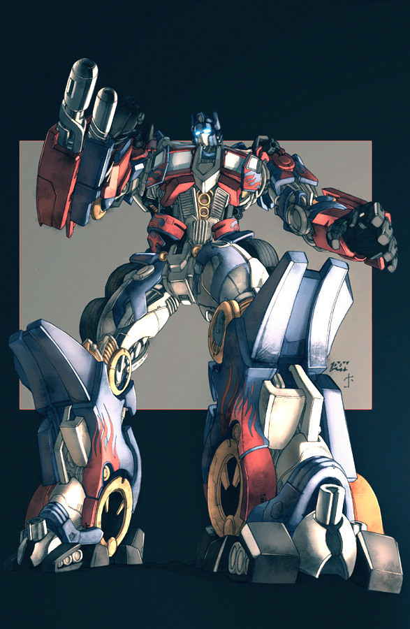
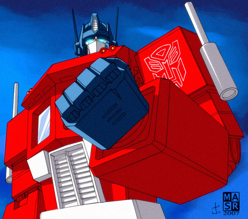
So i saw that good ol' uploaded a series of TF Movie pics he colored for Hasbro and noticed that both he and I [probably other colorists too but i dunno who") ] colored this same Optimus pic [drawn by none other than Don Fig.]
] colored this same Optimus pic [drawn by none other than Don Fig.][link]
so i figured i'd post mine up
definately curious to hear what Edgar thinks
its definately interesting to see how two different people can take the same picture to two different places
looks [to me] he kinda went for the more production/kid friendly kinda brighter [yet still incredibly sexy] colors. i wanted to make mine kind of "cinematic". give it a lot of mood and stuff
cheers!
Related content


Comments: 64

i saw "eldelgado" pic and it was look great, and the yours looks great too! x3
👍: 0 ⏩: 0


This is insane! They should make a new cartoon looking like this. 
👍: 0 ⏩: 0


Ohh they're both kickass in their own ways. That's what's so cool about colorists.
👍: 0 ⏩: 0


Hehe I can see why the little kid in the air port was staring  (Smile)")
👍: 0 ⏩: 0


Both versions are pretty good, although I like yours a bit better, as cool as Eldelgado's colouring is, your ones feels a bit more grittier like Prime has seen some wear and tear so to speak ^^
👍: 0 ⏩: 0


Why it looks like a watercolor painting?? O.O
Awesome!!
👍: 0 ⏩: 0

Oh Man that's awesome skill right there..i love Prime's shading :]
👍: 0 ⏩: 0

Woa, the colores are really good. It looks pretty accurate.
👍: 0 ⏩: 0


do more transformers.... this is really nice.....
👍: 0 ⏩: 0

I am liking this very much. Great job on the coloring!
👍: 0 ⏩: 0


Always great to see superb artists' interpretations on same pieces. Love the atmosphere both give out.
👍: 0 ⏩: 0


I found this beauty on Eldelgado's page ")


👍: 0 ⏩: 0


kool, its like having and insight to the industry.. thanks for sharing... and awesome work!!
👍: 0 ⏩: 0


omg I'm in love!!!! lol j/k
But this is a really awesome ass pic of OP!
but didnt he used to carry a sword or something?
👍: 0 ⏩: 0


i agree, but both are great, apples compared to oranges thing. nice.
👍: 0 ⏩: 0


i like your light better than mine to be honest... and the texture, i was too chicken shit to use one cuz it would be a nightmare to use it on all of the pieces
its awesome!
👍: 0 ⏩: 1

haha. thanks man. means a lot to me
your version is still pretty rad tho
all your pics turned out great
i never got any further than this prime pic cuz i guess they went in a different direction or something. ah well
cheers!
👍: 0 ⏩: 0

this rocks, you have a mad perspective going on here
👍: 0 ⏩: 0

Cool, can't wait to see the movie
Please take a look at my work. Please!!!!!!!!!!!!!!!!!!
[link]
👍: 0 ⏩: 0

Very nice! The colors are very impressive, the pose and the lightings are awesome. An instant

👍: 0 ⏩: 0

Nice, I really like this. The colours seem much more dramatic then the bright "kid-friendly" colours would. And they seem more realistic, which I rather like.
👍: 0 ⏩: 0

I like the cinematic colors for the movie 'Bots and 'Cons more than the kid-friendly/brighter colors. Maybe it's just me but cinematic suits these big guys better.
👍: 0 ⏩: 0


| Next =>