HOME | DD
 deaddreamer — ddr0067 icon
Published: 2002-05-11 12:55:50 +0000 UTC; Views: 7792; Favourites: 21; Downloads: 3027
Redirect to original
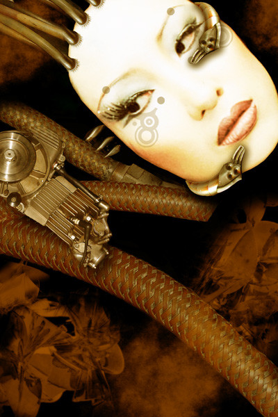
Description
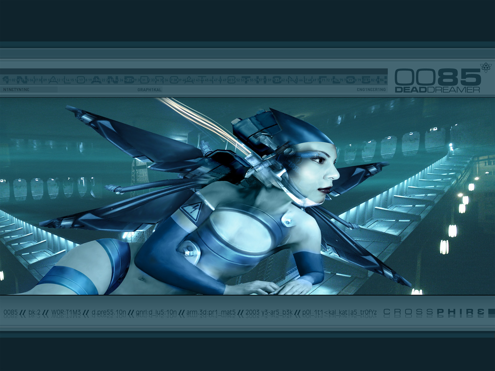
icon is a rather special image for various reasons. firstlyit is the first image of the whores of babylon series where i
shot the image of the girl by myself. i certainly hope that
i can continue to work in that direction. props go out to
yvonne for the nice shooting and i sure hope it wasn't the
last time.
secondly, it is a teaser for a series i want to start in
summer, if things work out. giving my pessimist way of
thinking, its even a wonder i'm still hoping to get it
together.
i worked rather long on the image and although i like it
very much it is still far from perfect - but i forced
myself to finish it before i sit for another month.
Related content


Comments: 35

Great Image, it all fits together and works very well
👍: 0 ⏩: 0


Great work again
just one thing, about the difference of sharpness on the face and other stuff.. but im always complaining...
👍: 0 ⏩: 0

Fanstastic work... the color choices are faboulous.. I love it
👍: 0 ⏩: 0

AnOtHeR GrEaT WoRk FrOm YoU AgIaN
keep up the good work
👍: 0 ⏩: 0

as always.. incredible
-----
Talent is a flame. Genius is a fire.
👍: 0 ⏩: 0

well done on the photo. i love how you played with it. you wouldn't believe how often i see your work ripped on club flyers down here in South Africa. *sigh*
-----
:: paroxysm ::
[link] .: My Card
[link] .: 3WC - The Creatives Are Restless
[link] .: KwanStudios
[link] .: deviantMAG
👍: 0 ⏩: 0

cool
has a nice surrealistic feeling, with those...fish(?) and everything.
also fresh colors
nice work
👍: 0 ⏩: 0

the overall look is great, but the face seems a bit blurry....it's nice to see you back on the scene again....it's been a while...and, as always, this piece bears the style that is unmistakably yours...
.:spunj13:.
👍: 0 ⏩: 0

I allways has such a hard time finding some words that is good enough to describe your work... "+fav" is what I think is the best word I can think of! Lovely work, as allways!
-----
[link] | abnorm thinking
[link] | me
[link] | my comics dev. pack
👍: 0 ⏩: 0

Bloody cool!!!
-----
Peace.
t-k
2002.
Let Beauty Be UR Drug!
👍: 0 ⏩: 0

this on the other hand, is some of the better work i have seen here lately..
-----
A S Y L U M 1 3
[link]
👍: 0 ⏩: 0

this is awsome work! love those wierd fish-like thingies swimming past. the girl looks amuzed by them. this goes dirrectly to my favs.
-----
:: DEADSUMO ::
3WC [link] the creatives are restless
👍: 0 ⏩: 0

amazing pic again, the girl looks awesome and the background fits in.
👍: 0 ⏩: 0

the face, and head, look great on the body. the background is quite intriguing. i really like the focal point the best though as it adds a nice aura to the image as a whole.
-----
deviantART FAQ: [link]
jarkolicious.com: [link]
👍: 0 ⏩: 0

yeah, the blur on the hair [the face itself is fine] is probably my only gripe about this work.
👍: 0 ⏩: 0

Well, I must say.. this is a very odd image..
I noticed it while browsing and read the description..
Didn't even notice who had made it until a couple seconds ago..
Sure the face does seem a little blurred, but that helps add to the chaos of the image..
I know this is a poor example, but it reminds me of The Smashing Pumpkins' Tonight Tonight video..
Well it's a very nice wallpaper..
-----
ARRGHH! Shiver me timbers and shit
👍: 0 ⏩: 0

love the quote at the bottom. it feels very appropriate for all the mixed images floating around. i love your work man.. this was put together very well but it's so damned strange. hehe
👍: 0 ⏩: 0

I've been watching your stuff for awhile man. you set some of the trends. This isn't my fav piece of yours but I've liked a lot of your schtuff.
👍: 0 ⏩: 0

... love the luminousity, (her skin looks pure like porcelain and works well with the translucency of the fish and nice soft watery colours ... very ethereal, very cool!
👍: 0 ⏩: 0

yee, i like the mix that this image contains, a great work!
-----
+
=>
&
[link] - the right way!
: what sport is the fastest in the world?
: what sport is the funniest in the world?
: what sport is hugh in denmark and asia?
👍: 0 ⏩: 0

wow! this is really deaddreamer style. i like this one! cool with the fish.
-----
> mikkeh
👍: 0 ⏩: 0

Thanks for sharing, now I can really see how much work you must have put into it. Impressive.
Have a good day/night!
-----
-Smaken är som baken, den är delad-
👍: 0 ⏩: 0

here's another try for the photo:
[link]
-----
--
crash course in chaos
www.deaddreamer.com
👍: 0 ⏩: 0

Very interesting and abstract.
-----
.caustic.
I hate numbers.
👍: 0 ⏩: 0
I know you were joking, this is getting out of control !
-----
-Smaken är som baken, den är delad-
👍: 0 ⏩: 0

Great work like always..
-----
.[link ]. StachtuS & ErevuS - Collaboration with Anemovatis - Final
.[link ]. As Close As We Could Get
.[link ]. .[link ]. Support the :flageu: European Union's flag icon!
.[link ]. Adopt a Deviant.
.[link ]. Angry Key Deviant Army Rehab. Training Camp .
. Agarash, AKD Army Hand to Hand combat division Captain .
👍: 0 ⏩: 0
uh. btw: heres the original photograph: [link]
-----
--
crash
👍: 0 ⏩: 0

yeah i agree with dj, i love the typo and the background rox too. and those lamps are nice find
-----
[::. check out work from a 14yo [link] .::]
[::. STYLE: 3d Futuristic Abstracts .::]
👍: 0 ⏩: 0
i was just joking, dj.desi gns
-----
--
crash course in chaos
www.deaddreamer.com
👍: 0 ⏩: 0

cool art as allways Deaddreamer
-----
- [ D ][ L ][ F ] -
👍: 0 ⏩: 0
You know I didn't mean it that way
It's not a big deal at all, I can see you have worked on it quite a bit. This is probably like 10 times better then I would have done myself.
-----
-Smaken är som baken, den är delad-
👍: 0 ⏩: 0
does that mean that you think i can't take a nonblurry photo ;P
seriously: i did a lot of retouch on the face but i tried not to get too blurry. oh well.
-----
--
crash course in chaos
www.deaddreamer.com
👍: 0 ⏩: 0
What can I say, it sure has your style to it, wich is a good thing. The face looks a little blurry from the rest but that's not very strange since it's a photo you have taken. Love it.
-----
-Smaken är som baken, den är delad-
👍: 0 ⏩: 0