HOME | DD
 deaddreamer — ddr0085 crossphire
Published: 2003-04-30 06:32:53 +0000 UTC; Views: 6987; Favourites: 25; Downloads: 3025
Redirect to original
Description
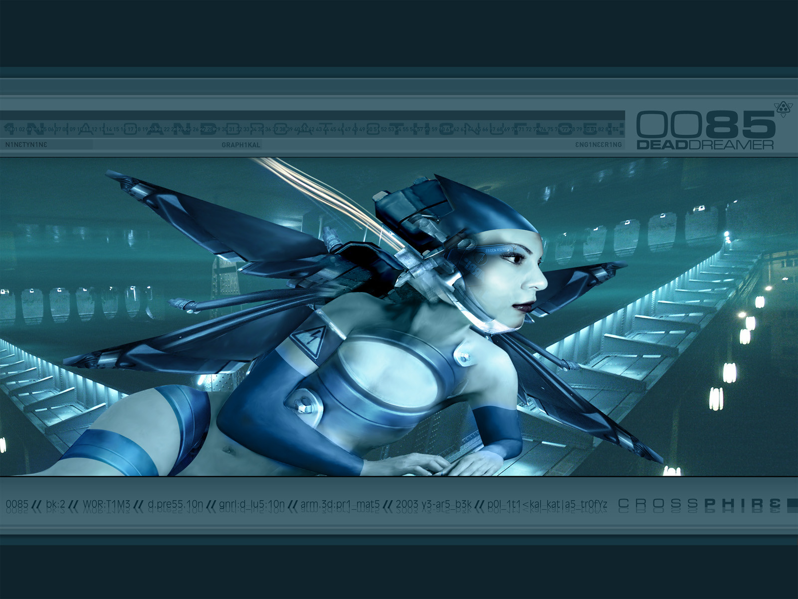
crossphire derives from a flyer i did for a drumand bass party in vienna. usually i keep those
things seperate, a flyer is a flyer and a wallpaper
a wallpaper, but this one works in both cases rather
well.
Related content


Comments: 42

the only image really posted here by the artist which i consider highly rhythmic, masterpeace-y, "i would hang on my wall"-y.
though some others (bioforge) are nice and defined, not enough aestetic 'oomph' in them.
this though, hot chickster, futuristic original feel, and tasty cyan oceanblueness. and not so fucking messy! space space is good.
the part about blending futuristica with an actual photo (though not looking realistic, but mind fools me into thinking it be reality) adds another spicy touch too.
flatness in painting, yes! i see imperfections, yes! imperfections is perfection. when does an error look aestetic? so here. more a degeneration from reality, far original so, a flattened dimension of a body. the fuel fire lines are the lastmost awesomeish touch.
👍: 0 ⏩: 0

heheh nice work bro, i like the blue theme n all, but her head looks kinda big dont ya think?.. but anywayz, looks bloody awesome, gw.
👍: 0 ⏩: 0

very well done! but the breasts regen is kinda strange looking, and so does the face/.. the rest loks great!
👍: 0 ⏩: 0

woha, cool!
diggin' those colors and the wicked background!
👍: 0 ⏩: 0

Its beautifull
is it possible if i can use the image if i would make a modification ???
please let me know
Love
Danielle
((^_^))
👍: 0 ⏩: 0

seems a little off when compared to some of your earlier work. nonetheless i like the blending and the imagery used. mixed with the colors and the background it works well.
👍: 0 ⏩: 0

not bad, lol the only thign i have to rant about is the thing on the girls head, it doesnt look so... yknow.. something, its not seamlss enough it kindof looks superimposed and bluh... good colours though.. gj..
👍: 0 ⏩: 0

aww.....u'Re awesome!.....the faces' some great manipulated, luv coloring...
👍: 0 ⏩: 0

*jaw drops open* Beautiful. I love all the details and the colouring. Very eye catching great for a flyer it seems.
👍: 0 ⏩: 0

the mood seems like ddr_0084_release. for the first time I saw it, I think ddr used a 3d software and after I read from the readme.txt... then, I knew that no 3d software. this is cool one because it confused me! love this...!
👍: 0 ⏩: 0


Hmm.. I dont think this matches your usual style in technique, but it's still rather nice. I don't like the face this time very much, or the background. But the wings are tight, really well done
👍: 0 ⏩: 0


lets see here... we have deaddreamer wallpaper, drum and base, the right resolution, superb idea.... yep it all equals nirvana!
Added to the collection and on my dtop right now.
Thanks for releasing this
👍: 0 ⏩: 0


I've seen it first in my mail...and this piece looks a little...distorted?...not sure...anyway...the colors are well chosen...and I like the angle...good piece...pity I missed the flyer...they're never handed out at the university...
👍: 0 ⏩: 0


+fav yup, awesomenesssssssssssssssssssssssssssssssssssssssssssssssssssssssssssssss sssssssssssssssssssssssssssssssssss
👍: 0 ⏩: 0


Wonderful surrealistic slant to this one - I love how the level of realism improves as your line of sight approaches her face.
👍: 0 ⏩: 0

something a little different. this pose is a lot more dynamic than your usual. i like! not sure about the 'painted' look of her arm...it makes it look flattened. i noticed this in some of your other works as well.
👍: 0 ⏩: 0

Very nice blending and masking. The lines around her legs are very sharp and clean. Nice work as usual.
👍: 0 ⏩: 0


Very cool. I think i'll stick this on my desktop right now. Kudos.
👍: 0 ⏩: 0

jup... thats really great... wonderfull job man!
👍: 0 ⏩: 0

Ya another deaddreamer wall to add to my collection. Looks killer man!!
👍: 0 ⏩: 0

weird but ass kickin' good.. definate fav..looks so very good hehe
👍: 0 ⏩: 0

don't get me wrong, still a very good one, but compared to your other work, it's crap
👍: 0 ⏩: 0
I'm sorry to say in my opinion it's one of your worst pieces ever, the colors are good, however, that girl's head looks distorted and mis-sized.
background is nice
👍: 0 ⏩: 0

Her navel seems a bit off-placed, but maybe that's just me...
Love the colours. Everything is so shiny, but in a subtle way. Sort of warped, like we're seeing it under water.
And do I recognise the girl? [grin]
👍: 0 ⏩: 0

Deaddreamer are you serious small boobs wow.
You did something a little new and exciting the chick wings
are really dope.
Great work.
👍: 0 ⏩: 0


i only had to see the thumb to know it was you - you have such a distinct style to your work. this is like eva said WOW!
👍: 0 ⏩: 0

WOW...
the detail is amazing..and the colors really please the eye.
This is some wonderful art hon...
i adore the pose she is in.
+fav
👍: 0 ⏩: 0