HOME | DD
 deaddreamer — ddr0079 manifestation

Published: 2002-10-29 09:28:15 +0000 UTC; Views: 25465; Favourites: 72; Downloads: 11764
Redirect to original
Description
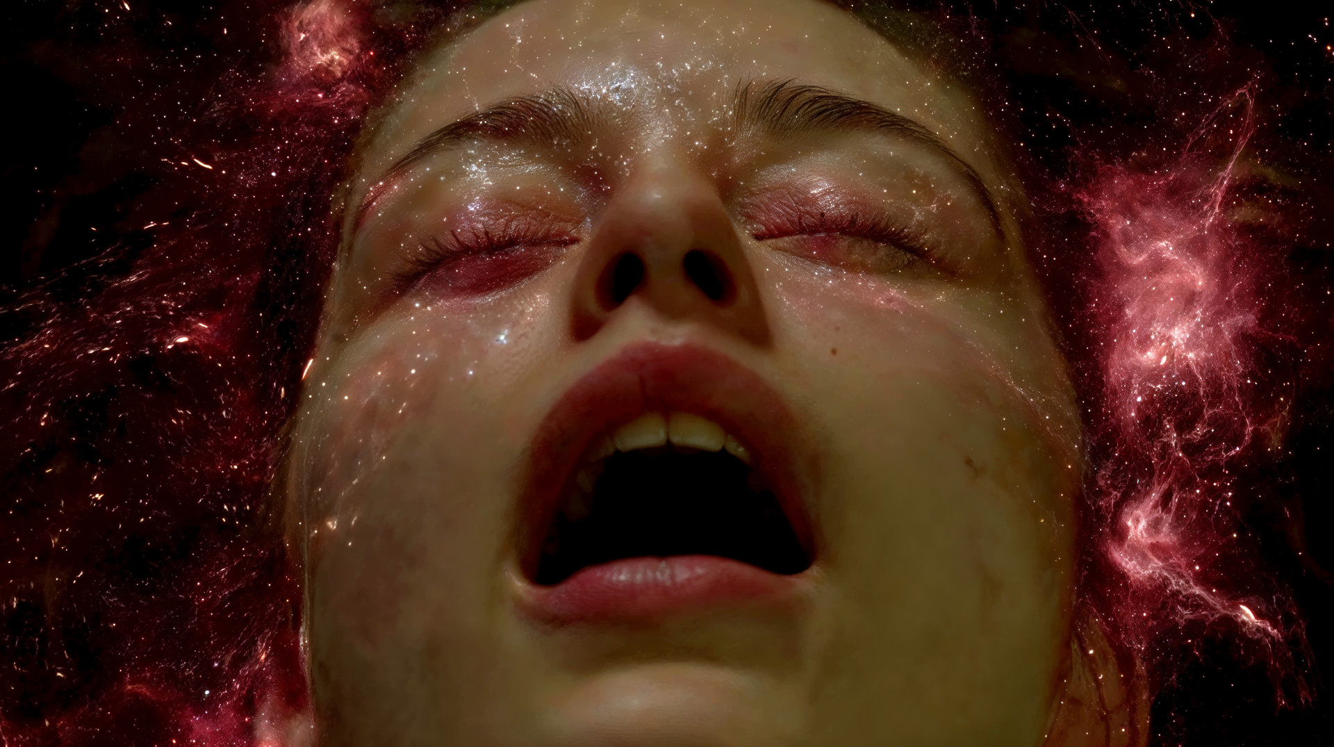
well, here we go again with another compositingwhich i made with sarah - like i mentioned before,
the photoshoot went really, really well and i used
lots of her photos for very different stuff.
manifestation should have been the front cover
illustration for a dnb flyer, but then i realised
that i got way too complex, and i decided to
release it as a ddr number.
anyway, the picture itself went quite fine, sure
a little gigerish again, but what the hell...
Related content


Comments: 79

I knew for a fact from the thumbnail that this had to be Dead Dreamer. Great work. Been following your work since i was a wee lil artist. Heh. Keep it up.
👍: 0 ⏩: 0


what really disturbs me is the head.. as far as I remember the heads were always detailed in your works..
👍: 0 ⏩: 0


heh.... i don't like that bunch of text on the top.. why that?? it's so contrasty, disturbing the rest of work ..but the "real manip" part is really great,tho - nicely detailed, great colors etc..that's really nicely done.. doh..just that text..! ..anyway - great work
👍: 0 ⏩: 0

Thats superb !!! A great wallpaper you have there mod, I can see this staying on my desktop for quite sometime now !
👍: 0 ⏩: 0

Very, very, very, very, very, very, very, very, very, very... Nice!!!
👍: 0 ⏩: 0

damn sir,that amazing,i try to make stuff like you do but i just don't get the same effect ..
👍: 0 ⏩: 0


Outstanding image. Very inspiring in your use of natural and unnatural elements. Even the color seems unterrestrial.
Nice work.
👍: 0 ⏩: 0

really amazing picture! love the colors and the layer work!
👍: 0 ⏩: 0


I've seen you do a lot better. There is very little focus and definition to this piece. The colors are really nice, but in the end however I just feel like this is a bunch of misc. textures overlayed on a nice photo.
👍: 0 ⏩: 0


interesting composition. all the things combined in this image, from the model to the background... it makes the picture kinda confusing, because you don't quite know what exactly is going on, and that is what makes it on this piece. makes you think, and that is something i like in art.
👍: 0 ⏩: 0

7shadows: nope, i really appreciate getting more comments than just '+fav' and 'i don't like it'. thank for the contructive critique
👍: 0 ⏩: 0


hmmm
I think this is the first ddr_ I don't really like.
It looks like something was missing .. I don't know.
The manip in the Stomach is really neat, but the rest seems a bit dull....
👍: 0 ⏩: 0

well. sorry in advance if you don't ever come to like suggestions on your artworks. i just thought an artist much admired deserve we take his art more seriously, with constructism. i tend to be honest, be assured.
👍: 0 ⏩: 0
most amazing. less on the minimalism, more on the focus, the ignition where sarah is depicted into one of the most stunning and distorted winged sirene i've seen lately. yes, it reaches me as if she was under water with those glossy monuments. the awesome light-green colors really brings that effect as well.
the parts i like less are the top and bottom layout. or shouldn't there be none? but you were enough clever to make it dark, so it doesn't bother the viewing of the main climax. the left extremity is also a little big on the textures, where it looses a little quality over, and it seems a little cut in many places. i think a certain perspective or minimalism there compliment the main image better.
i will say again, i really like how you twisted her into a suffering mermaid. the details are simply astonishing to look at.
👍: 0 ⏩: 0

another wicked manipulation by you. keep the cyberfemale goodness comin'.
👍: 0 ⏩: 0


absolutly awsome to say the least
it's definetly gotta be my wall for the next month
👍: 0 ⏩: 0


Man, I love the colours you use - great manip again
👍: 0 ⏩: 0
<= Prev |