HOME | DD
 DeadIshael — Angels and Demons

#black #demon #papyrus #sans #white #wings #wowie #angel #reborntale
Published: 2017-02-18 23:40:41 +0000 UTC; Views: 492; Favourites: 50; Downloads: 1
Redirect to original
Description
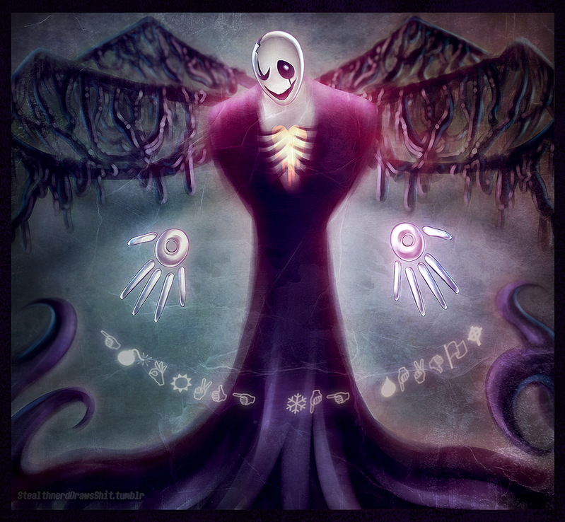
I want to try something out of the norm, so there's that. It felt weird though, but I think it turned out alright.But gosh. There's quite the amount of stuff going on whenever I draw though. Most foremost; layers. The small tendency of something going wrong because I sometimes draw on the wrong layers.
I also need to get my Sans consistent wowie.
I probably could have done more me thinks.
I just noticed that I have the critiques button on. But I figured that I'll just leave that on for the most of the drawings until the Core expires. Might as well make the most of it.
Related content


Comments: 9

Overall

Vision
Originality
Technique

Ah, yes, I like how it all has a magenta tint to it!
Issues? i see some overlapping lines, some messy lines too, some of the lines are far too thick or thin in areas.
papyrus' mouth is too far down his face (or his nasal cavity is too far up, you choose)
some spacing, for example on sans' tail (tail? sorry if i get that wrong, i believe it;s a tail) is wider than the rest.
sans' horns look... i don't know how to describe it. they look strange at the base of his head, too thin.
again speaking about the line thickness, it looks like sans' horn that is facing away from the viewer is floating because of how close the color of the lines are to the background.
otherwise, i think this art looks amazing. once again i like the magenta-red kind of aesthetic going on, and the brush for the shading looks pretty cool. the originality is kinda low because, i have seen this done many times.. but i still like it! :>
👍: 0 ⏩: 1

I agree. It seems that I need to make my lines better and neater too. Although that would be something that would take time and effort, which I will try to provide. I tried to make the very first circle (The skull) as nice as possible, but with the effect of making them really thick it seems.
I do notice that about Papyrus too. The 'mouth' being a bit too low. I need to experiment with this too...
I'm not sure if you're talking about the wings on the back of Sans, or the small tail between Sans and Paps, so it might be the wings you're seeing perhaps...?
Haha, I still have no idea how horns really work, so it's pretty much understandable that it looks off.
But thank you so much! I enjoy the details you notice and give effort to write down and critique. I really appreciate it! But I do hope that I will be able to fix the issues the next time I create a drawing.
👍: 0 ⏩: 0

Love how happy and innocent Pap looks here. He just looks so excited to see the new day. Watch out for Sans though, Papy, that look in his eye seems like trouble to me. Loving the texture in this. really adds depth.
👍: 0 ⏩: 1
Thank you! But Papy sure do have to watch out for Sans. Things may get hairy if let alone, but Sans seems to do a lot of watching out for Paps himself heh.
👍: 0 ⏩: 0

Oooh! I love the colours on this, especially the style with the shading, it looks a bit like painting ")
👍: 0 ⏩: 1
Awesome! My brush is a type of paint-ish type. Still experimenting colors, blending, and proper shadings. But thanks!
👍: 0 ⏩: 0

Why thank you so much!
👍: 0 ⏩: 1