HOME | DD
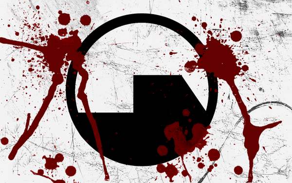
 DeadSet — ES Logo - Redesign
Published: 2004-09-05 18:46:39 +0000 UTC; Views: 147; Favourites: 0; Downloads: 44
Redirect to original
Description
Well, seeing as how I've ventured more into the field of simplicity, I thought a more simplistic logo would fit me, so this is what I just got done with. (Smile)")