HOME | DD
 deadspirit6 — DESIGNinstance

Published: 2002-10-26 09:42:22 +0000 UTC; Views: 4939; Favourites: 18; Downloads: 367
Redirect to original
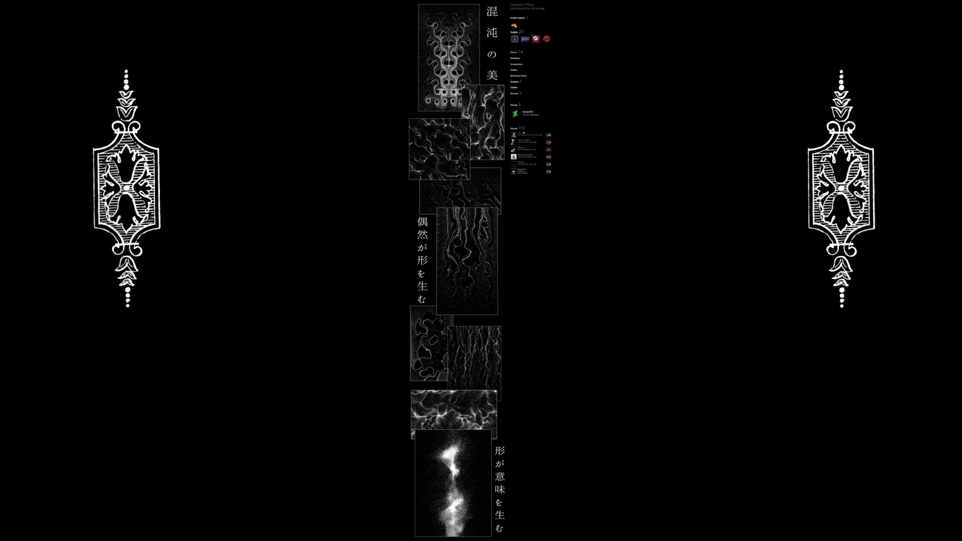
Description
...back to "black" walls. Hope you folks enjoy this!Related content


Comments: 63

 (Smile)")

")


*dies*
*looks back*
*dies again*
VERY nice job on this one!
👍: 0 ⏩: 0


3d is medicre, 2d is sub-par, is this really old or something?
because i thought everyone stopped doing this ..
👍: 0 ⏩: 0

I like the gear on the top right corner, that's fantastic...
👍: 0 ⏩: 0

Man o man I love this!! I've been looking for something new to dress up my imac and I finally found it!! Thanks for continuing to do such amazing work!
👍: 0 ⏩: 0


Great piece of work here, the composition is spot on, I think that lighting is so well balanced with the black, well done.
👍: 0 ⏩: 0


dont like the typo... think you made it yourself... and as i said... the model needs more sharpness
👍: 0 ⏩: 0


good job.. but i dont like the fonts and the 2d.. nice 3d stuff tho'
👍: 0 ⏩: 0


is a very good image but needs more work -_- methinks people have lowered their standards for faves these days -_-
👍: 0 ⏩: 0


nice colors, i think the 3d is a bit harsh/chunky, just me though
👍: 0 ⏩: 0

Nice, but i think it's a tad on the mediocre side. Blurry for one, and the 2D just doesn't blend well. Too obtrusive. Better 2D typo would've suited this much better.
👍: 0 ⏩: 0

i must have bad taste because all these other people seem to enjoy this immensely but i look at it and think to myself, "meh". it doesn't grab my attention; looks like a couple hours were spent working on the piece.
👍: 0 ⏩: 0

Oooh.. I love the colors. Great job. I might well use this in the future.
👍: 0 ⏩: 0

thank you, I have not seen something as good as that on deviant in a long time. I love the use of blue... I marked it as my fav so that I can go back later and set it as my wall paper, thats good work man, I hope that one day ill get a daily deviant thing.
👍: 0 ⏩: 0

awsome. Another addition to my favs
Keep up the good work
👍: 0 ⏩: 0

nice work! slightly jaggy, but who's to say my stuff isn't on occasion! great work. keep it up.
👍: 0 ⏩: 0

smooth yet jagged, colored yet almost black and white. very nice
👍: 0 ⏩: 0

Well placed little designs and patterns all over this peice...colour flows nicely...the black wide screen feel is also great.
Wekk constructed and wicked colours and light
👍: 0 ⏩: 0

This is definately for donwload, and yes i prefer black backgrounds!
my first site was black - blue, i am font of this compination, i also like the metalic feel to it
great design again Dinesh!
👍: 0 ⏩: 0

a lot better typo and line art would have improved this 10 fold. Nice attempt.
👍: 0 ⏩: 0

i want to have sex with this, lol. fabulous job +fav
👍: 0 ⏩: 0


some great stuff you got there dude, i like how smooth everything looks
👍: 0 ⏩: 0

dope man. this is gonna be PIMP on mah desktop thnx!
👍: 0 ⏩: 0

Dead Dude how do ya do all this bullshits ya gotta tell me damit
you should upload more TUTs for this sort of shits..
man just excellent
keep it up
👍: 0 ⏩: 0

| Next =>