HOME | DD
 DecoEchoes — Japan with Pan Am

#advertising #aviation #fuji #japan #lockheed #pagoda #panam #shinto #tokyo #vintageart #travelposter #airliner
Published: 2016-09-20 13:54:40 +0000 UTC; Views: 3642; Favourites: 61; Downloads: 0
Redirect to original
Description
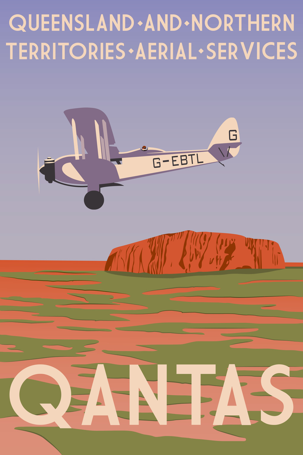
I decided to turn my "Come Fly With Me 2" postcard box art into a full-blown poster.Related content


Comments: 8


I love the artwork and your style. I am a big fan of old travel
poster artwork. One criticism, though. Pan Am colors are blue
and white. You might want to redo the aircraft in their color
scheme.
👍: 0 ⏩: 0

A few years back, ABC ran a short series called "PanAm" that told a rather romanticized story of the airline in its heyday. Have you seen it?
👍: 0 ⏩: 0

Nice job! What's important for you in a drawing?
👍: 0 ⏩: 1
Well, What do you try to achieve? and to improve?
 (Smile)")
👍: 0 ⏩: 1

My main goal with my artwork is to make it indistinguishable from authentic period posters - that is, getting the colours, shapes, fonts, and flat but textured "lithographed look" exactly right. Related to this goal is my striving towards ever more efficient minimalism - being able to convey more and more with fewer lines and colours. Since actual posters in the 1920s and 30s would have been lithographed by printing each colour separately, one on top of the other, economy of colour and shape was advantageous. This is a difficult aesthetic to hold to when working digitally, as you can easily include gradients, transparencies, and other effects that would be extremely difficult to execute in a regular lithograph. It was much easier to follow these rules when I painted my posters by hand, but far more tedious a process
")
👍: 0 ⏩: 1
Thank you really! I'm really interested in that simplification effect, I think it adds strong impact and readability to your image! Keep up with the good work!!
👍: 0 ⏩: 0