HOME | DD
 DeepChrome — Kryptonian Landscape
Published: 2010-10-16 02:15:08 +0000 UTC; Views: 3291; Favourites: 30; Downloads: 353
Redirect to original
Description
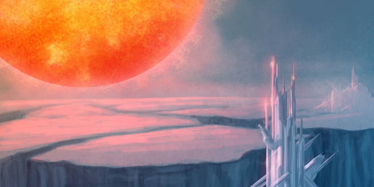
I happened to hear the opening theme to the Superman movie (the Reeves classic) on my ipod the other day, and it turned into an utter, complete earworm on me by the next morning.Since then I've been looking at various Superman stuff on YouTube, as well as recalling my fascination with Krypton's crystalline technology. I collect gems and minerals as a hobby, so it's somewhat natural that I would be drawn to a world where the technology is so advanced it's crystalline and can be grown from the ground in minutes. (I've wanted a replica of their control crystals, the pretty polished "shard" shapes for years. Yet to find one, except I have one tiny quartz point that looks somewhat like this, which is why I bought the thing about 15 years ago...)
However, much as I love the movie interpretation of Krypton, I haven't really liked the idea that the planet somehow seemed to independently glow like one of those glow-in-the-dark stars despite having a large red near-supernova sun in the sky.
So here's an interpretation for the crystalline structures, as well as the blue we see on the planet. I'm rather happy with how I got this to work. I did one previous speedpaint that was basically Krypton about to go under as Kal-El's ship takes off, but it wasn't the best.
So here we are. I don't think I've ever posted Superman-related fanart before...that's a first.
")
About two and a half hours in Photoshop CS3, with a Wacom 6x8 intuos tablet.
Related content


Comments: 9


Man, I gotta redo this one sometime. I leveled up on SF landscapes out of a hobby of doing them more often recently. When I get v2.0 of this done, I'll put it up on DA.
👍: 0 ⏩: 0

Definitely like the crystalline Kryptonian structures.
The sun has nice texture and corona, but it doesn't look like it's outside the atmosphere. When you have an object in the sky like a sun or moon, you can't have any colors in the object that are darker than the blue of the sky -- the background of space is black, after all, and the sky blue fills that it. So a moon needs to look like it is set to "screen" mode in Photoshop: the darkest areas will be sky blue, and any color lighter than black will only add to the lightness of the blue sky base color. I noticed that you have made this "error" in a few of your other paintings with moons with dark colors in them.
It's a little bit harder in this case because the sun has deep red and the sky is pretty dark, but there still needs to be some interaction of the atmosphere with the sun to make it seem outside the atmosphere, instead of something hovering directly over the ground there.
It could be as simple as setting the sun layer to Screen, and then painting on top of that with a new layer to fix the problems that would cause... like maybe strengthening the corona. I would try a paintover, but unfortunately I'm without my workstation this weekend.
👍: 0 ⏩: 2
I would love to see that overpaint when you get a chance - this is a particular challenge I've been having with moons/suns, and would love any input to help improve that. Sometimes I've been lucky, sometimes I haven't, and I'm still looking for an effective way to pull off atmospheric interaction effects with the custom brushes I've got. Sometimes I've found ways to do clouds covering moons to offset their glow a bit, but that still doesn't quite cut it...(To be honest, I'm actually not that satisfied how the star looks in the sky, which is why I'm actually pretty interested to learn better ways to do this.)
I usually use Linear Dodge or Lighten (sometimes Screen) for a lot of the light effects, and in this case, the corona and a lot of the "lighter" surface texture on the star, were done in Linear Dodge. To get the extreme redness, I had to start on the Normal mode, since Linear Dodge tends to render bold reds a light pastel pink, or pastel orange, depending on what little amounts of red or orange are in the actual color. It's annoying, and I wouldn't mind learning a good workaround to solve that problem.
I got into doing these environmental speedpaints because I knew I had a pretty large weak spot in environments, including stuff like cityscapes, atmospheric effects, and so on. Industrial stuff like machinery and equipment are another shortcoming of mine, and I'll eventually look into speedpainting entirely industrial environments, like the insides of ships, space bases, etc. Right now I'm just testing what I can do, and broadening my horizons from that.
I ultimately want to do a webcomic, and those require a visual setting to stick characters in. Which meant that I had to shape up some of these weaker areas. Critique and information on better ways to do things are part of what I want to get out of doing these.
 (Smile)")
👍: 0 ⏩: 1
I got my computer back sooner than expected. Yay!
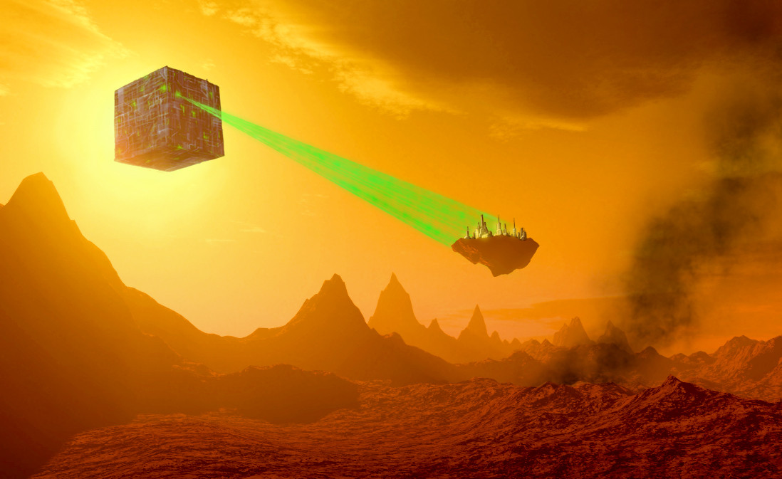
The first suggestion is to put some atmospheric haze and a few clouds in front of the sun disc to put it firmly in the background. I've done this in both of my examples, and this will help even if you don't change the color of the sun.
The second is to change the sun so that no color is darker than the blue sky, and unfortunately that means changing the red-orange color. I tried two approaches:
First is a darker disc and a bright corona. This maintains the feel of a red sun, though the color is washed out and sort of pastel-ized by the atmosphere, but I think that's fairly realistic. I've lost most of the sun texture in doing this, which you'd want to add back in, but using lighter colors. You also might want to go even wilder with the bright corona. [link]
Second is a bright disc. This is probably how a red giant would actually look from a planet's surface, which is to say, not very red at all. Which is no fun. [link]
👍: 0 ⏩: 1
Both of those speedpaints are awesome. Thank you!
I second about overpaint #2 - that's the real way the star would likely look. I ran across some high-quality astronomical speculative art a few years back by a guy who went with the tinting idea on the giant/colored suns rather than taking the color literally, for the sake of realism. Giant suns were more orange/yellow than red. I just liked the idea of Rao, Krypton's sun, being extremely red for artistic purposes.
I've also taken your advice, and posted a new version of this landscape with the upgraded sun/sky effects. (It's just the same title with a "v2" attached to it.) Feel free to give me whatever you think on that one.
👍: 0 ⏩: 0
Here's an example of what I'm talking about in a daytime moon photo: [link]
👍: 0 ⏩: 0

Thanks.
Might use the same techniques and try a blue-sun planet next...
👍: 0 ⏩: 0