HOME | DD
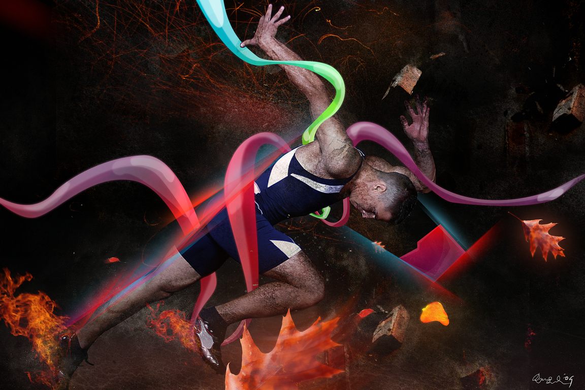
 degodson — Frozen In Time
by-nc-nd
degodson — Frozen In Time
by-nc-nd
Published: 2009-04-04 13:10:21 +0000 UTC; Views: 2481; Favourites: 18; Downloads: 117
Redirect to original
Description
Ok, something new.Not much to talk about.
If you wna critique, feel free to do so with the critique feature.
This piece is a wallpaper pack of 9 images sizes varying from:
2546 x 1697
2048 x 1365
1920 x 1280
1680 x 1120
1600 x 1066
1440 x 960
1280 x 853
1152 x 768
1024 x 683
Feel free to download. I'd appreciate if no one tried to manipulate/edit/distribute or claim responsibility for this piece.
Done in: Adobe Photoshop
Stock of runner bought from stockxpert.com
other stock elements from sxc.hu and cgtextures.com
Related content


Comments: 17

Overall

Vision
Originality

Technique
Impact
1st style:
Cool concept, but i agree with what inphi said, i think this piece would be cool if it was like your original style. Such as having stroke lights coming out from his shoes and if the bg was blue, like he is runing in the air. Also you can add bubbles around him like he is floating somewhat.
The texture use also gives is a cool touch, as in the grunge style, take out the lines and try to give it more darkness and depth imo. But theese 2 styles are hard 2 connect, hope to see more experiments like this tho.
Cheers!
👍: 0 ⏩: 0

Overall
Vision
Originality
Technique
Impact
Alright. First of all, you mixed too many styles which, in my opinion, don't work together.
I especially dislike the fire on his shoes, the burning/glowing leaves and the cracks on his body. - The fire definitely needs better blending, i don't see any relation between him and the leaves, and the cracks are kind of too much on him.
Furthermore those colourful shapes simply don't fit the rest. I mean, you've got a rather dark and "suppressive" atmosphere but they actually represent happiness and joy in my opinion.
Overall the whole quality could be better as well.
I hope you get what I mean.
Keep it up e.deviantart.com/emoticons/s/s… " width="15" height="15" alt="
 (Smile)")
👍: 0 ⏩: 1

cool mate, you vanished on msn when i tried to get feedback on it
thanks still.
I think you're feedback has some good points and agree but i think i ended up liking it how it is anyway, but still, it's always a learning point. critiques give me the power to grow stronger!
thanks for keeping it real.
don't get drunk tonight and blame it on the alcohol tomorrow
")
👍: 0 ⏩: 0

I like alot very powerful compostion in my opinion keep up the good work
👍: 0 ⏩: 1

its too congested in my opinion bro..whats the purpose of the leaves?? i also feel that the fire on the feet dont need to be that big..i do however, dig the gradients going down his back..you have other gradients but they dont look as smooth as the ones going down his back..
👍: 0 ⏩: 1
yeah i blurred certain parts of the gradients to achieve some softness.
thanks for the feedback still. agree with it
👍: 0 ⏩: 1
good ish bro..no prob i still need to figure out how do those things ha
👍: 0 ⏩: 0

Its verry good but i think the leaves I dont know i dont like them

👍: 0 ⏩: 1


Hey man looks cool! love the fire and dirt u gave him...not sure about the random bricks and leaves tho.
overal v cool (Y)
👍: 0 ⏩: 1
alright mate, cheers for the feedback
👍: 0 ⏩: 0