HOME | DD
 Deko-kun — Digimon Parallel - Logo's all the way
#bandai #akiyoshi #animation #digimon #hongo #logotypes #parallel #toei #decokun #c
Published: 2015-02-16 18:37:26 +0000 UTC; Views: 1858; Favourites: 25; Downloads: 0
Redirect to original
Description
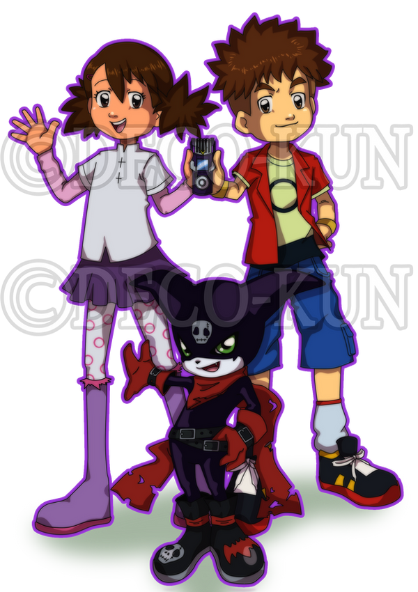
These are the logo's for Digimon Parallel from the first one to the latest!Digimon (C) Akiyoshi Hongo, Toei Animation & Bandai.
Digimon Parallel & Logotypes (C) Deco-kun
Related content


Comments: 17

Those looks awesome all of them (though, the 2013 one is the only one i don't like as much as the others).
I'm beginning to think i'm the only one in the deviantArt digimon community that sucks at making logos xDU
👍: 0 ⏩: 1

I didn't like 2013 either! xD
No I was really bad as well! But I learned by making these and some other non-digimon logos.
It's easy if you get the hang of it.
")
👍: 0 ⏩: 1
I guess i'l have to practice a lot then xDU
👍: 0 ⏩: 1
")

 (Smile)")

NP  (Wink)")
👍: 0 ⏩: 0

These all look kickass!
What did you use to make them?
👍: 0 ⏩: 1
Haha! Thanks Sakeke! Really appreciated.
Well the normal/professional way to do logo's is with Illustrator and the Pen Tool.
But I made these with Photoshop. But only the last two are with the Pen Tool from Photoshop.
But I think you can import them to Illustrator, if you want. Haven't checked it though.
👍: 0 ⏩: 0

Thank you Midnitez!!
Yeah they are! Well... I was inspired by you on the last take from this
Digimon Story: Digital Anomalia Title Screen 2.0 by Midnitez-REMIX
👍: 0 ⏩: 1

I actually rather like the old ones, or at least I like the idea of the circlular world symbol behind the letters.
The newest one looks excellent but it looks really similar to every other digimon logo with nothing unique that's relevant to the season theme. (Sorry, no offense intended)
I mean I just kinda think that there needs to be a balance between perfectly imitating digimon style and adding your own flair to it...
👍: 0 ⏩: 1
I know! I liked that idea as well. But Parallel is still in it's early steps.
The logo might change again in the future. (I'm kind of a perfectionist! xD)
No offence taken.. don't worry! I was/still am thinking that the logo should have something,
that shows the theme of the season. For example Tamers logo and Frontier's logo.
Are way different than Adventure's one.
Thank you for your comment!
👍: 0 ⏩: 0