HOME | DD
 Delicious-Daim — Kapitan Navi Logotype
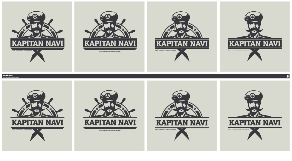
Published: 2006-05-02 20:43:18 +0000 UTC; Views: 8037; Favourites: 30; Downloads: 810
Redirect to original
Description
.Related content


Comments: 35


")

Mimo tego, że temat jest hmm inny, to widać twój styl.
Rząd drugi, kolumna druga.
👍: 0 ⏩: 1

tez tak mysle:] czuc stylem moim? briljant, ciesze sie,ze to widac:] dzieki.
👍: 0 ⏩: 0


 (Smile)")


nice and a little bit with other style than your other logotypes.

👍: 0 ⏩: 0

all of them could work...
nicely concepted and produced...
👍: 0 ⏩: 0

i agree that the second from the left in the bottom right is the one! but for what purpose you made this logo? Pub? Beer? However it's very simple but nice!
👍: 0 ⏩: 1

The second from left on the bottom line is the one, it's the most balanced! In my opinion, however... u rock man!
👍: 0 ⏩: 0

Top work - Agree on 2nd top, sits very neatly, says what it needs to.
👍: 0 ⏩: 0


i likd 2n 6th... supper work.. i lk the simplicity!
👍: 0 ⏩: 0

 (Wink)")


For sure the top left middle one is by far the best. It stands firm, great weight and looks very corporate and profetional. Great work!
👍: 0 ⏩: 0


śmieszny jest... nie zdziwiłbym się gdyby pod mundurem nosił skórę z ćwiekami........ wystarczy spojżeć na te wąsy.....
👍: 0 ⏩: 0


swietne. dobrze oddaje charakter zlecenia.
Co to za font btw: zajebisty jest!
👍: 0 ⏩: 0

lovelly illustrated man, nice work, classic touch to it.
👍: 0 ⏩: 0


first one looks the best imo, I ussually go for teh simple designs, but dunno, just looks better! XD
👍: 0 ⏩: 0
