HOME | DD

Delicious-Daim — My Week Beats Your Year

Published: 2006-01-09 04:14:38 +0000 UTC; Views: 8587; Favourites: 166; Downloads: 956
Redirect to original
Description 
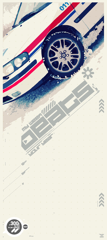
Vector art on top based on photo by 5-tab: [link]
Foto here: [link]
Inspiration: My Week Beats Your Year by Telefon Tel Aviv
Related content
Comments: 27

FlowisKing [2006-03-05 12:24:33 +0000 UTC]

👍: 0 ⏩: 0

Ethernity [2006-01-24 00:37:46 +0000 UTC]

nice 2d and typo

👍: 0 ⏩: 0

22MOON [2006-01-22 18:55:53 +0000 UTC]

nice fonts

👍: 0 ⏩: 0

polel [2006-01-18 16:14:21 +0000 UTC]

jak zawsze kawal dobrej roboty

👍: 0 ⏩: 0

FoT [2006-01-12 20:55:55 +0000 UTC]

grat work + fav

👍: 0 ⏩: 0

kaz1021 [2006-01-11 14:08:39 +0000 UTC]

i love this

👍: 0 ⏩: 0

rOrtes [2006-01-11 13:35:32 +0000 UTC]

super chociaz wolalbym inna furke

👍: 0 ⏩: 0

pwess [2006-01-10 11:24:36 +0000 UTC]

great work, love the color blending

👍: 0 ⏩: 0

kureb [2006-01-10 03:31:44 +0000 UTC]

Great work on vectors.


I love it

👍: 0 ⏩: 0

Dozign [2006-01-10 03:08:05 +0000 UTC]

nice composition

👍: 0 ⏩: 0

AHalo [2006-01-10 00:48:43 +0000 UTC]

damn dude thats so tight. the car looks really realistic.

👍: 0 ⏩: 0

cypr-3-ss [2006-01-09 16:18:04 +0000 UTC]

miszczu!!!

👍: 0 ⏩: 0

5-tab [2006-01-09 13:58:15 +0000 UTC]

hey ! great work bro'!!

That is the size(crop) that I want(ed) to do for a vector illustration, so that's so cool same vision.
Nice add on with typo. it works well.

And I would have seen initially, more straight lines for the car with your squarre pxl font, but i think it works well with this kind of not perfect line, that brings a nice contrast and dynamism.

Now you gave me the desire for moving me much more for the illustrations that I was to make

Thanks bro' !
++
5ive

👍: 0 ⏩: 0

polaus [2006-01-09 13:56:34 +0000 UTC]

super .. bardzo mi sie podoba to co robisz

👍: 0 ⏩: 0

Chrono6 [2006-01-09 13:12:31 +0000 UTC]

pimp man ^ _ ^ G J : )

👍: 0 ⏩: 0

darkevil [2006-01-09 11:00:15 +0000 UTC]

👍: 0 ⏩: 0

abhimanyughoshal [2006-01-09 10:40:51 +0000 UTC]

fantastic work... love the typo and colours!

👍: 0 ⏩: 0

MiG-Quadra [2006-01-09 10:05:44 +0000 UTC]

your typo godlike as always as juss said...
i totaly agree with him

👍: 0 ⏩: 0

juss [2006-01-09 09:54:01 +0000 UTC]

love the snowy colours typos exellent as always, nice work

👍: 0 ⏩: 0

kontrastt [2006-01-09 09:27:24 +0000 UTC]

great job!

👍: 0 ⏩: 0

spritek [2006-01-09 09:25:41 +0000 UTC]

Wow, what's this typo ?

👍: 0 ⏩: 1

Delicious-Daim In reply to spritek [2006-01-09 21:38:24 +0000 UTC]

select 420: [link]

👍: 0 ⏩: 1

spritek In reply to Delicious-Daim [2006-01-09 22:33:05 +0000 UTC]

Very nice, I hope you'll code it soon I've also got a perso font... I don't have the time to code it it's still at the "illustrator state" so I draw it every time I need it

👍: 0 ⏩: 0

verty [2006-01-09 08:50:06 +0000 UTC]

fuckin mad

👍: 0 ⏩: 0

Steelo23 [2006-01-09 06:13:59 +0000 UTC]

Now that is F-R-E-S-H!!!

👍: 0 ⏩: 0

Reusol [2006-01-09 05:05:24 +0000 UTC]

VERY impressive

👍: 0 ⏩: 0

smashmethod [2006-01-09 05:00:56 +0000 UTC]

Excellent design.

👍: 0 ⏩: 0