HOME | DD
 Delicious-Daim — Official Synthetic City 10
Published: 2006-04-19 12:26:17 +0000 UTC; Views: 9661; Favourites: 139; Downloads: 881
Redirect to original
Description
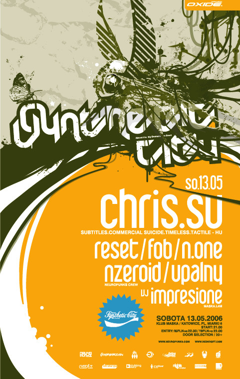
Official Synthetic City 10poster/flyer
Typo by [link]
cables by jestemelf

Related content


Comments: 41


beautiful, love the wires coimng in over the text, really brings some dimension to it. and Chris .Su is a legend too
 (Wink)")
👍: 0 ⏩: 0


haah, chris.su...i know him personally.
great poster, anyway,i really like the colour choice
👍: 0 ⏩: 0

 (Smile)")


layout and typography are as always, the highlights. very nice
👍: 0 ⏩: 0

fuckin boh! flyer rokz and the event looks delicioussss
")
👍: 0 ⏩: 0

very cewl! do you draw those flies your self?? I really like your style!
👍: 0 ⏩: 0


bravo thats really nice work everything fits perfectly...
👍: 0 ⏩: 0


killer work, guys... loving the colours and typo!
👍: 0 ⏩: 0


Simple gorgeous. The composition, the colours, the font. Superb.
👍: 0 ⏩: 0

oh man i love chris su
great work on the flyer
👍: 0 ⏩: 0

is there a name for this type of art or style?
I'm clueless about it, but I really love it.
👍: 0 ⏩: 1

I made this type just for this flyer. maybe in the future ill make a regular font ;]
👍: 0 ⏩: 0

Z ciekawości spytam, czy będziesz brał udział w inspired quality ([link] )?
👍: 0 ⏩: 1

kurde,nie wiem czy bym jakies szanse mial szczerze mowiac
👍: 0 ⏩: 1
Myślę, że byś miał. Obejrzyj prace nadesłane na poprzednią edycję.
👍: 0 ⏩: 0


I think I prefer the CocaCola-esque synthetic city logo in the blue splash more than the one at the top. It has more pop and readability. Overall design of the flyers looks great, too.
👍: 0 ⏩: 0


raz dostales fava! nie widze przeszkod bys dostal go poraz drugi! a co do samej pracy to wiesz co o niej sadze!?
👍: 0 ⏩: 0


if i'll ever need someone to create a flyer for something mine, i would want noone but you!
👍: 0 ⏩: 0

incredible ad mate. very well done, you layed everything out perfectly.
👍: 0 ⏩: 0